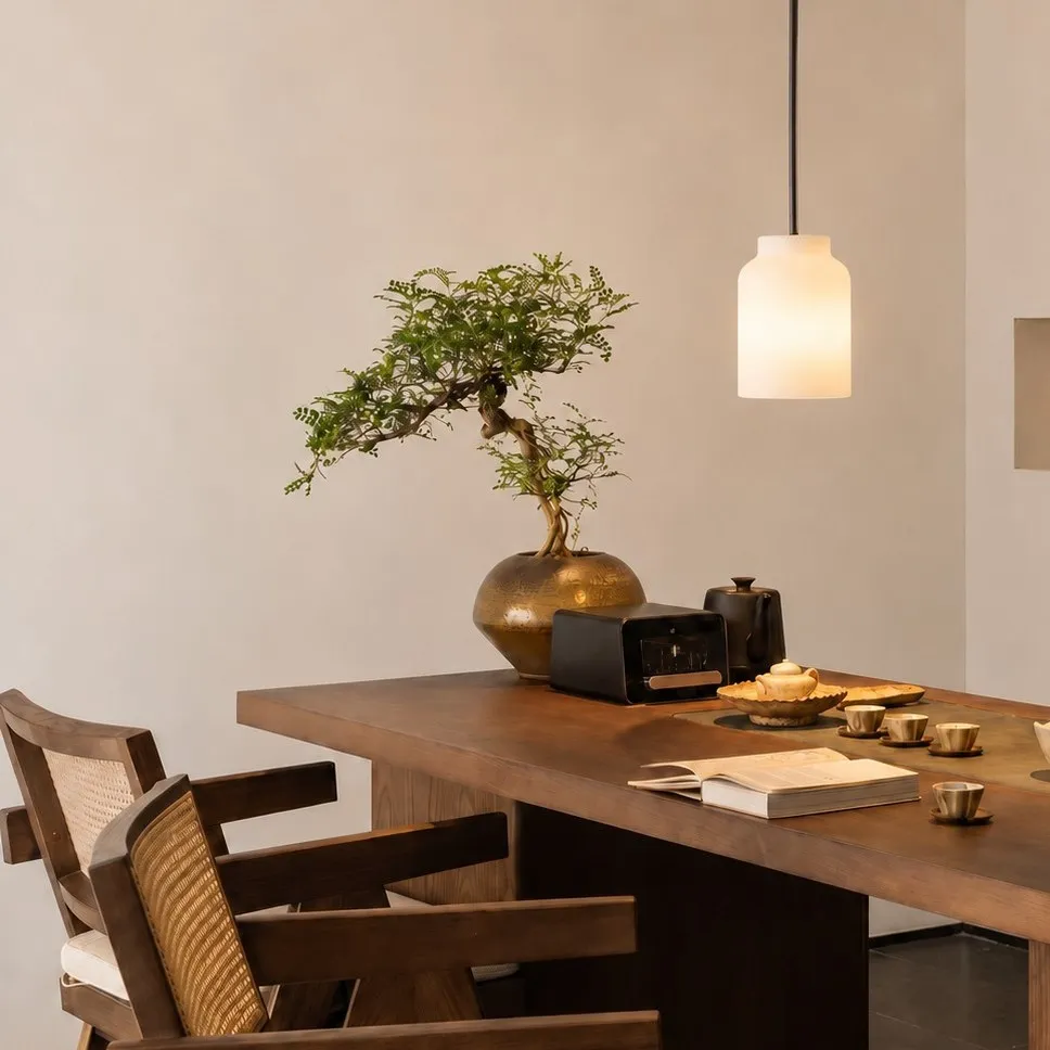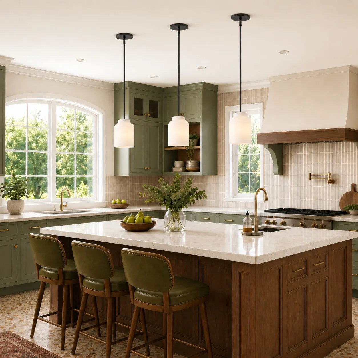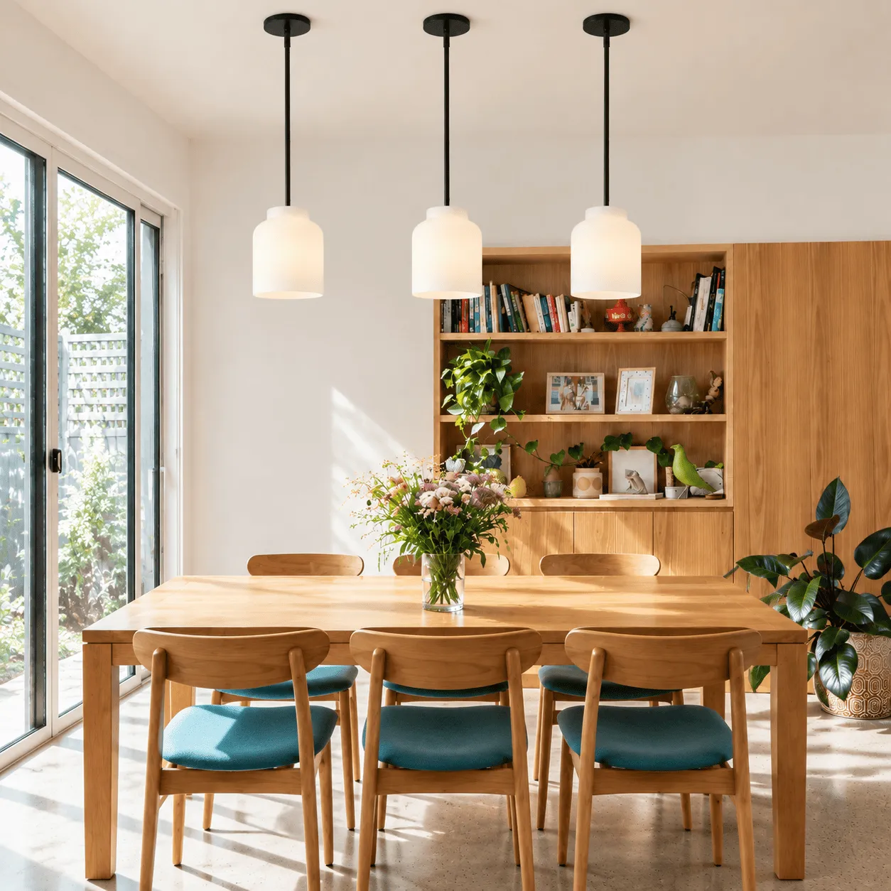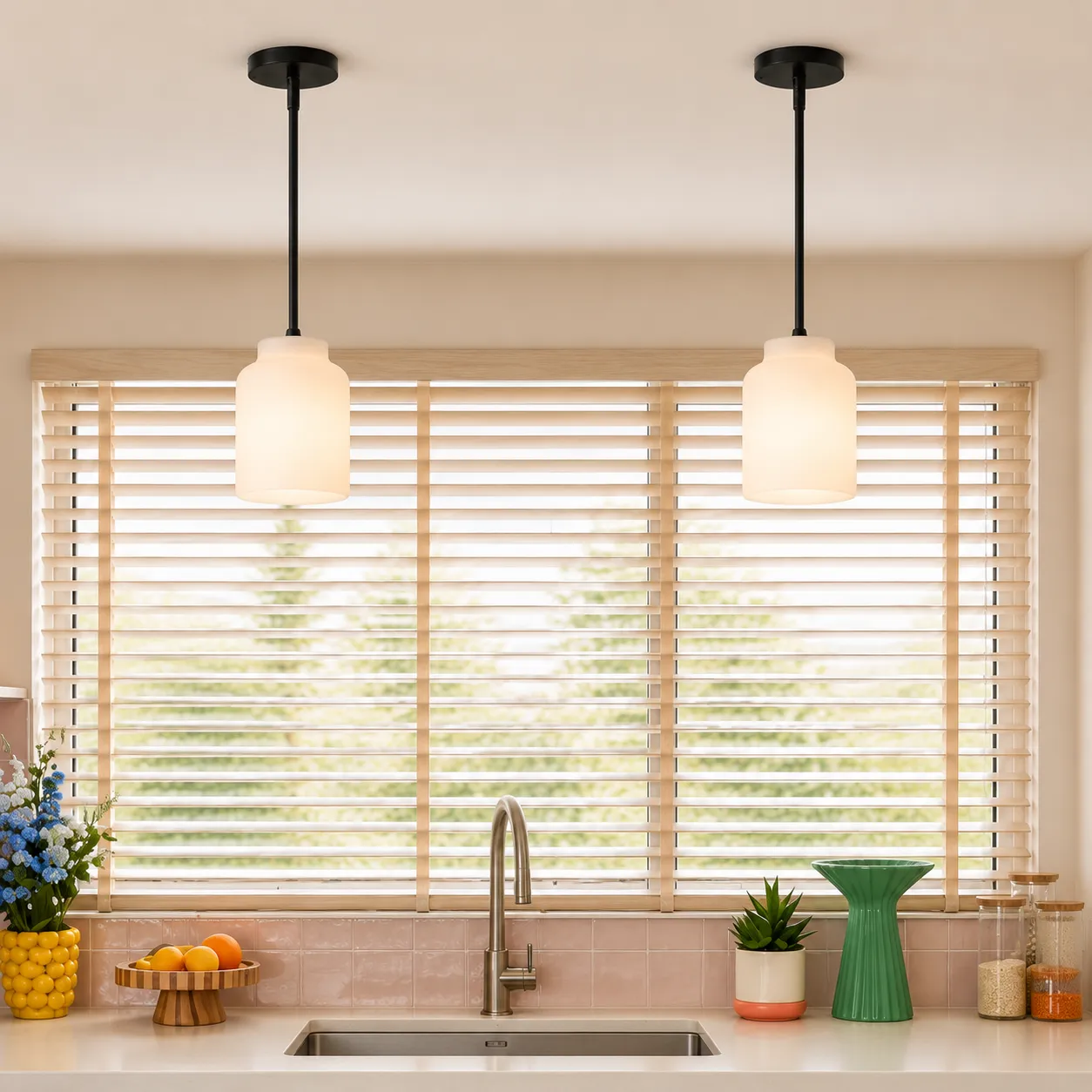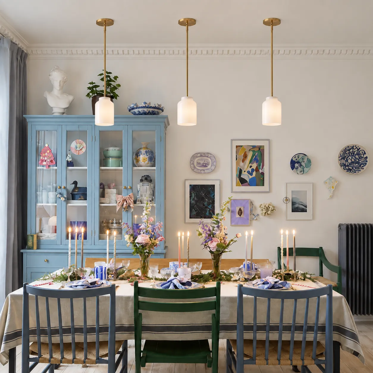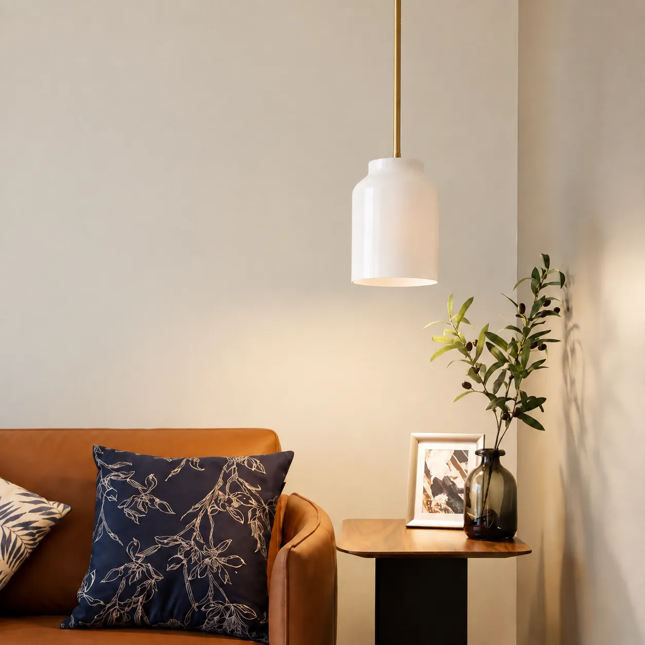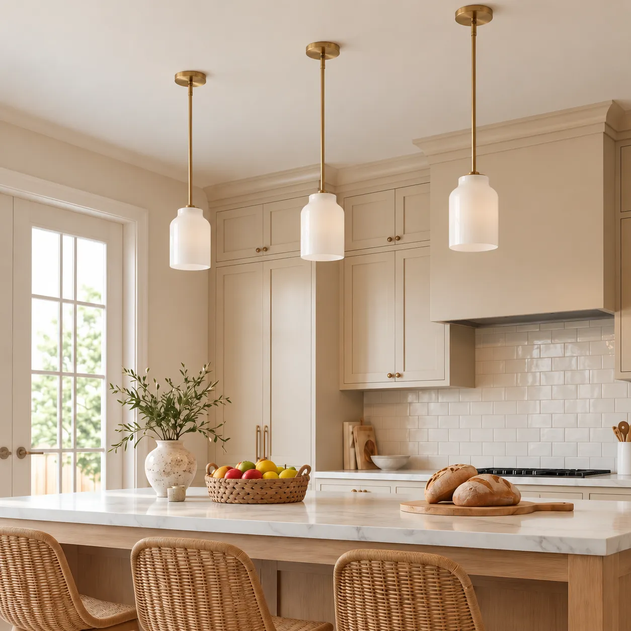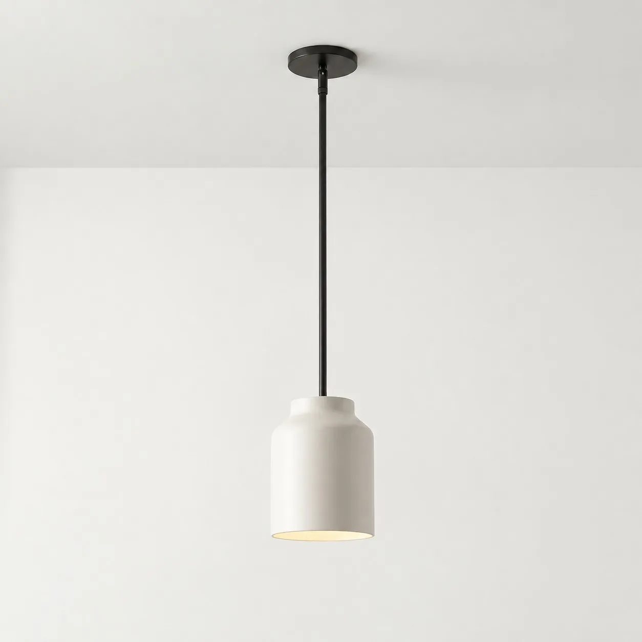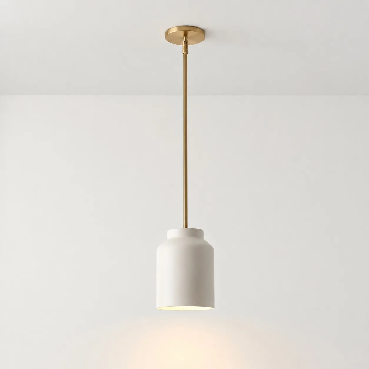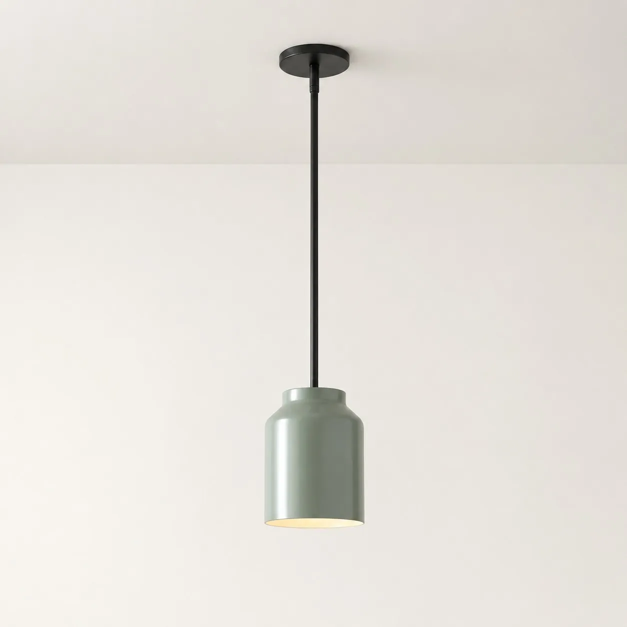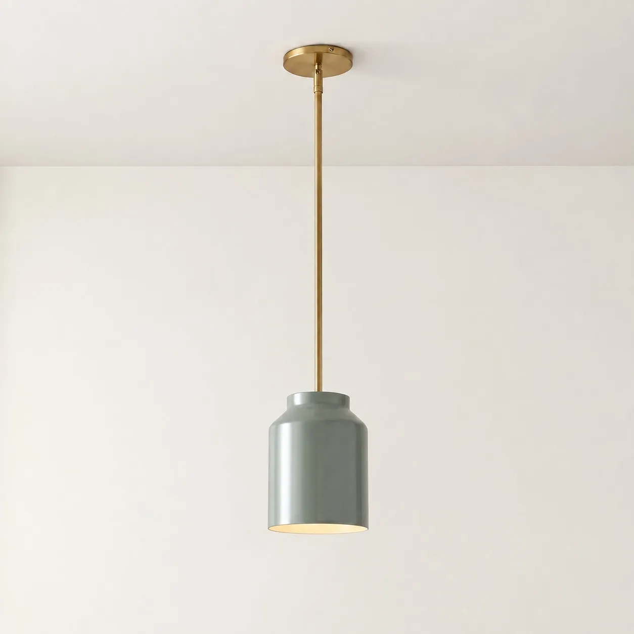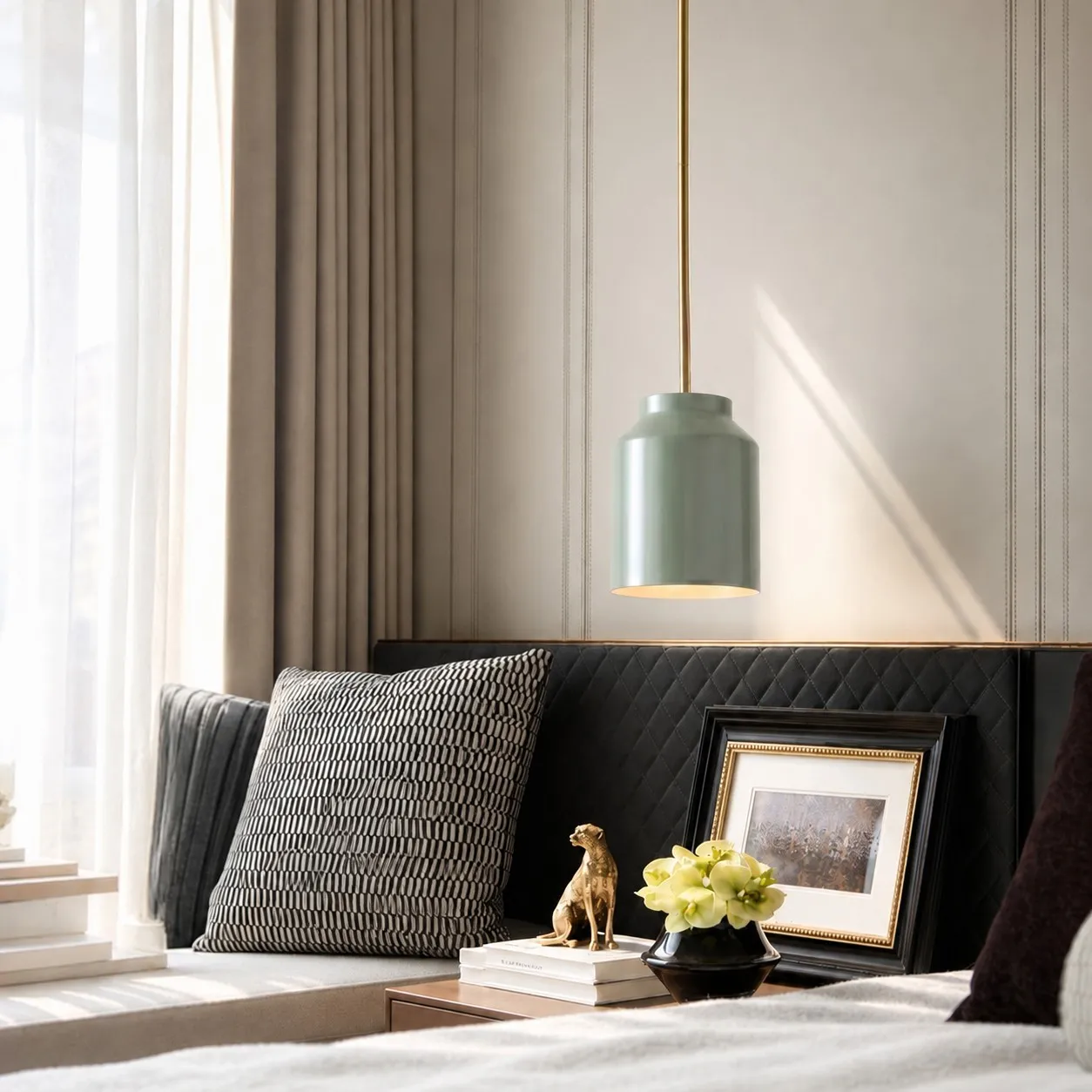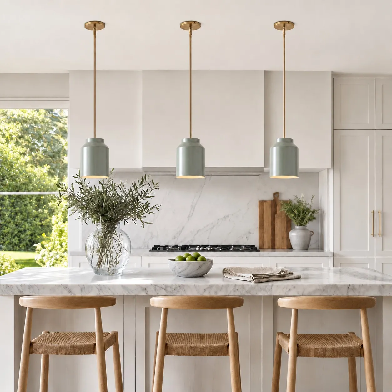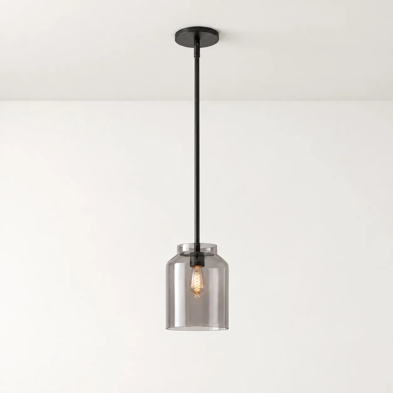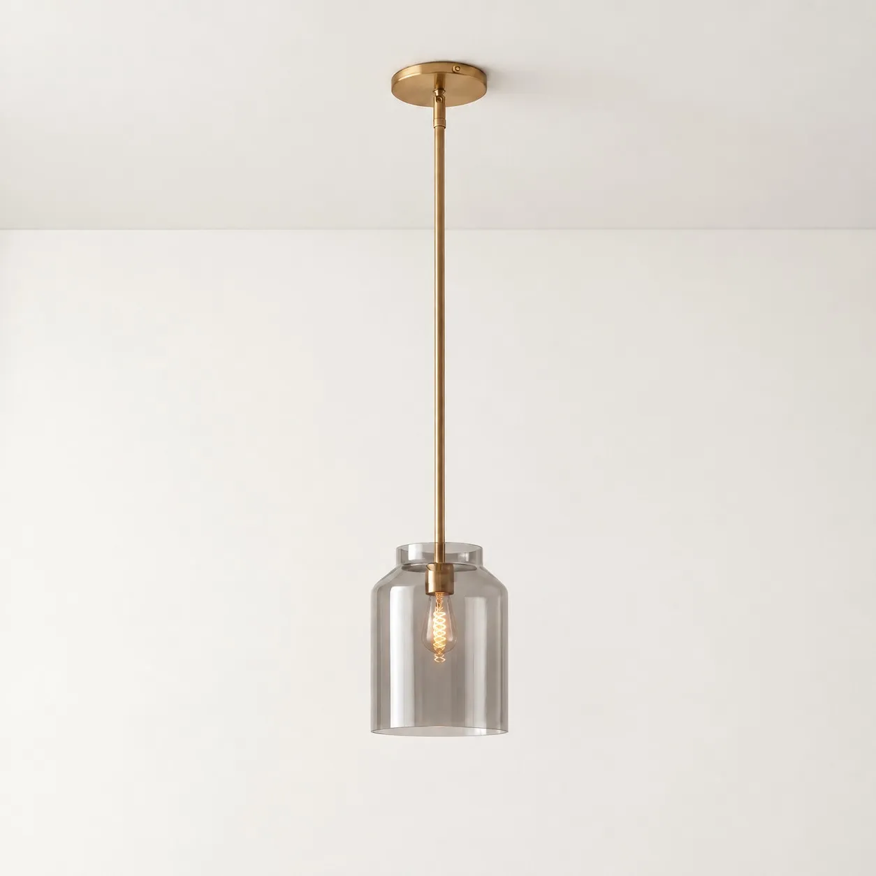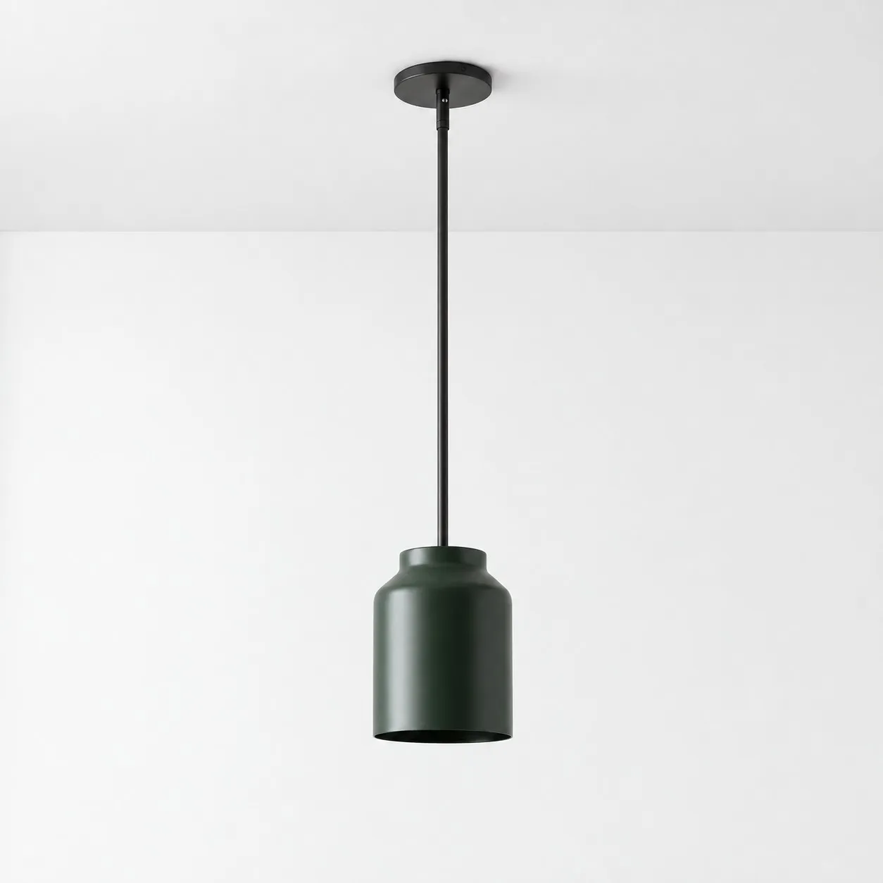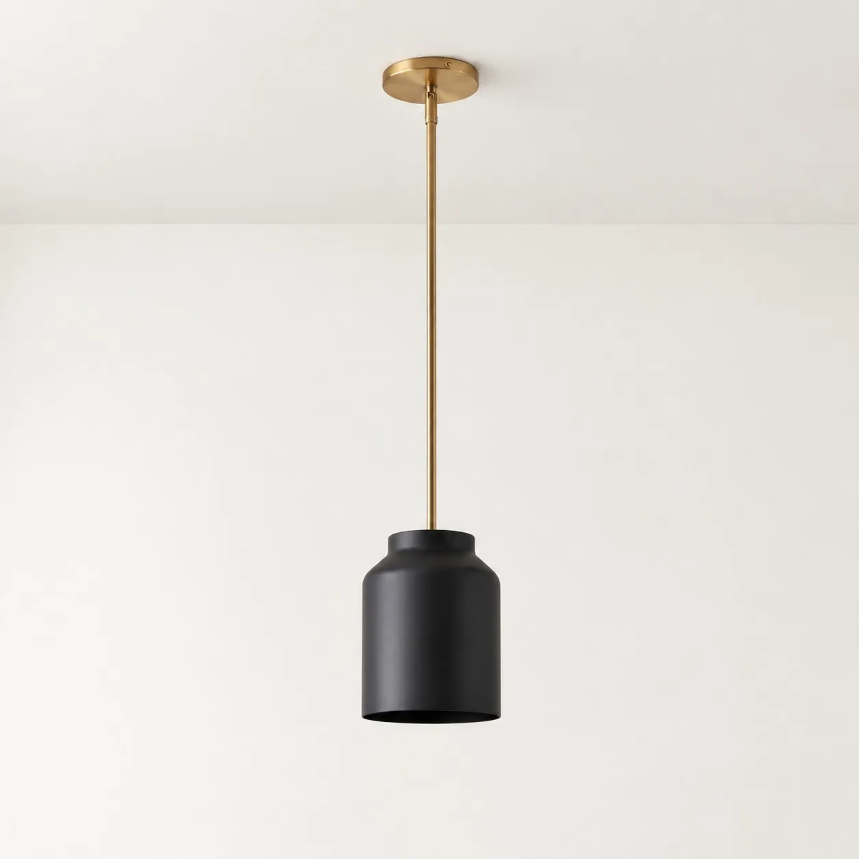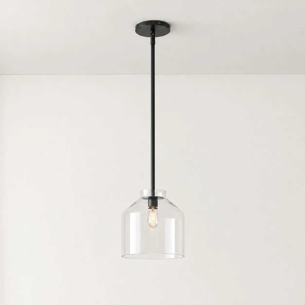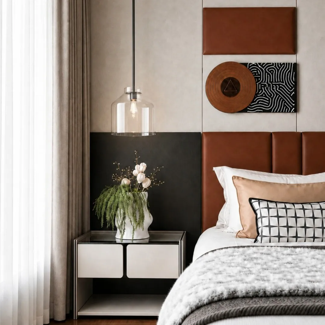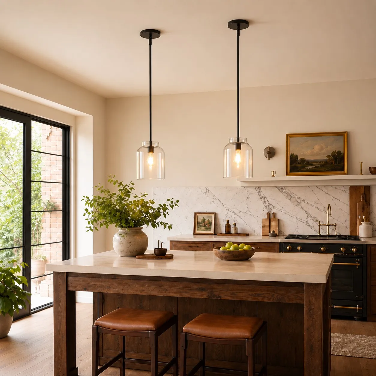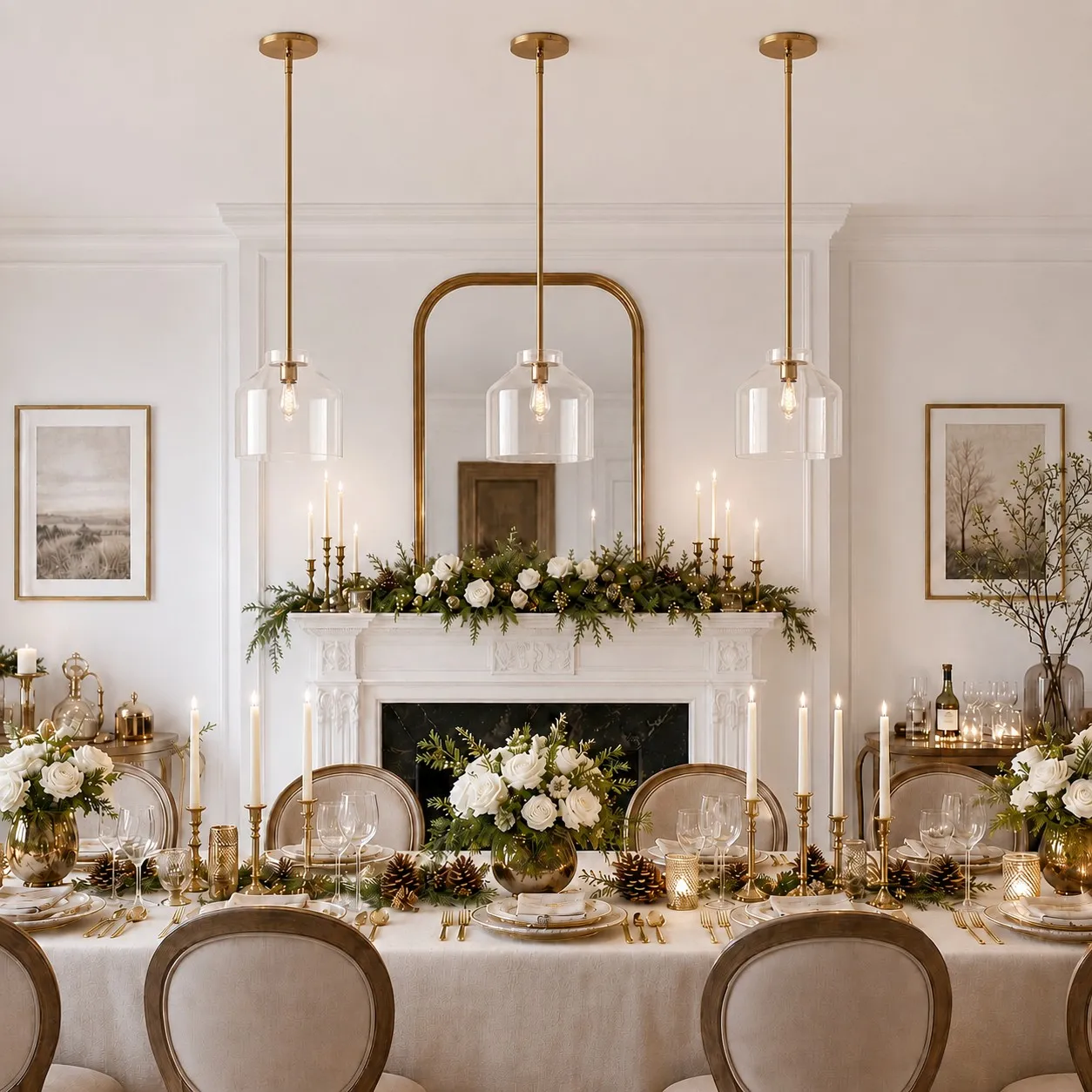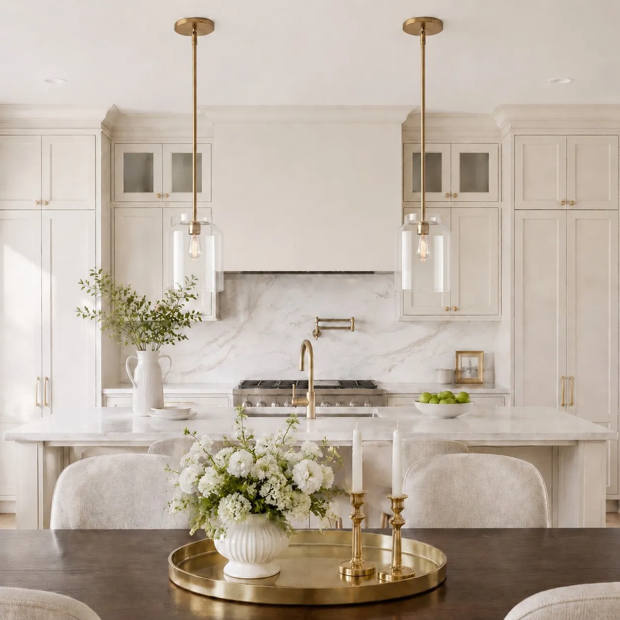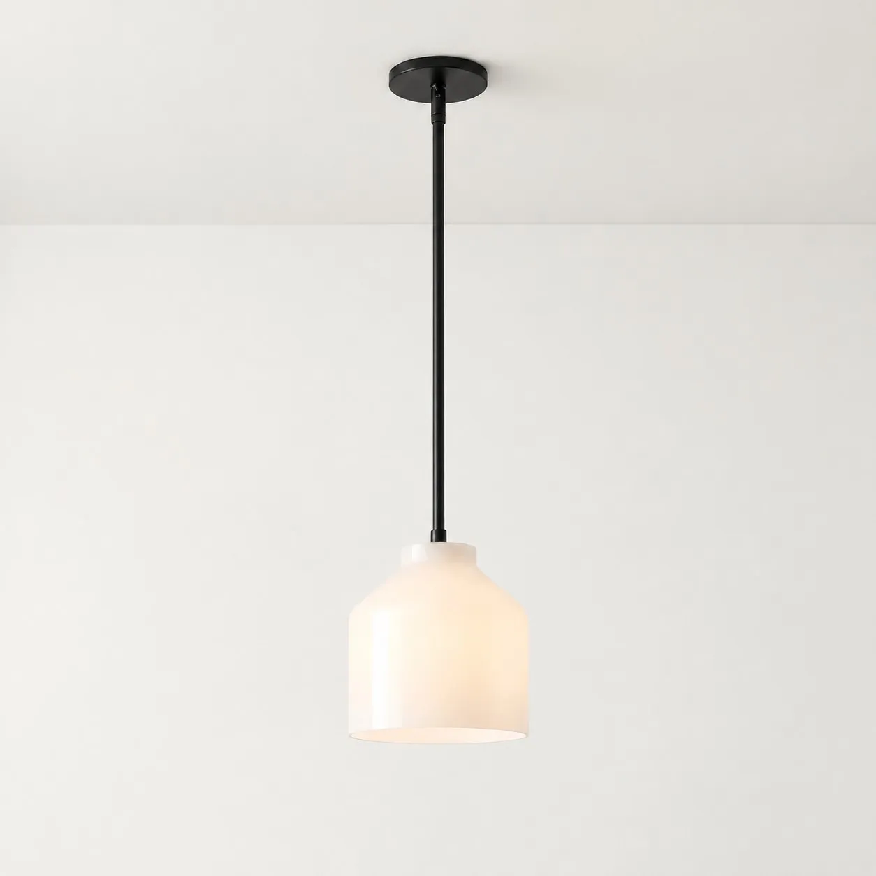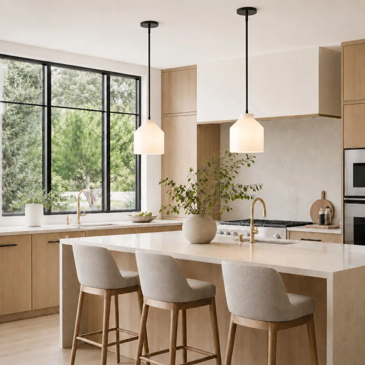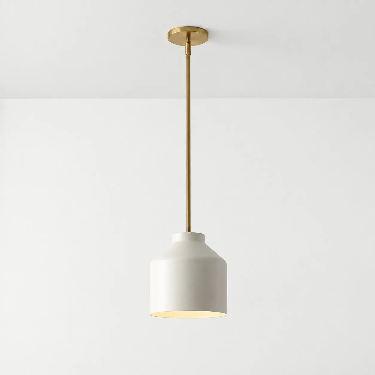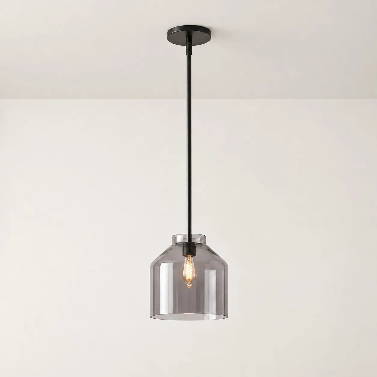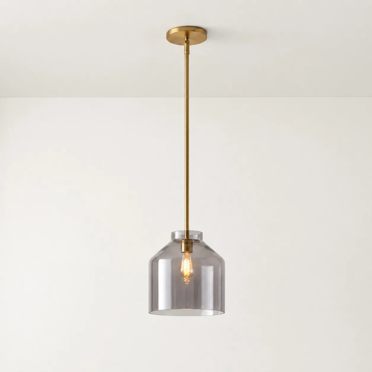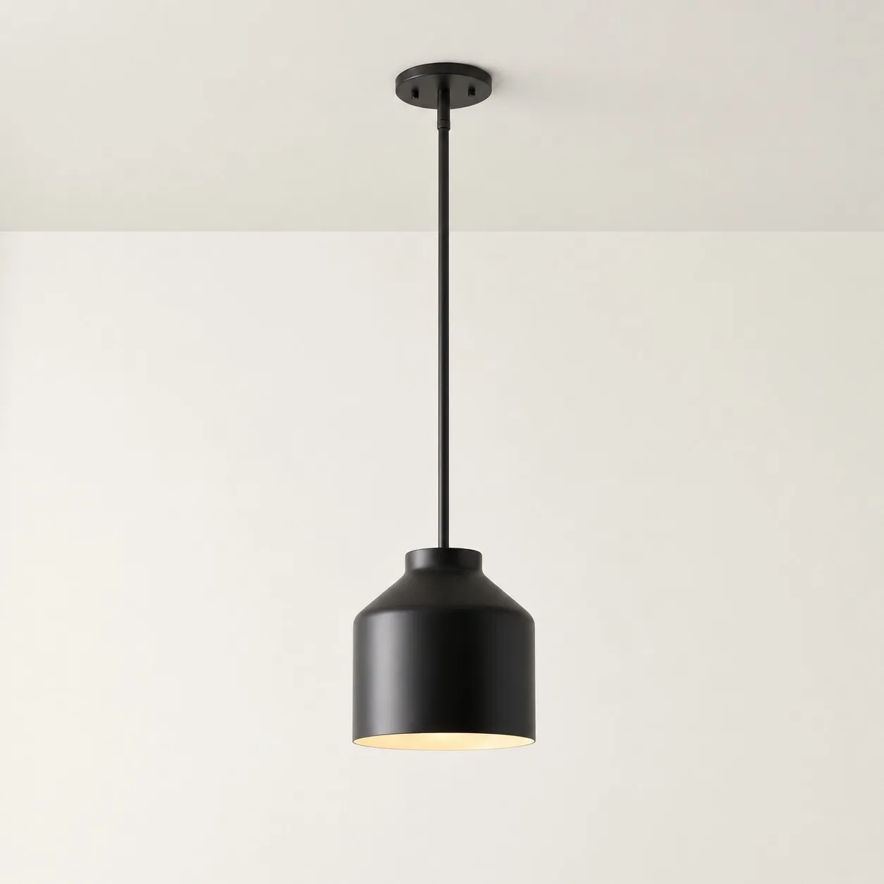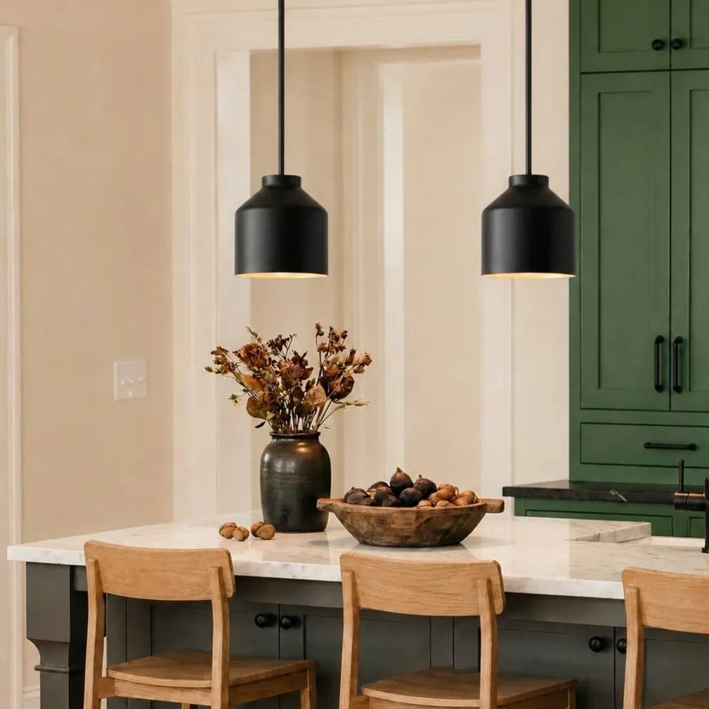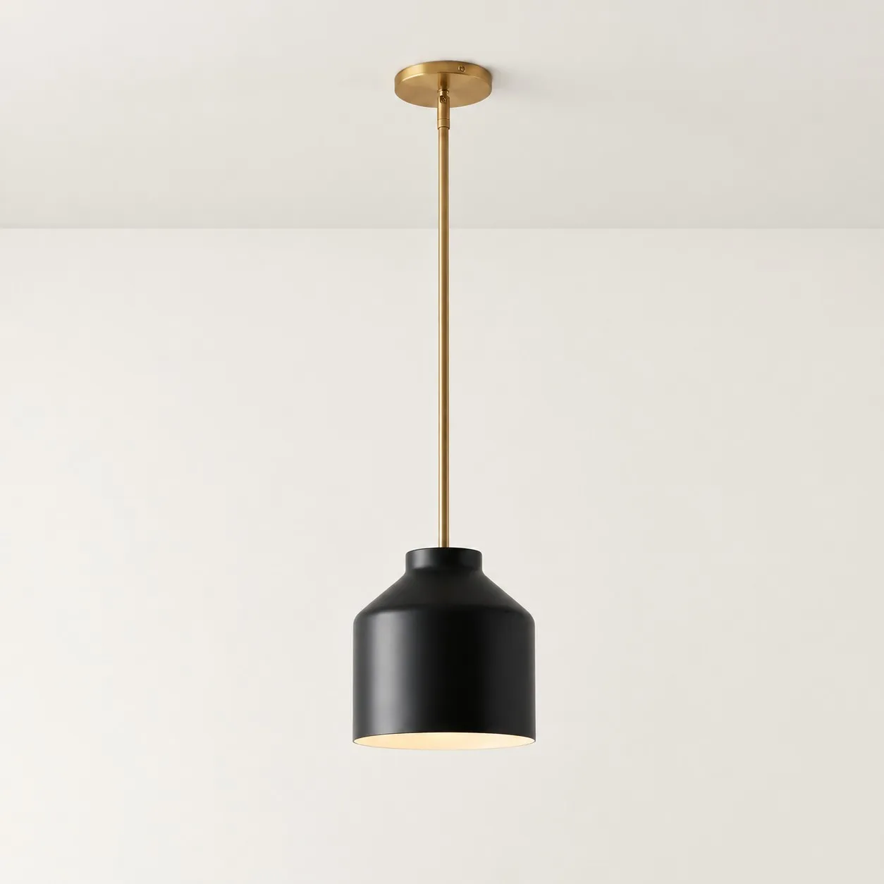
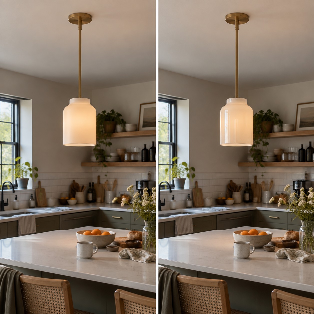
A glossy pendant can look beautifully sharp in a product photo, then reflect an entire row of windows above your island. A matte shade can look soft online, then lose definition in a dim kitchen. The finish did not necessarily change. The room did.
There is no universally better surface. Choose by asking what the shade will reflect, where you will see it from, and how willing you are to maintain its appearance.
What Actually Changes Between Matte and Glossy?
A matte surface scatters reflections, so its highlights tend to look softer and less distinct. A glossy surface produces clearer highlights and may show recognizable shapes from the room around it. The same pendant color can therefore feel quieter in matte and more active in gloss.
Keep color and shape constant when judging that difference. Comparing a matte black cone with a glossy white globe tells you little about finish: you may simply prefer one color or silhouette. If the seller does not offer comparable samples, look at finish swatches in your own room under both daylight and evening lighting.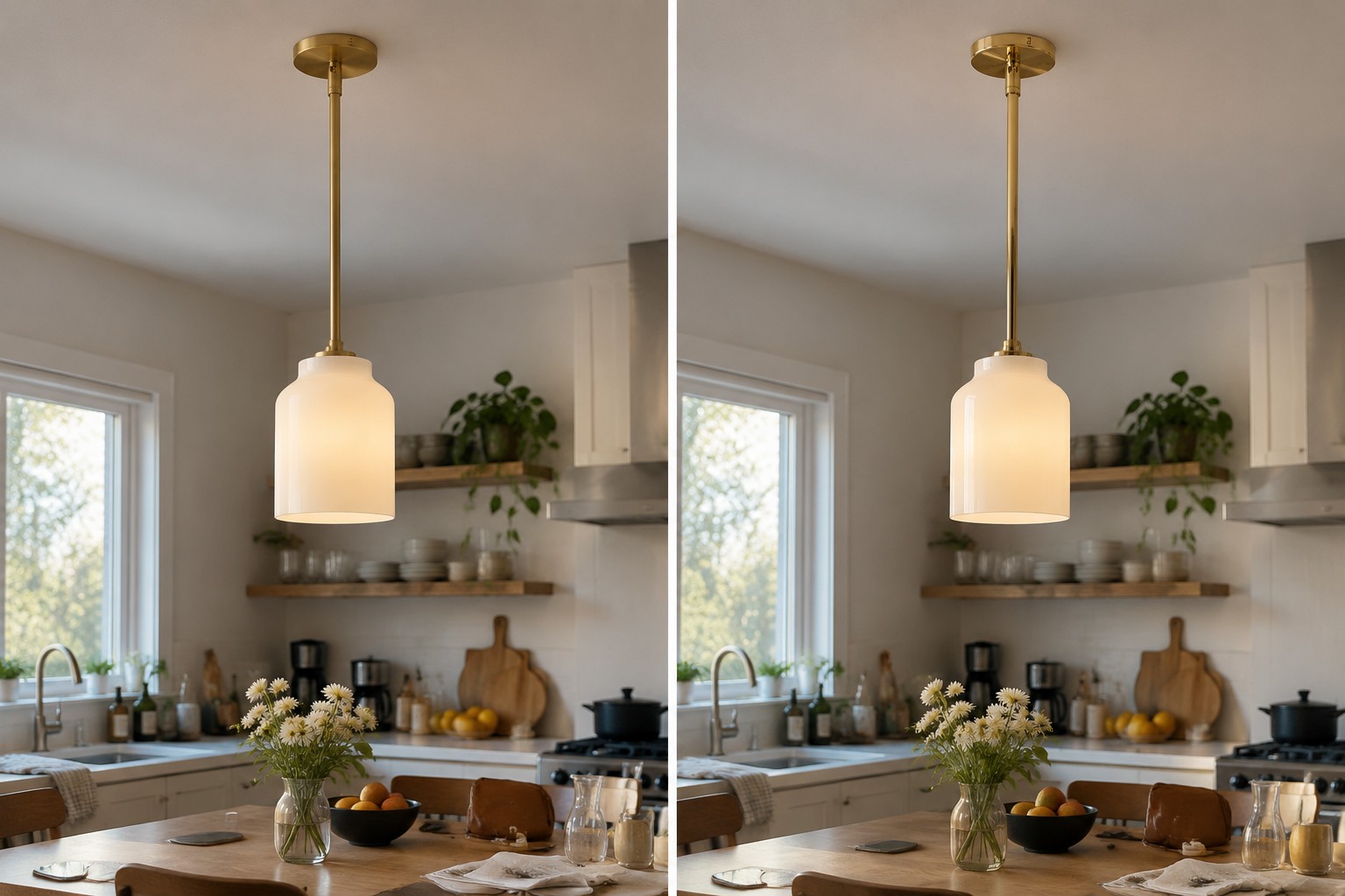
Look at Your Kitchen Before Looking at Another Product Photo
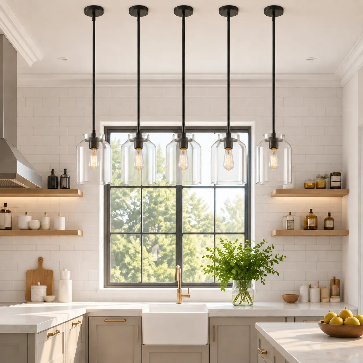
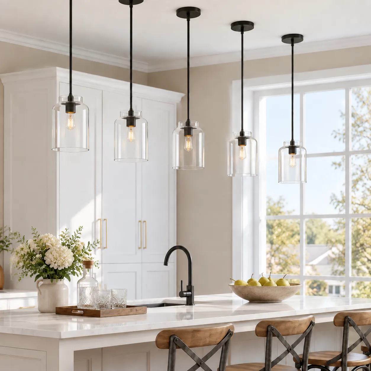
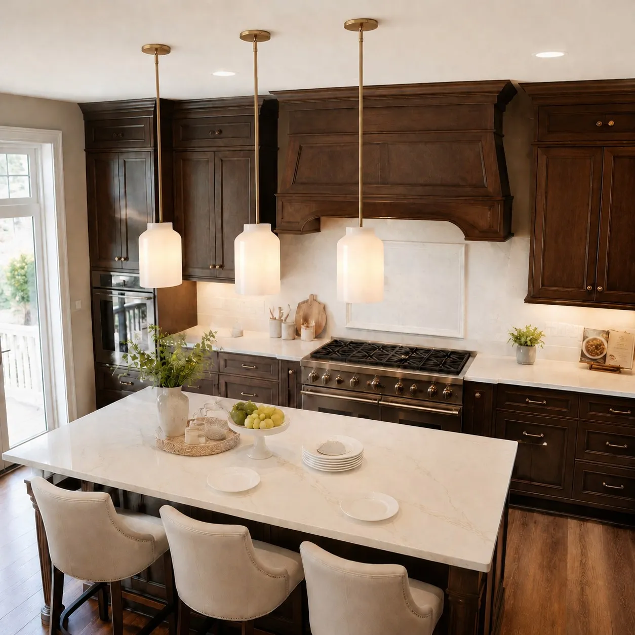
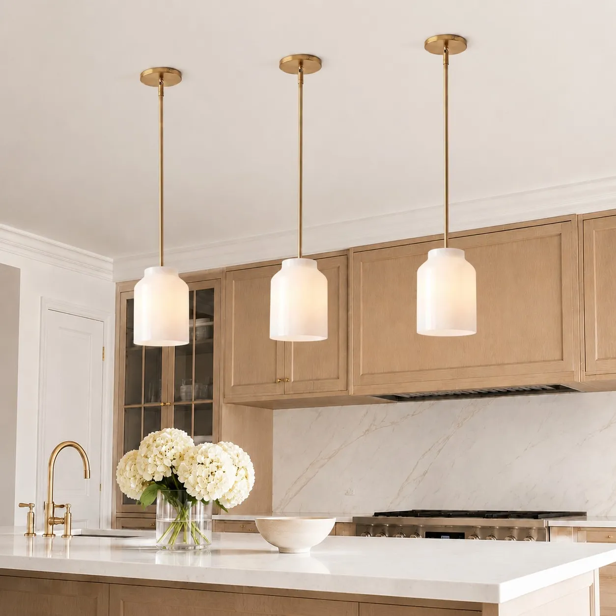
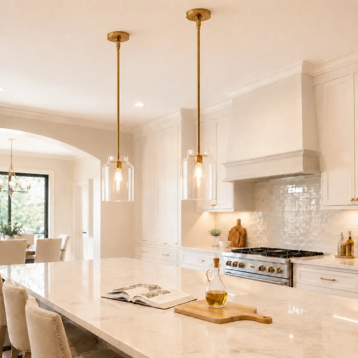
Count the reflective surfaces already in view of the island: polished counters, glossy cabinet doors, glazed tile, glass, stainless steel, and bright metal hardware. A glossy pendant adds another surface that responds to all of them. That can enliven a plain kitchen or make a visually busy one feel restless.
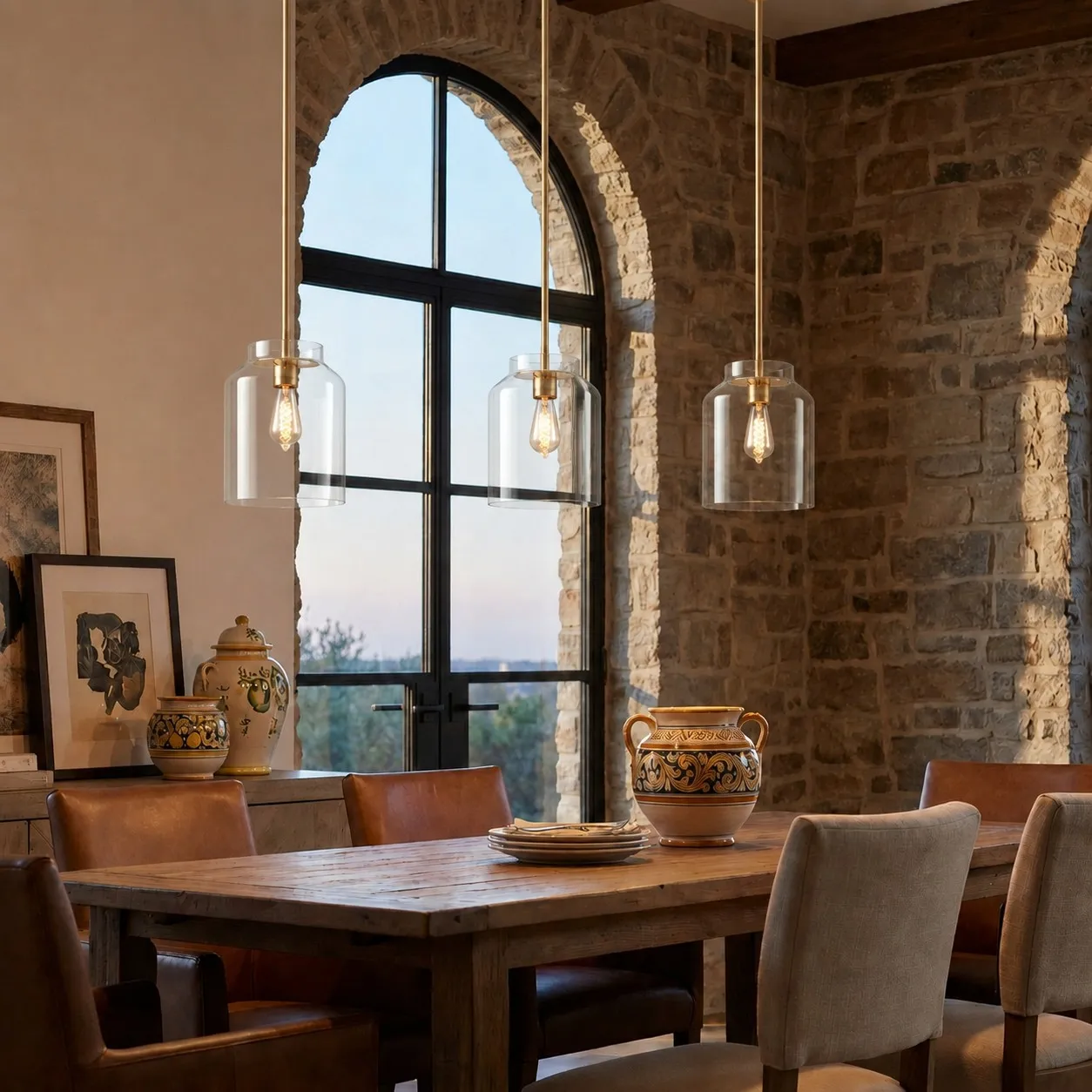
Matte is often a calmer choice when several surrounding surfaces already shine. In a room dominated by timber, fabric, and softly finished cabinetry, gloss may supply the contrast the space lacks. Neither conclusion follows from a style label such as “modern” or “farmhouse”; the actual surfaces matter more.
Check the Pendant Twice: Day and Night
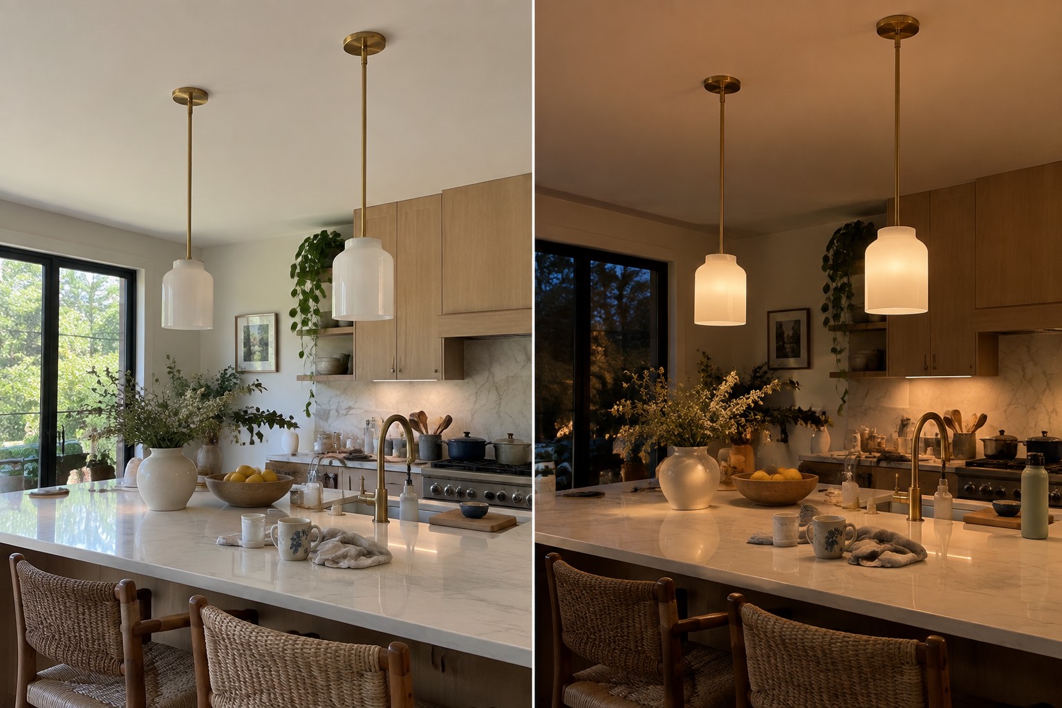
In daylight, note where the windows sit in relation to the planned pendant. Would a strong reflection fall in the middle of the shade from your usual seat? At night, turn on the lights you normally use and look for small, bright reflections on the proposed finish.
This matters especially when the ceiling is low or the pendant hangs near seated eye level. A highlight that seems subtle in a close-up product image can be much more noticeable when the fixture fills part of your everyday view. Hanging height and shade curvature can change the result, so treat this as a room check rather than a blanket rule against gloss.
Does Gloss Make the Kitchen Brighter?
A glossy shade may look brighter because it carries distinct highlights. That does not tell you how much useful light reaches the island. Task lighting depends on the bulb, shade opening, mounting height, and other lights in the kitchen. Choose the surface for its appearance; assess illumination separately.
The same distinction applies to colored metal. Gloss can pick up pale windows, dark cabinets, and nearby objects in its reflections. Matte reduces crisp reflections, but its color still changes in different ambient light. Neither finish guarantees that a shade will match a photographed color in every home.
Match the Relationship, Not Every Piece of Hardware
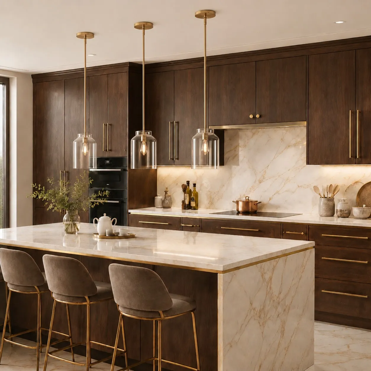
Your pendant does not have to duplicate the faucet or cabinet pulls. A more useful question is whether the finishes belong to the same visual plan: perhaps a quiet pendant balances polished hardware, or a small amount of shine repeats elsewhere in the room.
The Metio Dome wall sconce makes this easier to picture. Its currently listed options include black or white shades and several arm finishes. It is a wall light, not a pendant, but it shows how a metal finish can relate to another fixture without requiring every shade, arm, and handle in a home to look identical.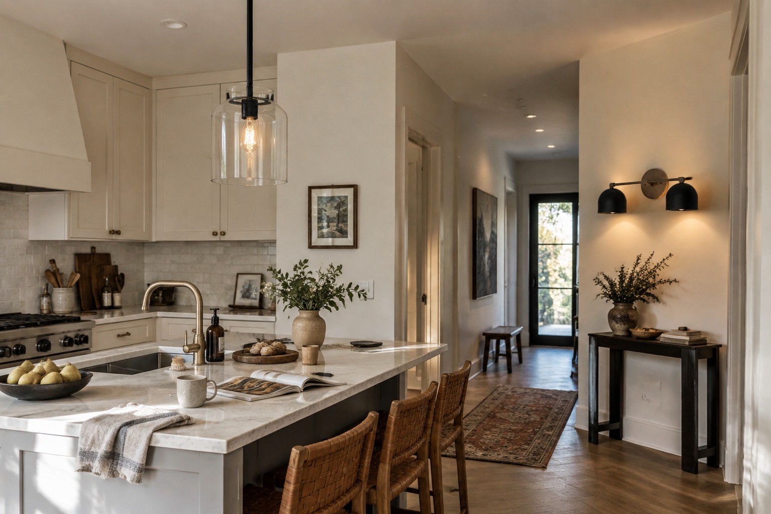
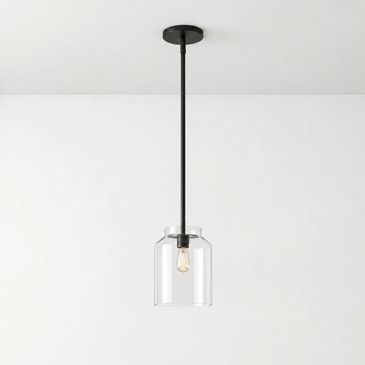
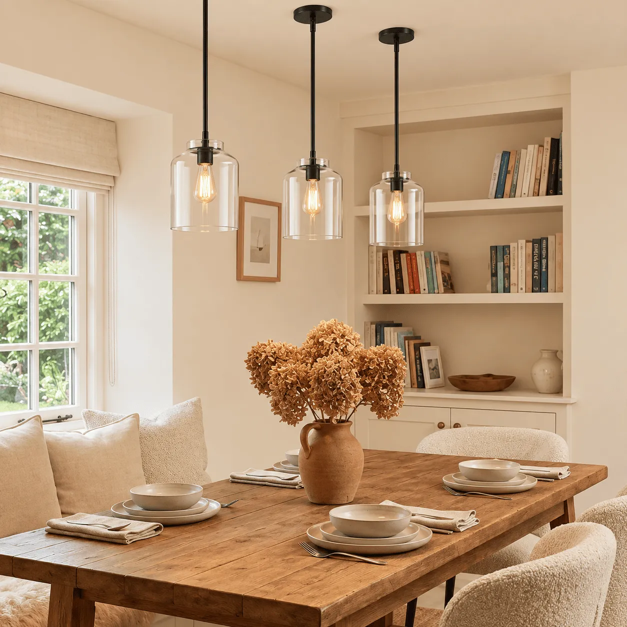
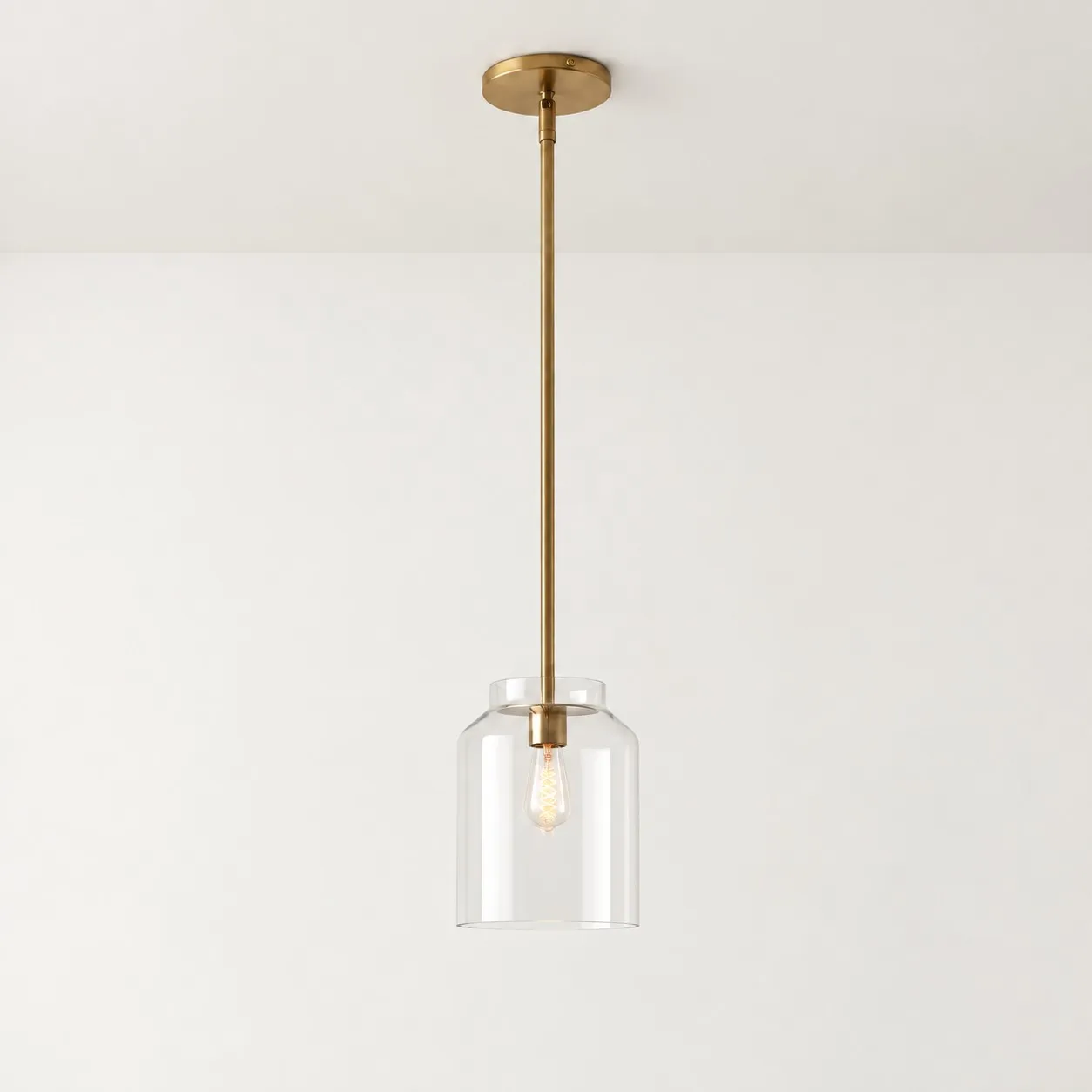
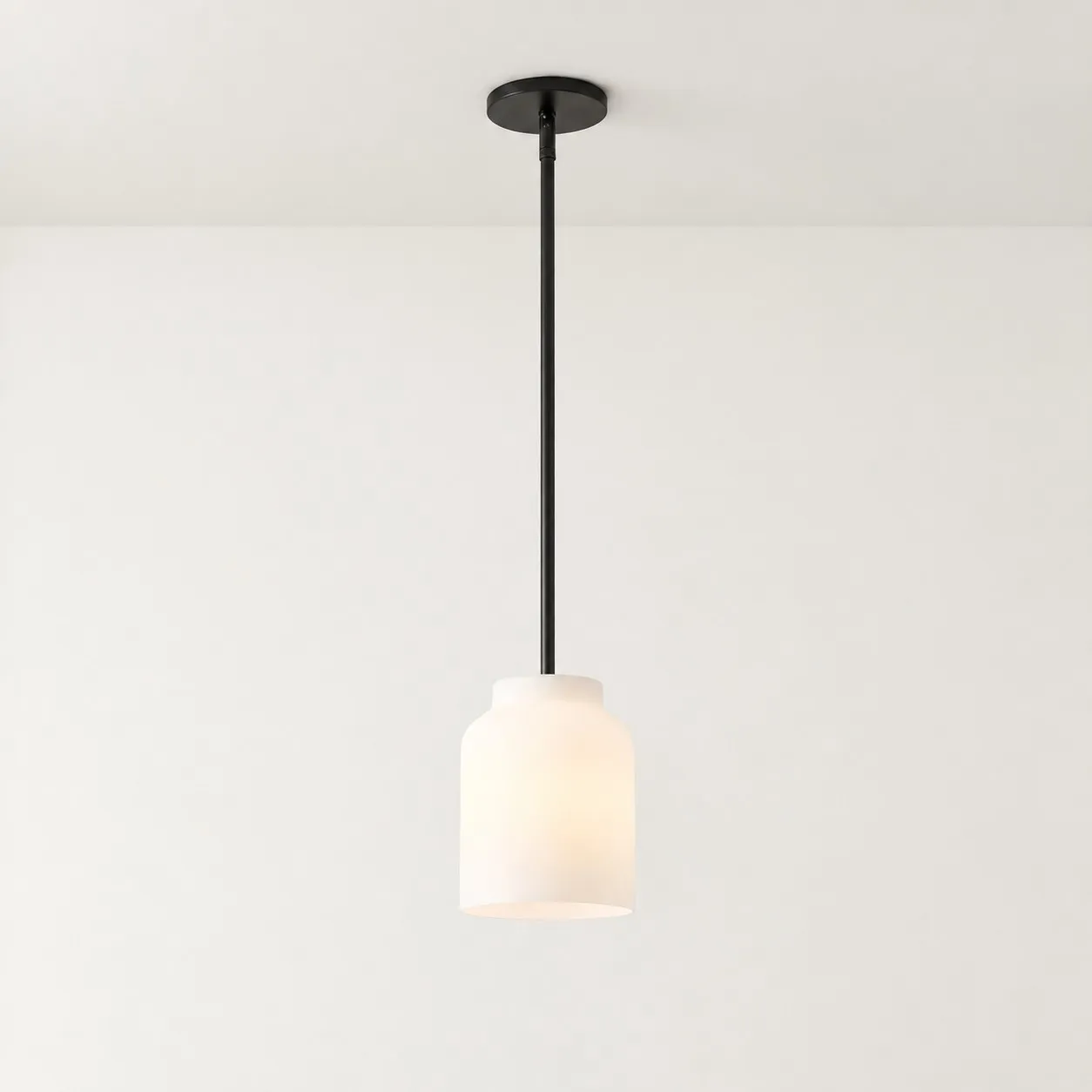
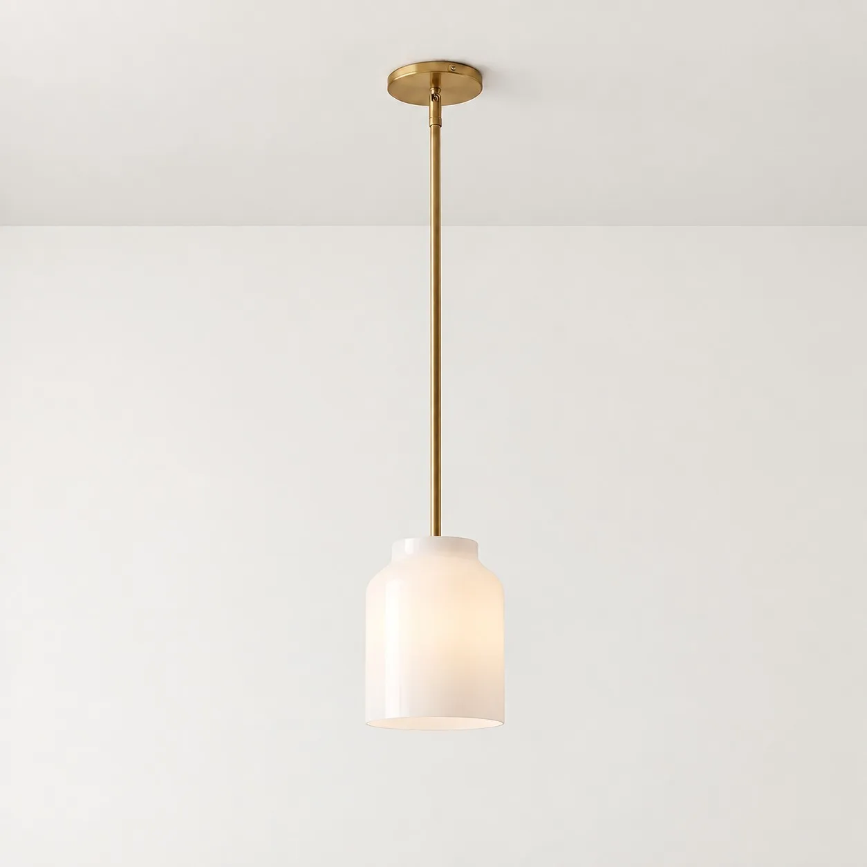
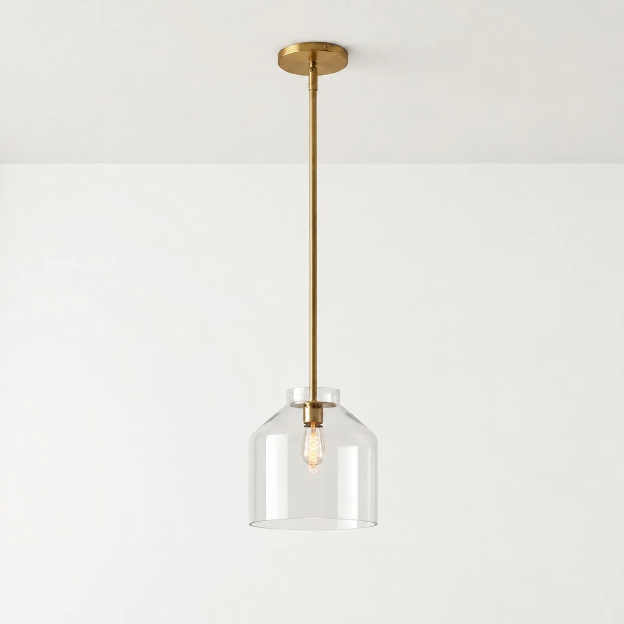
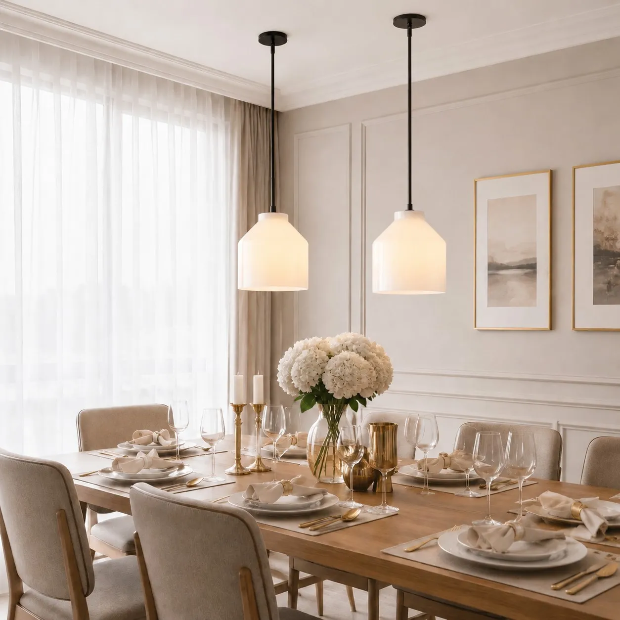
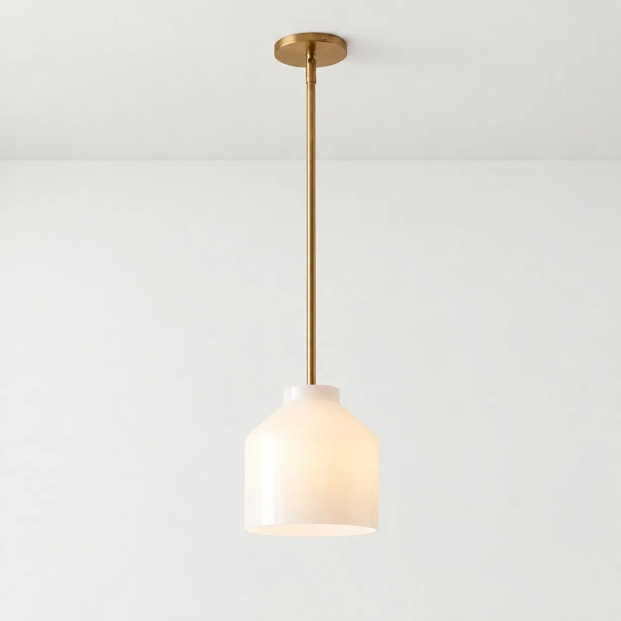
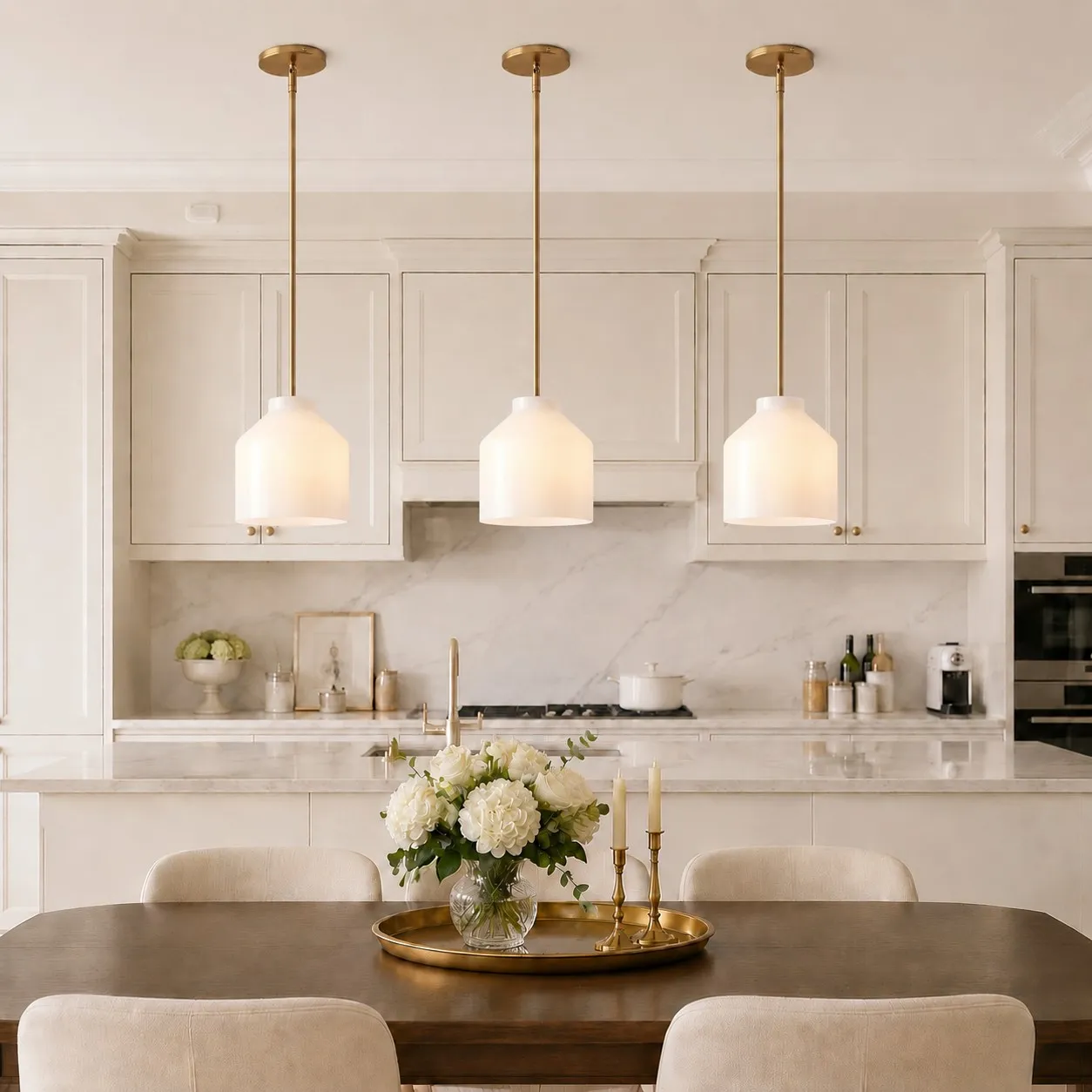
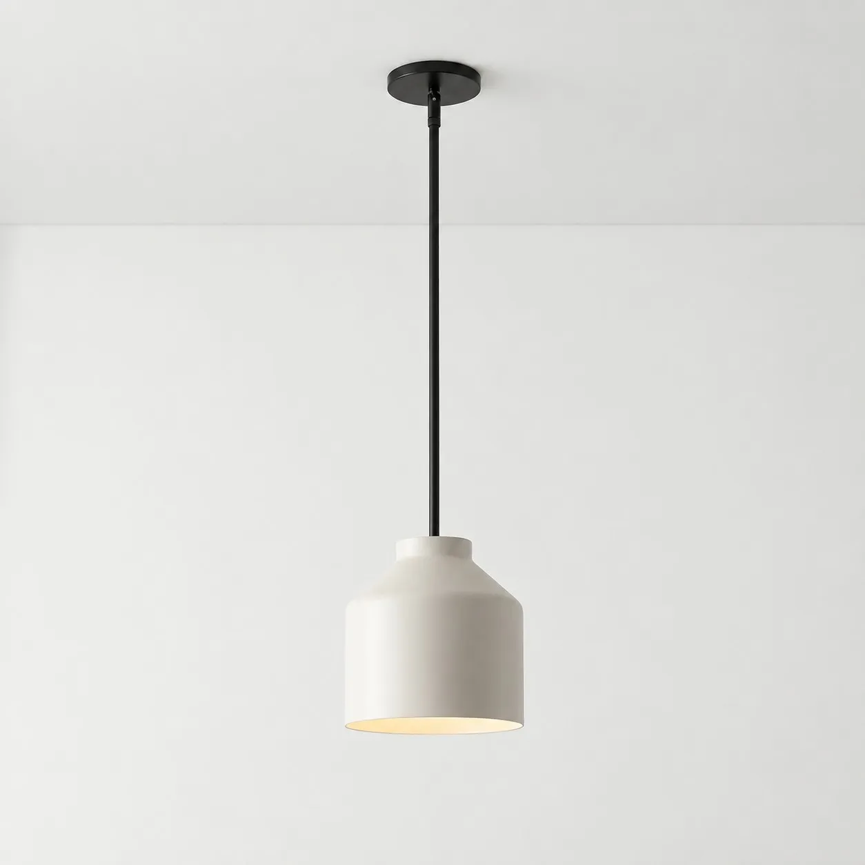
If you are considering the Hanton pendant light above an island, assess its actual listed finish against your cabinets and hardware. Do not assume every Hanton color is offered in both matte and glossy versions; verify the finish of the specific variant you intend to buy.
Think About the Marks You Will Notice
Dark gloss can make fingerprints and wiping marks conspicuous. Dark matte finishes can show pale dust. Coating, color, kitchen grease, and cleaning technique all matter, so neither surface deserves a universal “easier to maintain” label.
Check the fixture’s care instructions before using cleaners or abrasive cloths. If the pendant will sit near frequent cooking, also consider whether its shape is easy to reach and wipe. A complicated shade can create more maintenance than the difference between matte and gloss.
For a final decision, describe the room honestly. If it already has plenty of reflections and you want the pendant’s outline to stay comparatively steady, lean matte. If the room is visually quiet and you welcome changing highlights, gloss may look better. Make that choice from the window, island, and seat you actually have.