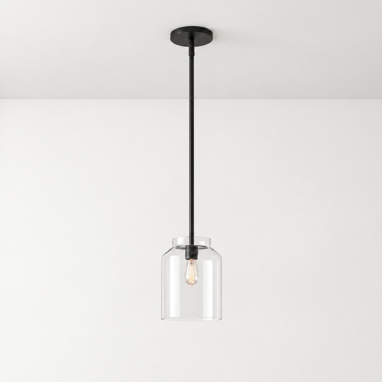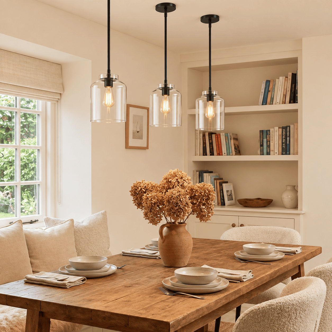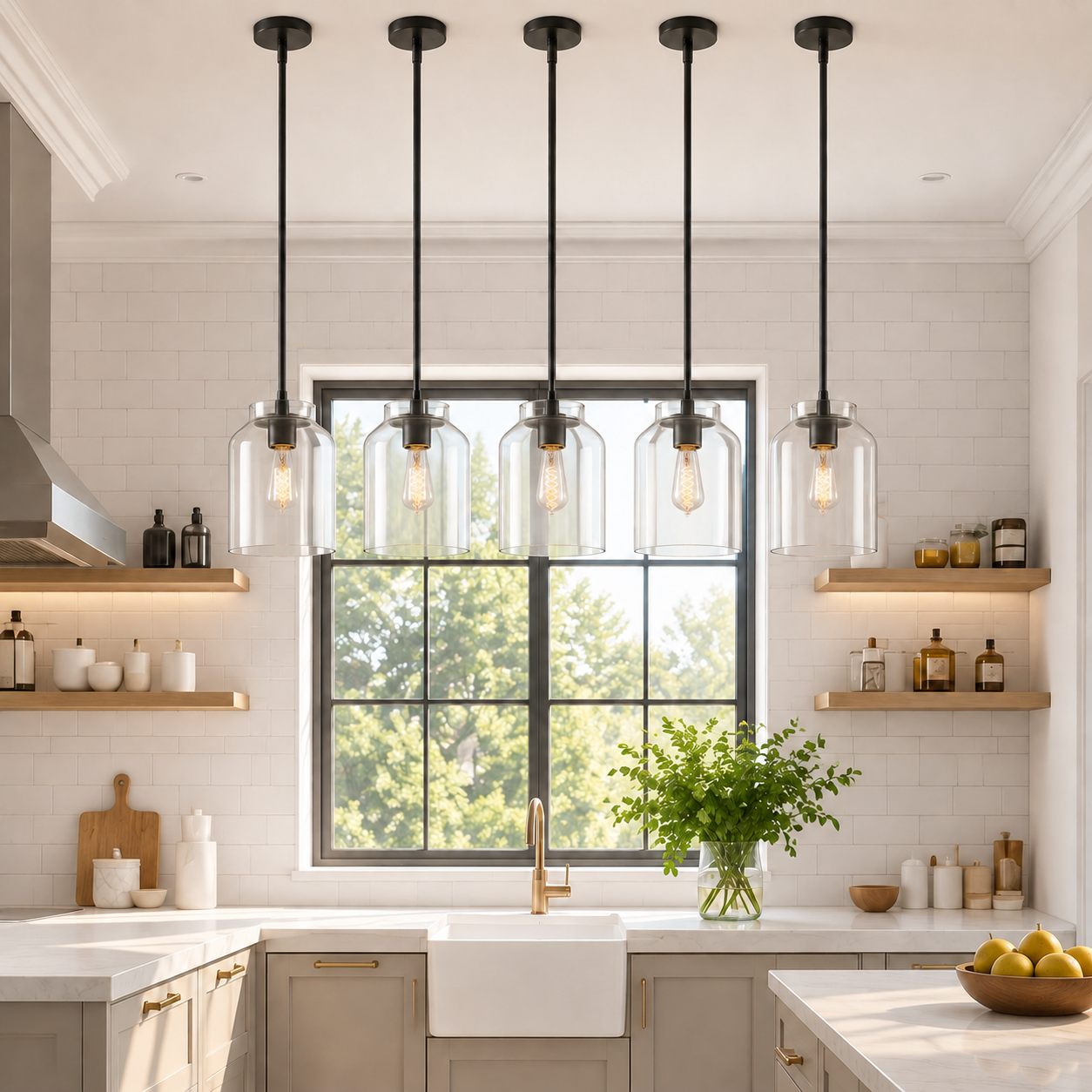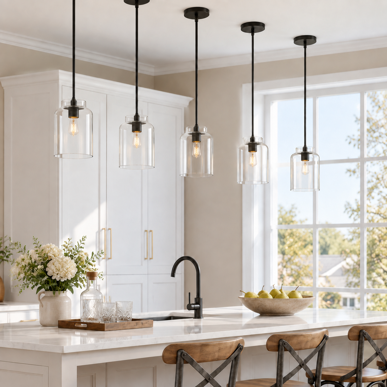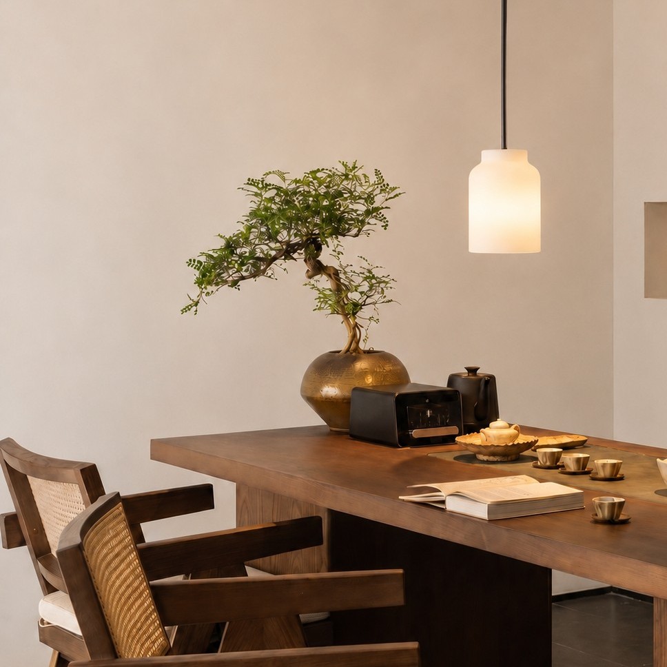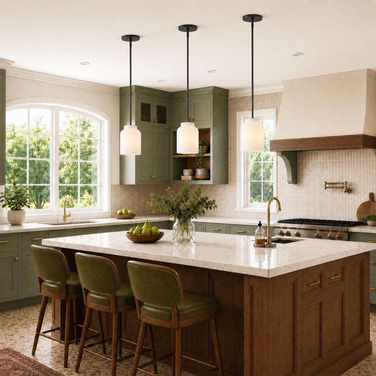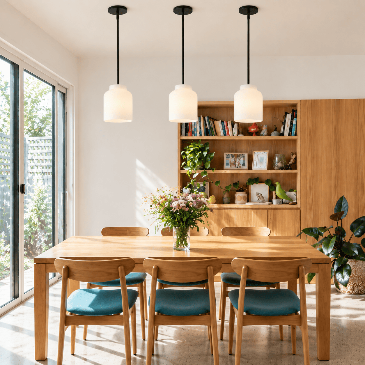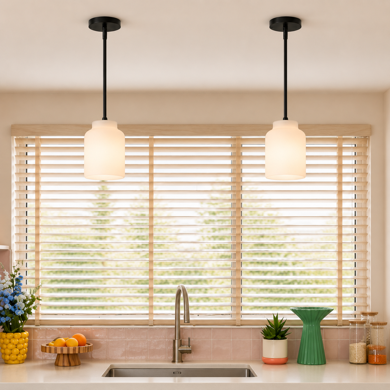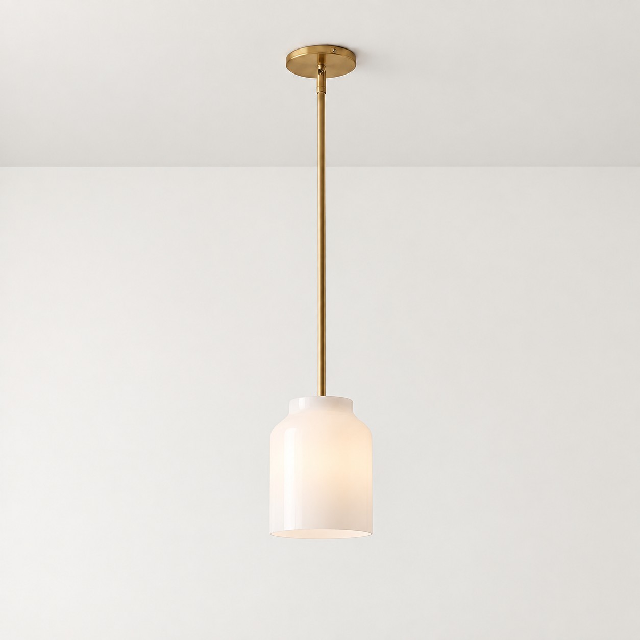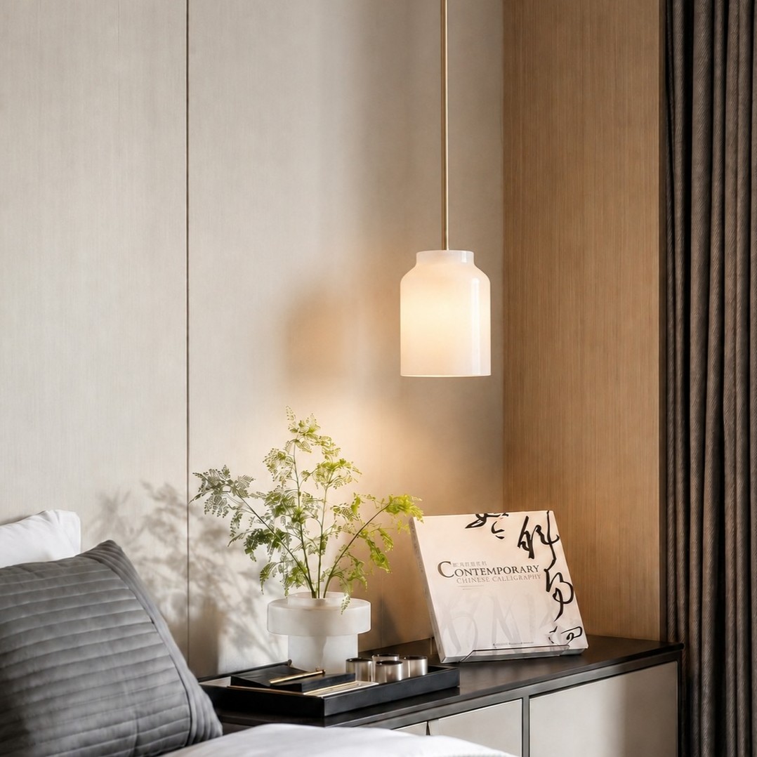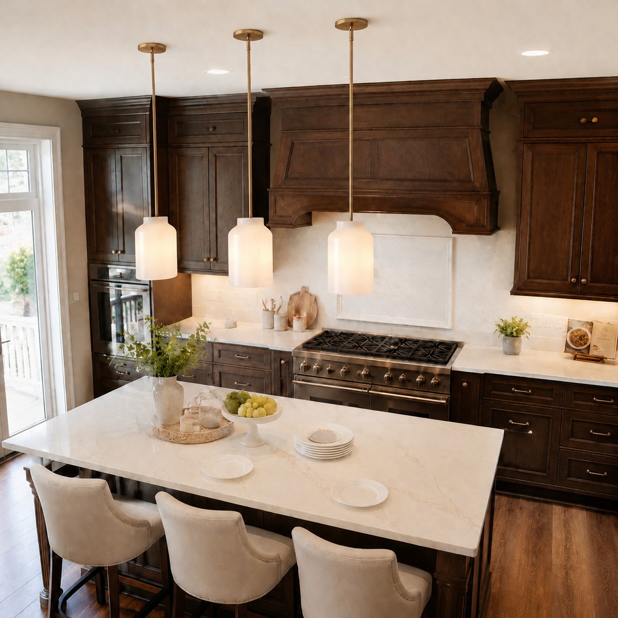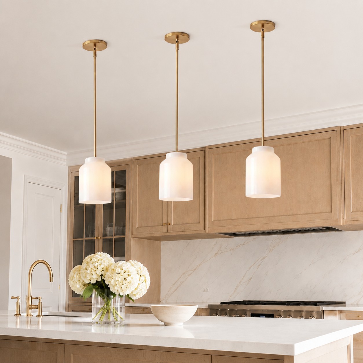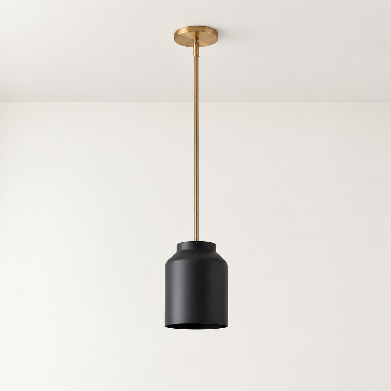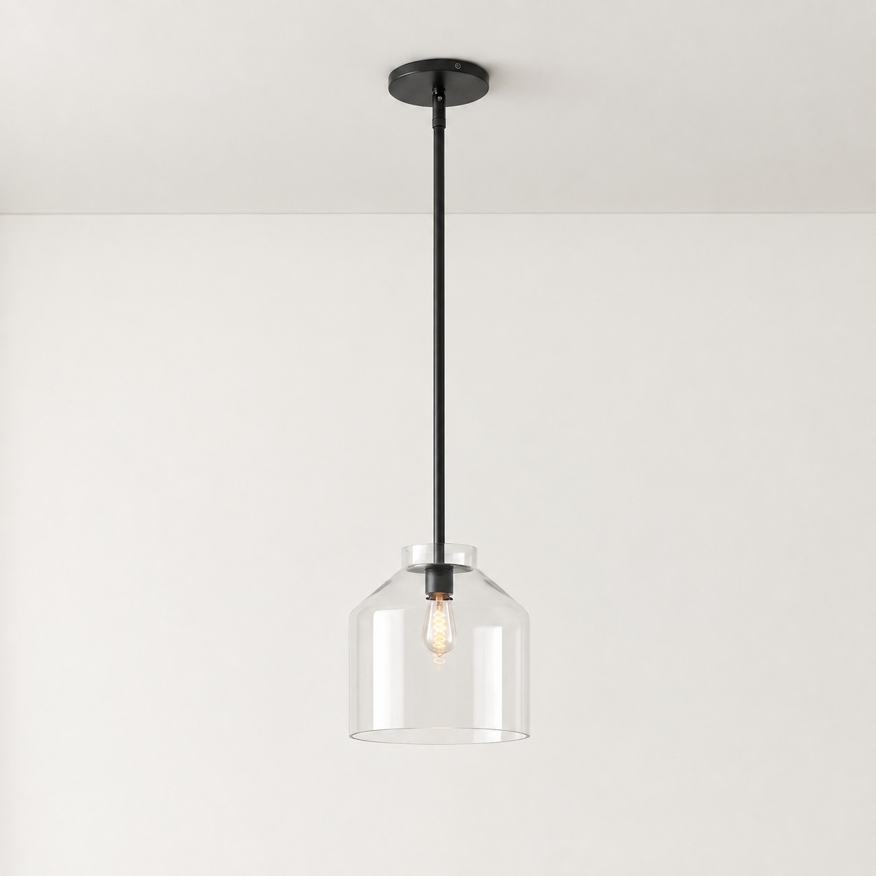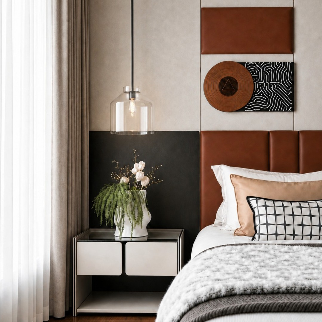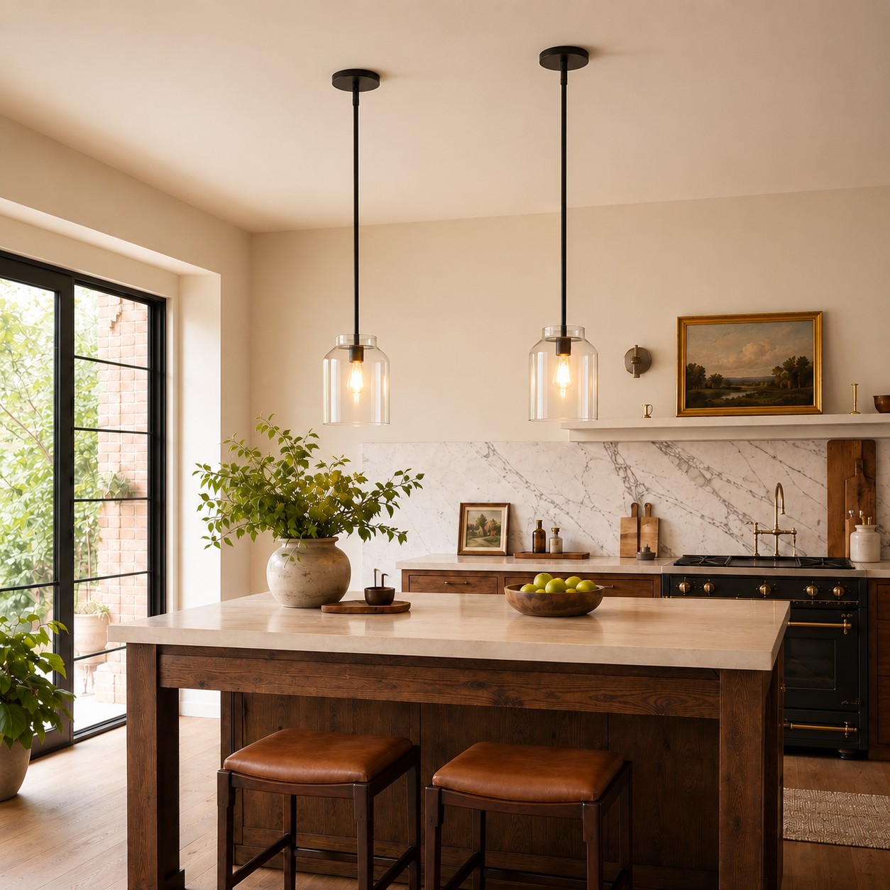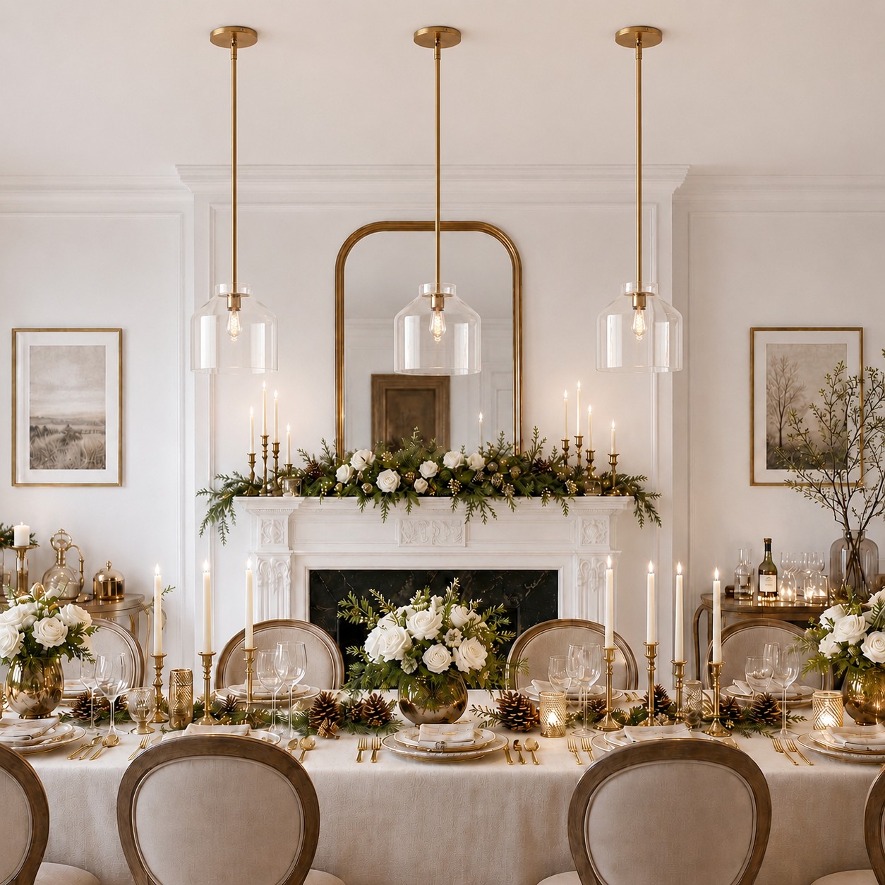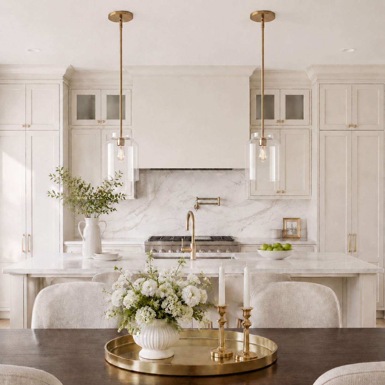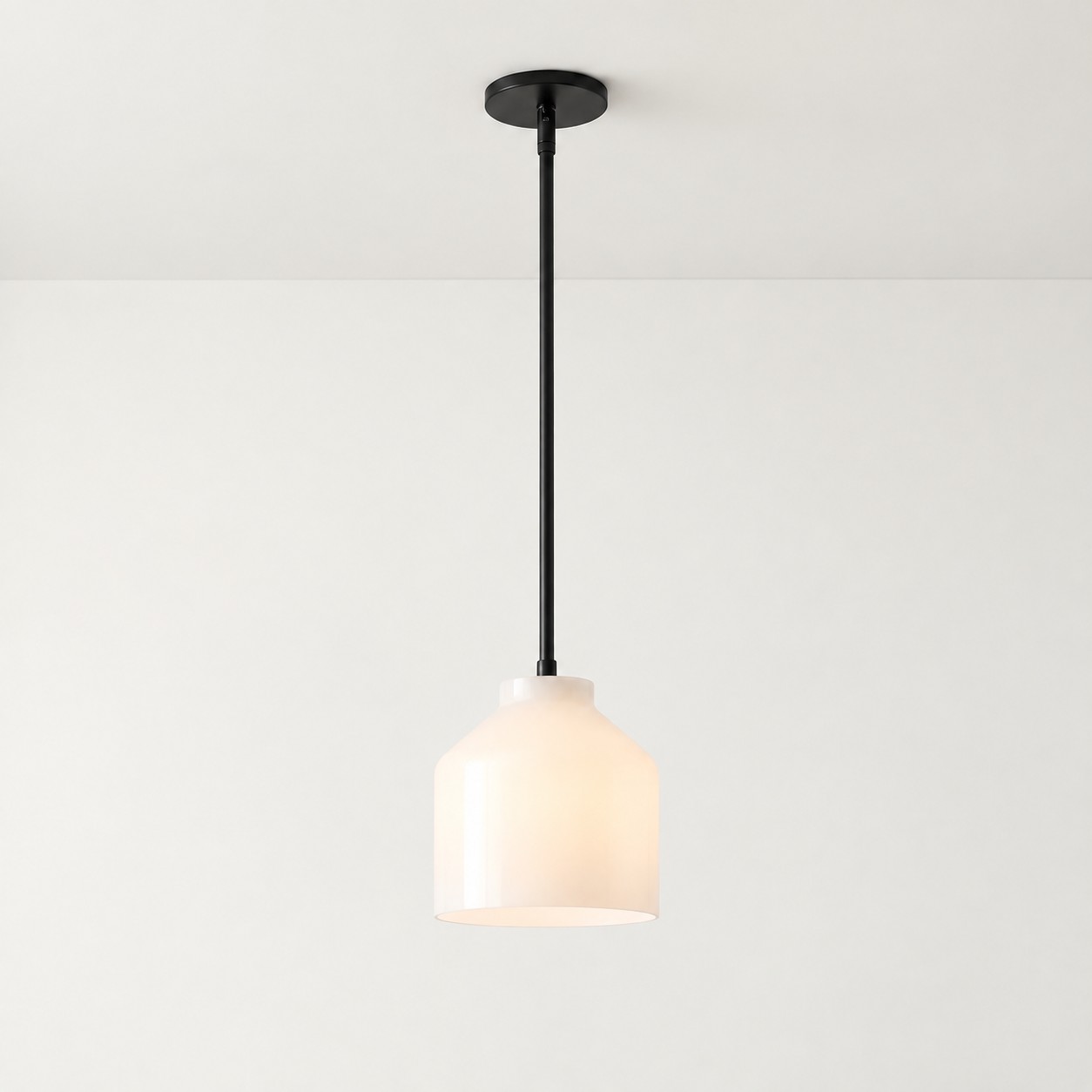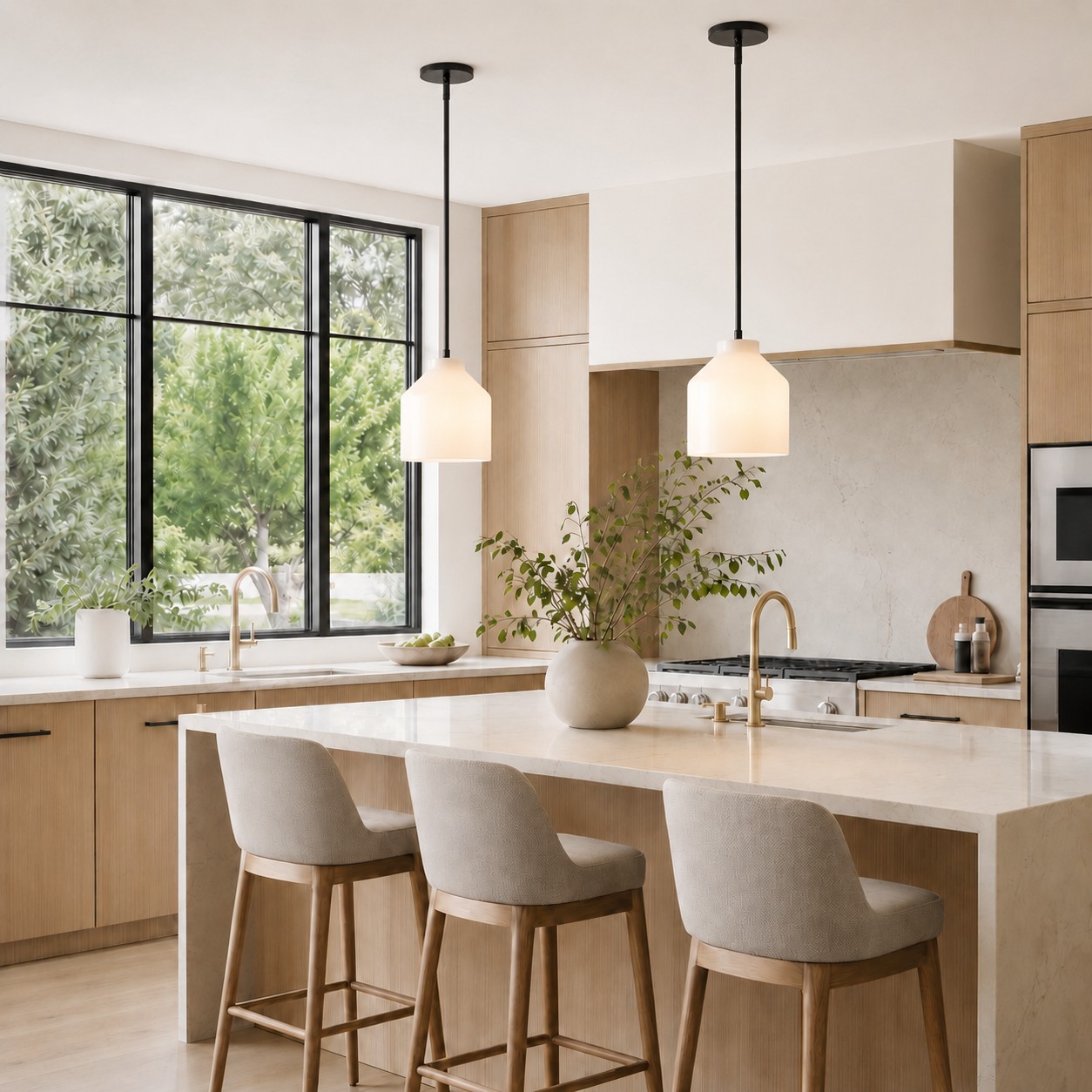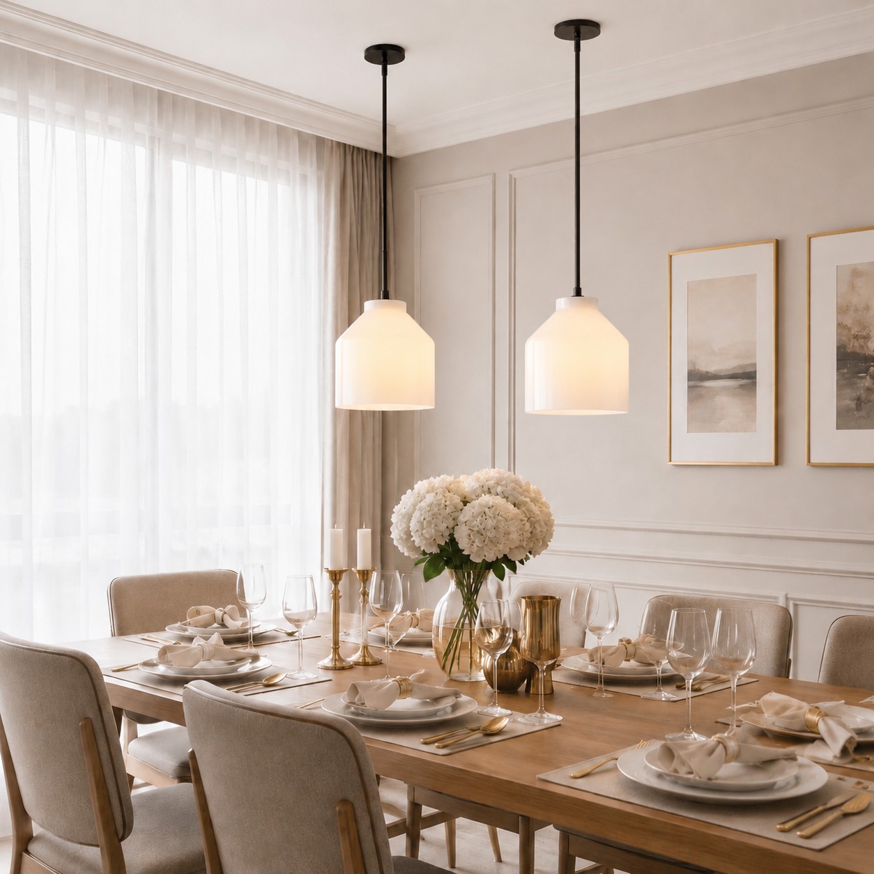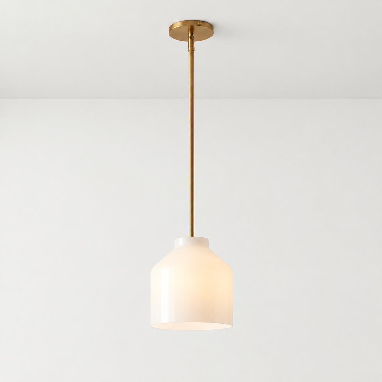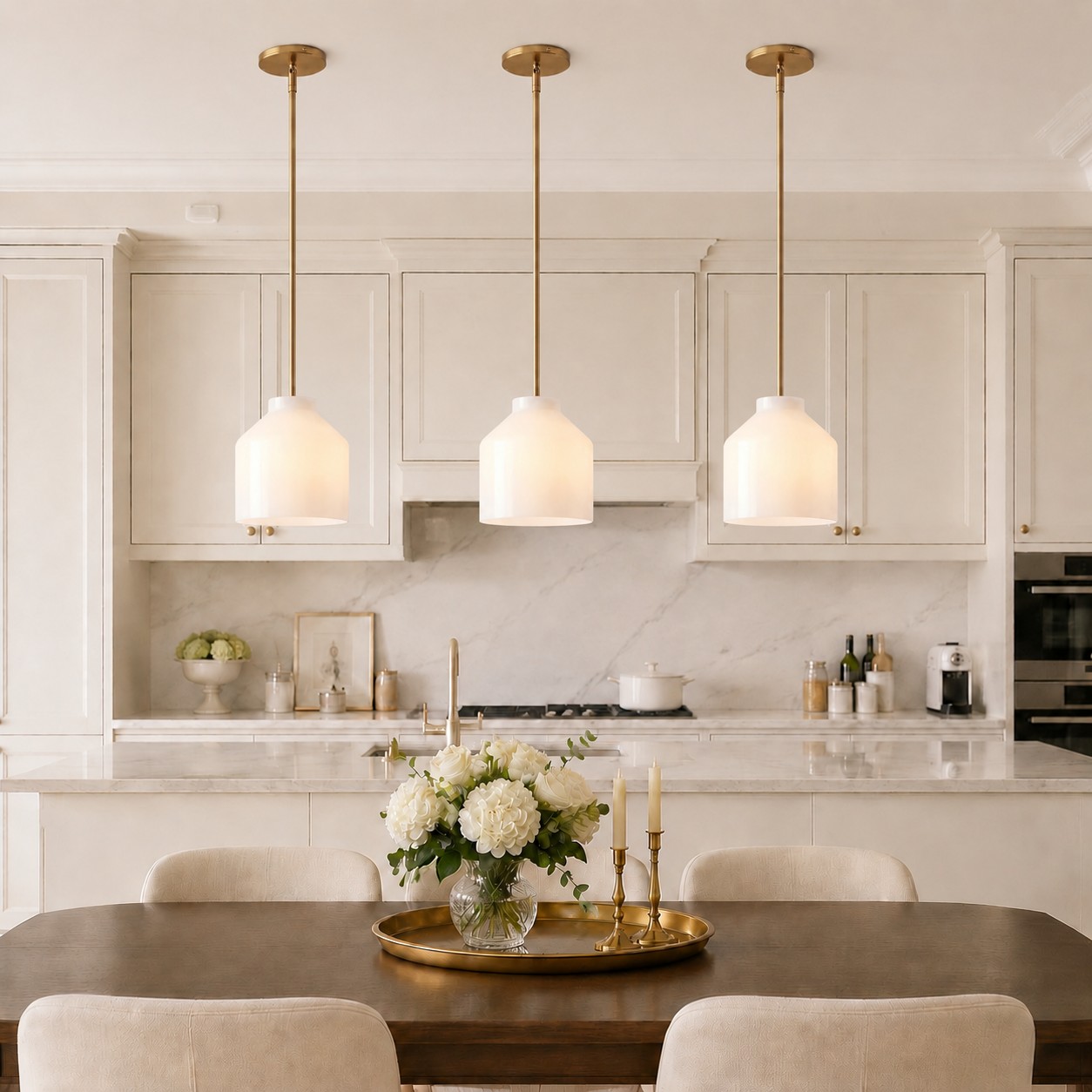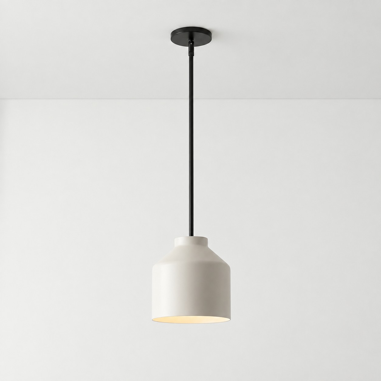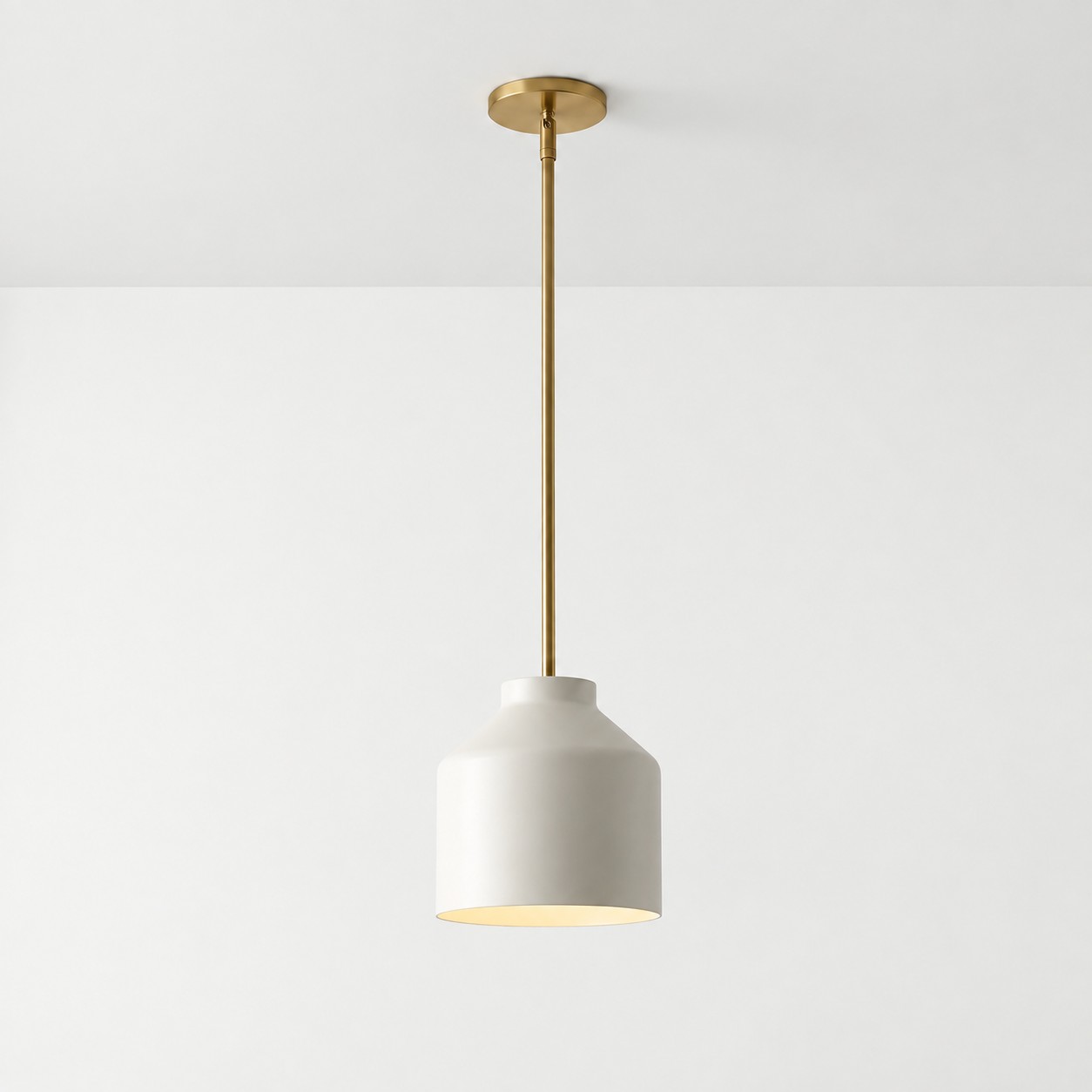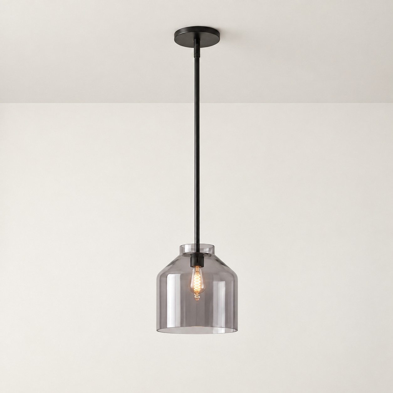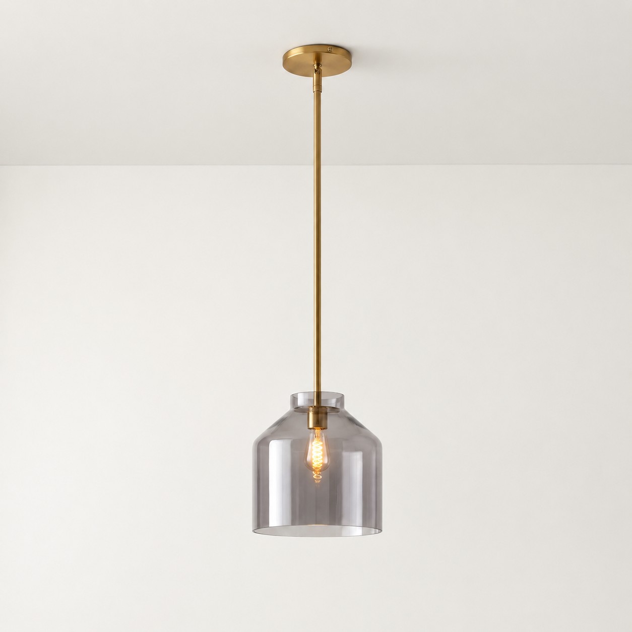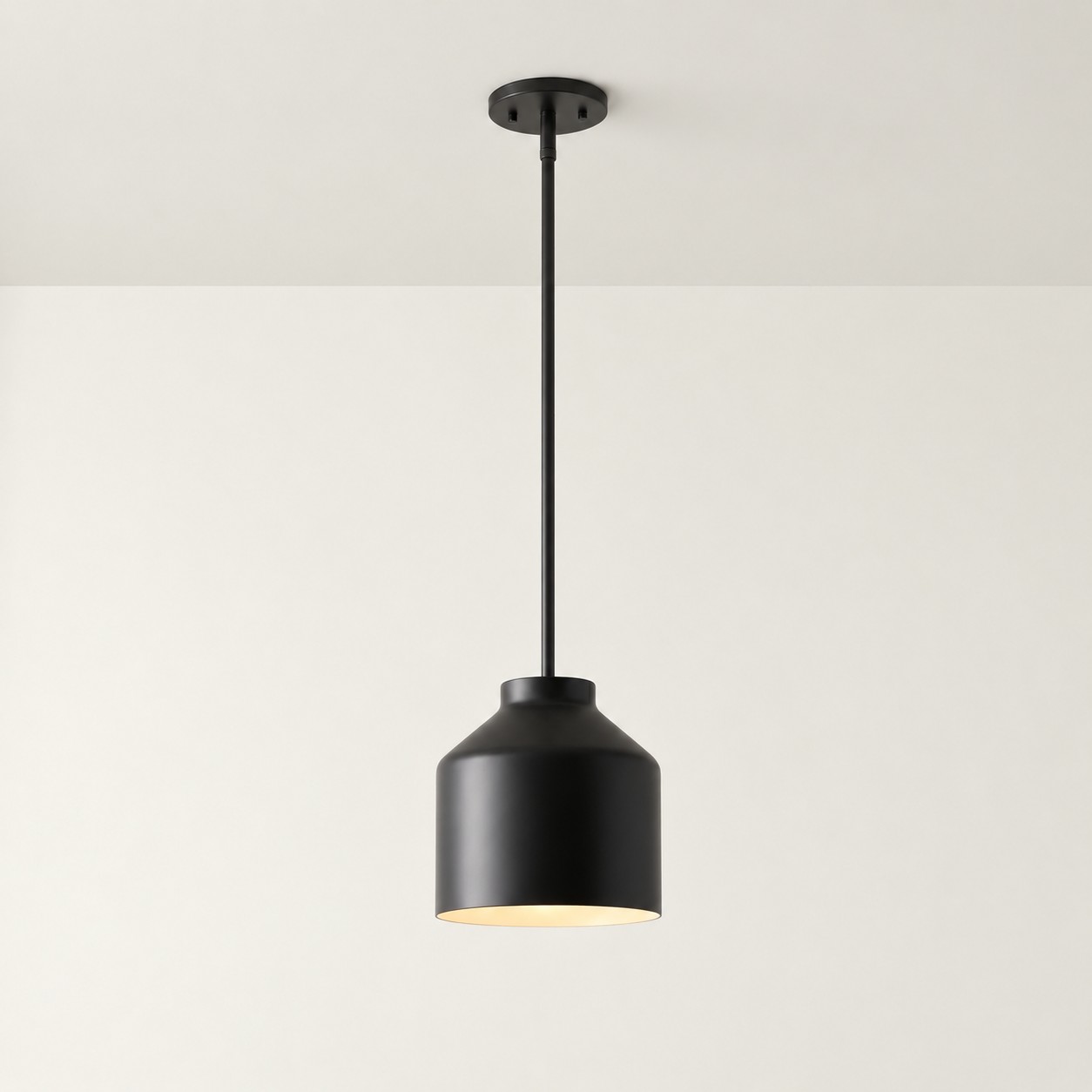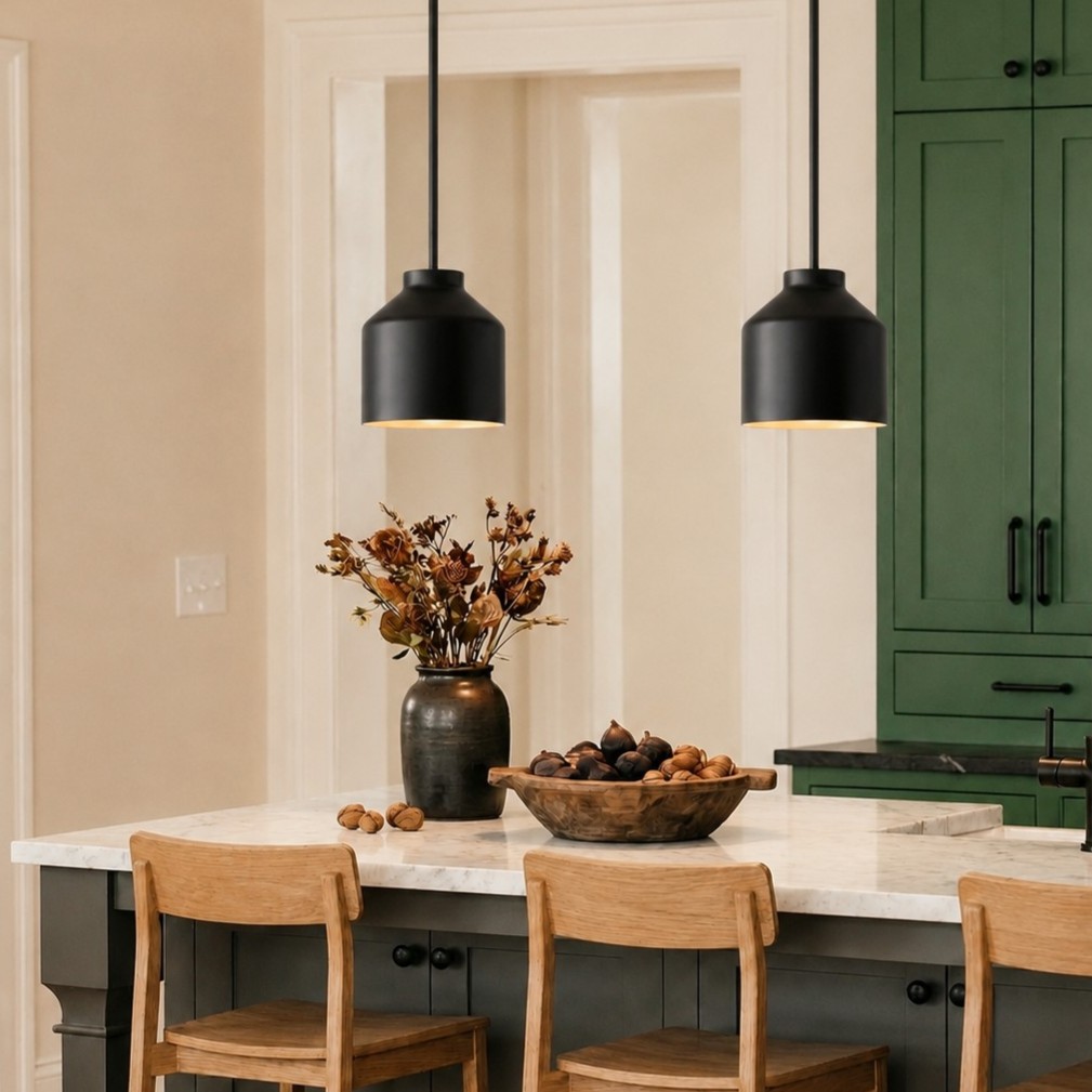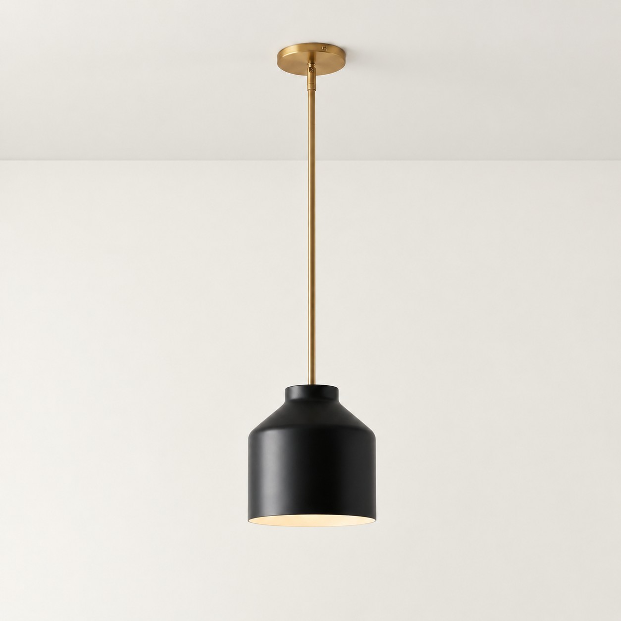
A colored pendant light is often the one that catches your attention first. A neutral fixture, however, can feel like the more sensible choice.
You may love a green, blue, or softly colored pendant but worry that it will look old-fashioned in a few years. Black, white, gray, and other neutral finishes appear safer because they seem less connected to a particular trend.
Color, however, is not the only factor that determines how well a pendant light ages. In many cases, it is not even the most important one.
Colored pendant lights do not automatically date faster than neutral ones. The greater risk comes when a trend-specific color, silhouette, finish, and room style are all combined in the same fixture. A colored pendant with a simple shape and restrained finish can remain relevant longer than a neutral pendant with a highly recognizable period look.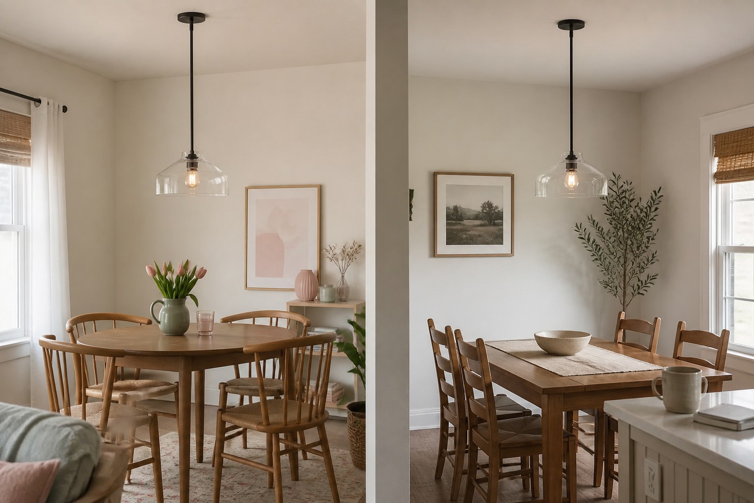
What Does It Mean for a Pendant Light to Look Dated?
Before deciding whether colored lighting ages quickly, it helps to separate three different problems that are often described with the same word.
Genuine design aging
The first is genuine design aging. The color, shape, and finish are so closely associated with a short-lived trend that the fixture immediately suggests a particular period, even after it is moved into an updated room.
A loss of compatibility
The second is a loss of compatibility. The pendant may still be attractive, but new cabinets, wall colors, flooring, or furniture no longer work with it. The fixture has not necessarily become old-fashioned; its relationship with the room has changed.
Personal color fatigue
The third is color fatigue. After looking at the same shade for several years, you may simply want something different. That is a change in personal preference, not proof that colored pendants are out of style.
These distinctions matter because they lead to different decisions. A fixture with a heavily dated design may need replacing. A compatibility problem may be solved through styling changes. Temporary color fatigue may not justify removing a pendant that still works well.
Neutral Does Not Automatically Mean Timeless
Black, white, gray, and beige fixtures are generally easier to coordinate, but easy to coordinate is not the same as timeless.
A neutral pendant can still look dated because of an exaggerated scale, a highly recognizable silhouette, or a finish associated with a specific decorating period. If the fixture is too large for the table or visually overwhelms a low-ceilinged room, choosing it in white instead of green will not solve the underlying problem.
The real advantage of a neutral finish is adaptability. If you replace your dining chairs, repaint the walls, or introduce new accessories, a neutral fixture is less likely to conflict with the updated palette.
Long-term versatility comes from several factors working together:
- A relatively simple silhouette
- Proportions appropriate for the room and table
- Materials that work with more than one decorating style
- A finish that does not depend on an artificial trend effect
- Lighting performance that continues to suit the space
Color is one variable within that system, not a guarantee of design longevity.
Three Color Characteristics Affect How Quickly a Pendant May Date
1. Saturation
The more saturated a color is, the more likely it is to become a primary focal point. It may also create color fatigue sooner.
That does not mean every bright fixture will age badly. If a vivid color has been part of your personal style for years, you may continue to enjoy it long after the trend cycle moves on.
For homeowners who are still developing their interior style, muted, gray-influenced, or nature-related colors are often easier to carry through future changes.
Instead of asking only whether green will go out of style, ask what kind of green it is. A sharp, highly saturated green makes a different commitment from a softened green that can sit comfortably beside wood, stone, and warm neutrals.
2. Undertone
Two pendant lights from the same general color family can behave very differently in one room.
A cool color may coordinate with a blue-gray countertop, while a warmer or grayer version may work better with timber, cream walls, and warm flooring. How well a pendant ages often depends on whether its undertone relates to surfaces that will remain in the room for years.
Compare the fixture with:
- Cabinetry
- Countertops
- Flooring
- Wall color
- The wood tone of the table
- Dominant metal finishes
If the pendant conflicts with several permanent surfaces, it may feel wrong long before the color itself becomes unfashionable.
3. Visual area
The level of commitment also depends on how much colored surface the fixture adds to the room.
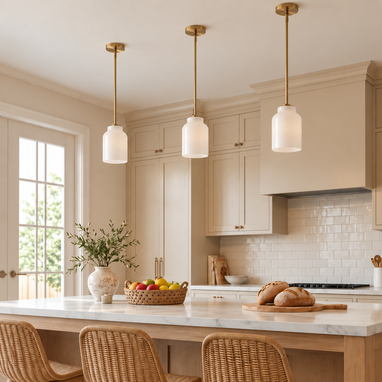
One small colored pendant is not equivalent to three large colored shades over an island. The larger the shades, the stronger the color, and the greater the number of fixtures, the more influence they have on the overall palette.
A product photo showing one isolated shade therefore does not tell the whole story. Buyers should consider the total block of color the complete installation will create.
Use the Trend-Stack Test
Instead of trying to identify a supposedly timeless color, examine how many strong trend signals appear in the same pendant.
| Trend signal | Question to ask | Lower-risk direction |
|---|---|---|
| Color | Would I still like it if the color disappeared from trend reports? | A shade connected to your long-term taste and existing room |
| Silhouette | Does the form only work within one highly specific style? | A relatively simple and adaptable shape |
| Finish | Is the surface treatment strongly associated with a temporary effect? | A restrained finish with a natural-looking texture |
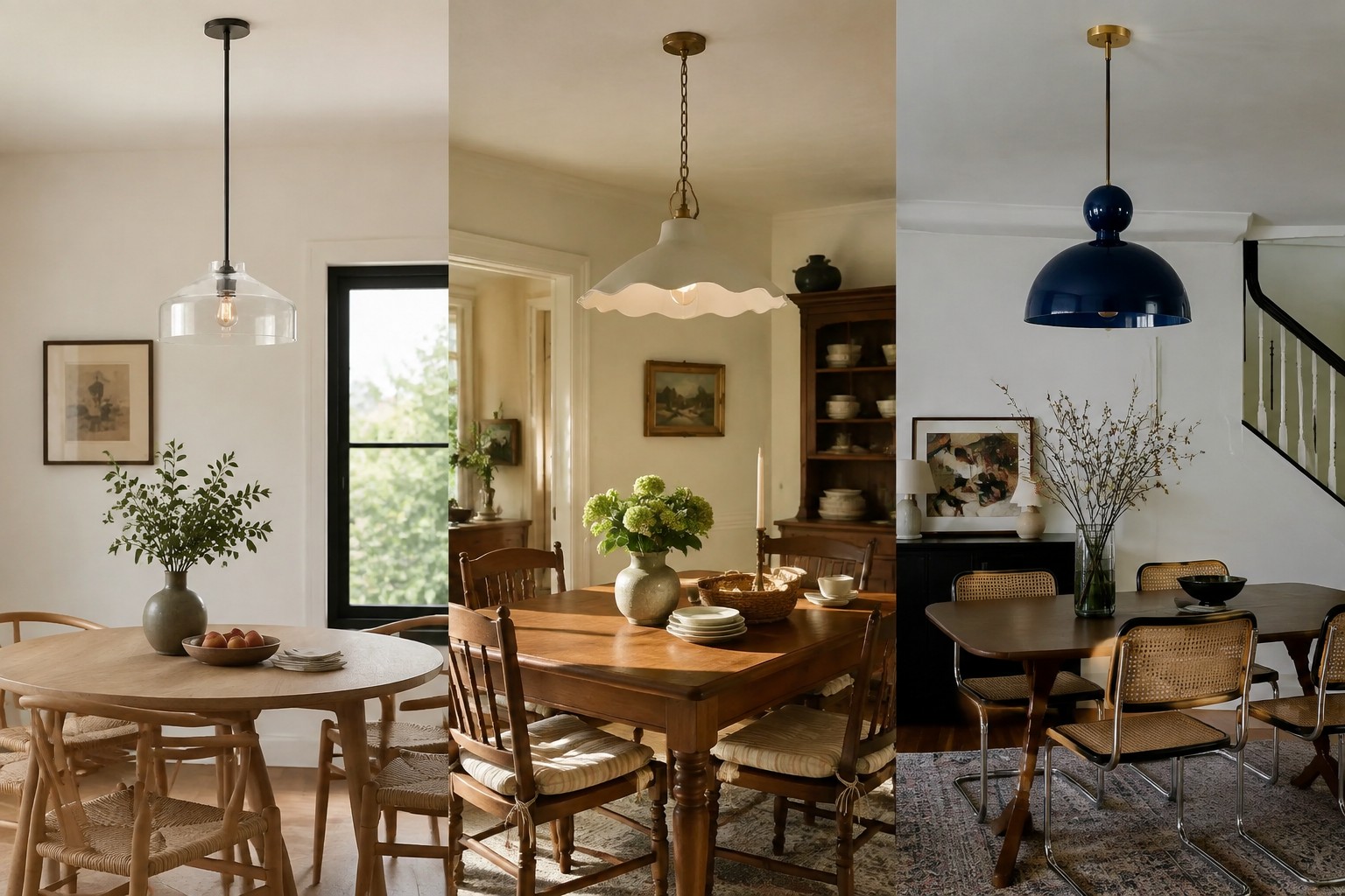
When only the color is expressive and the silhouette and finish remain simple, the risk of rapid aging is usually lower than buyers expect.
When all three elements are highly trend-specific, the fixture is more likely to become tied to a particular period. If the surrounding room changes, its color, shape, and finish may all begin to feel misplaced at once.
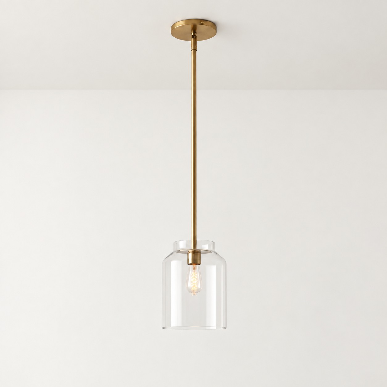
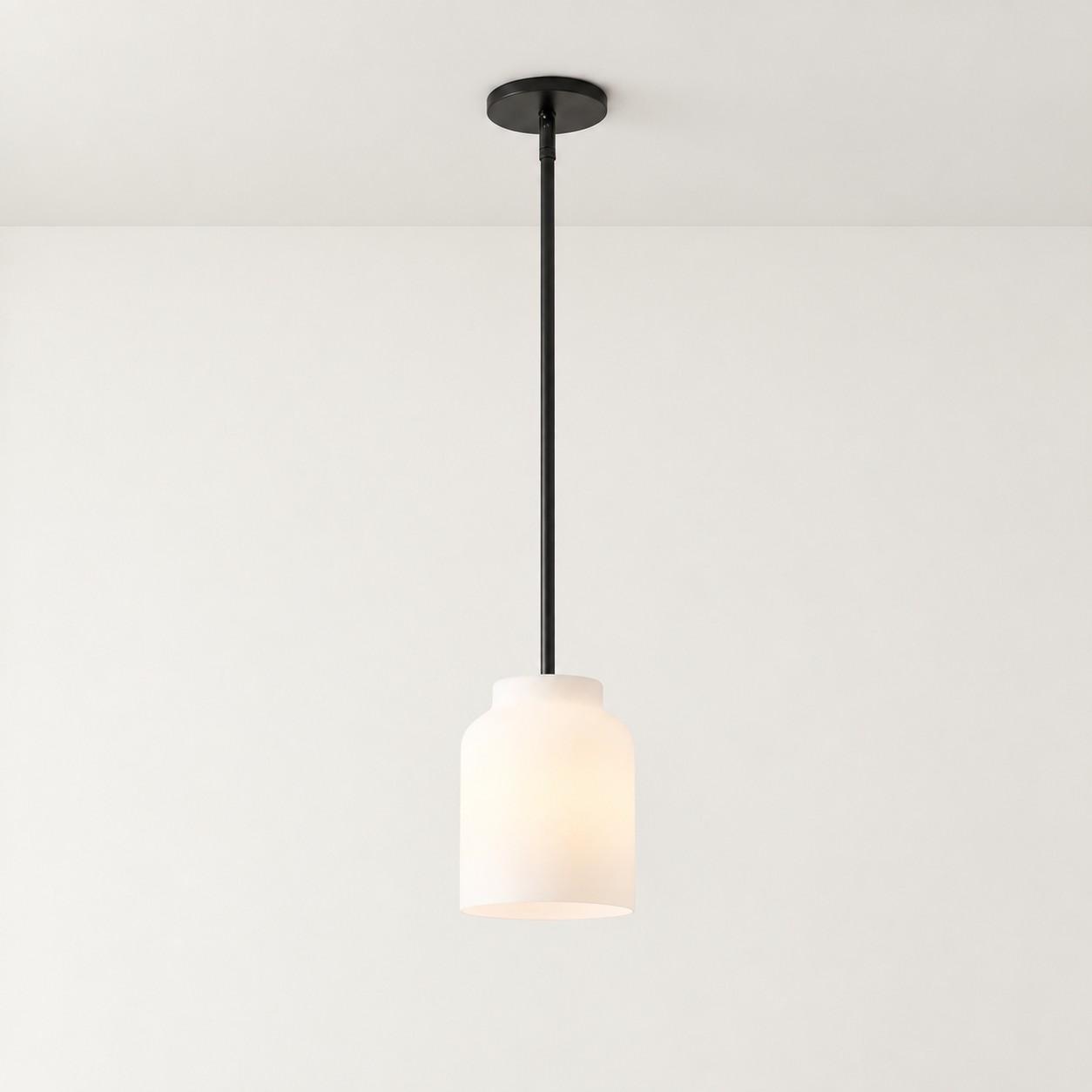
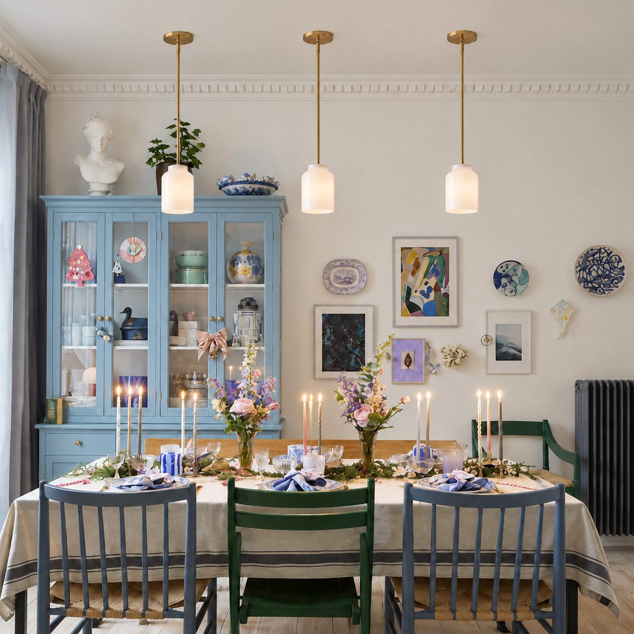
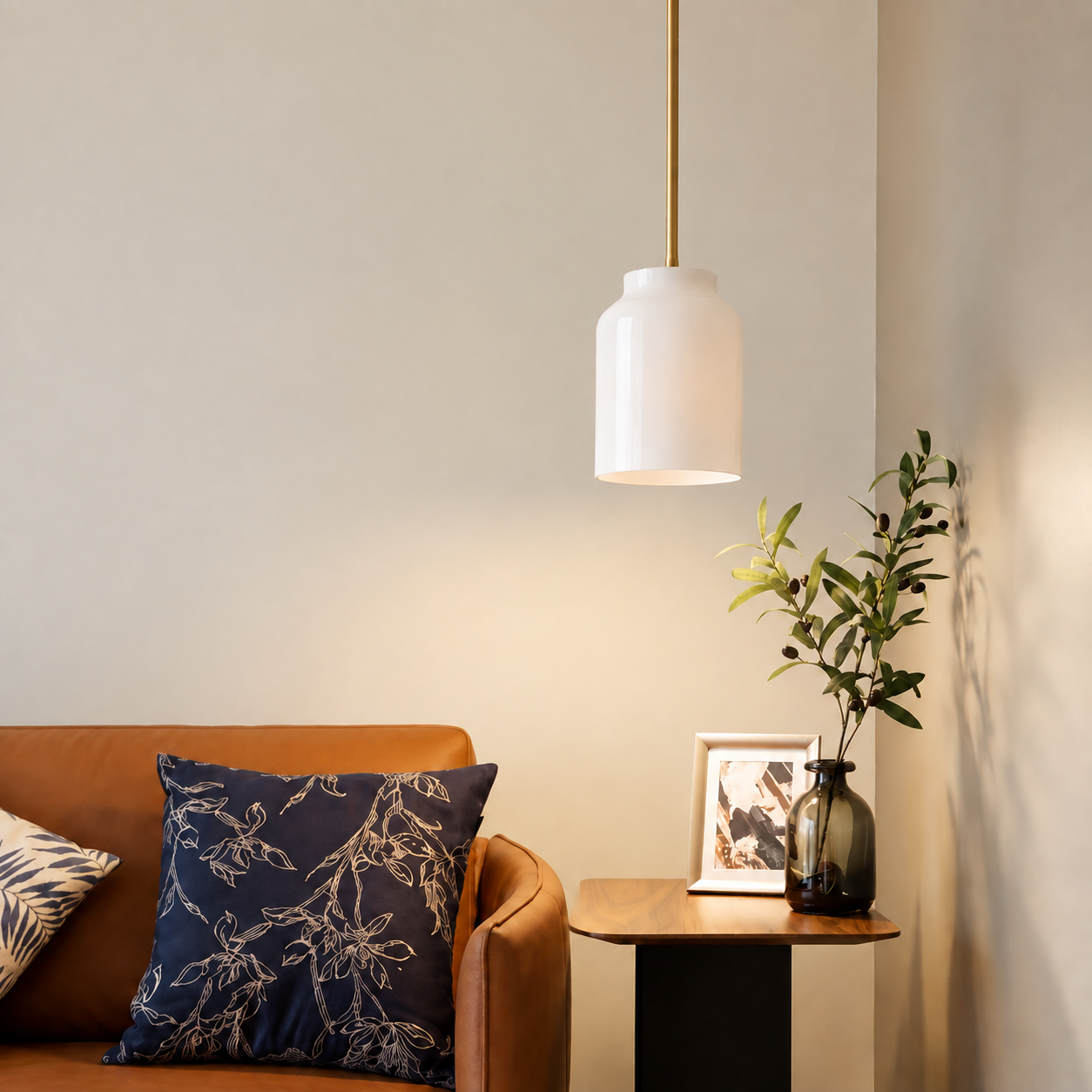
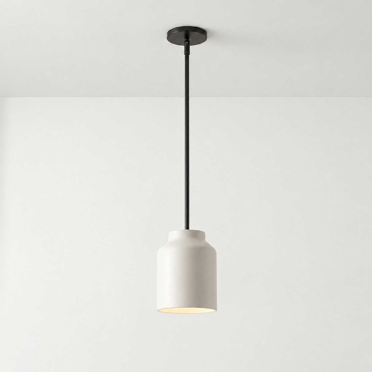
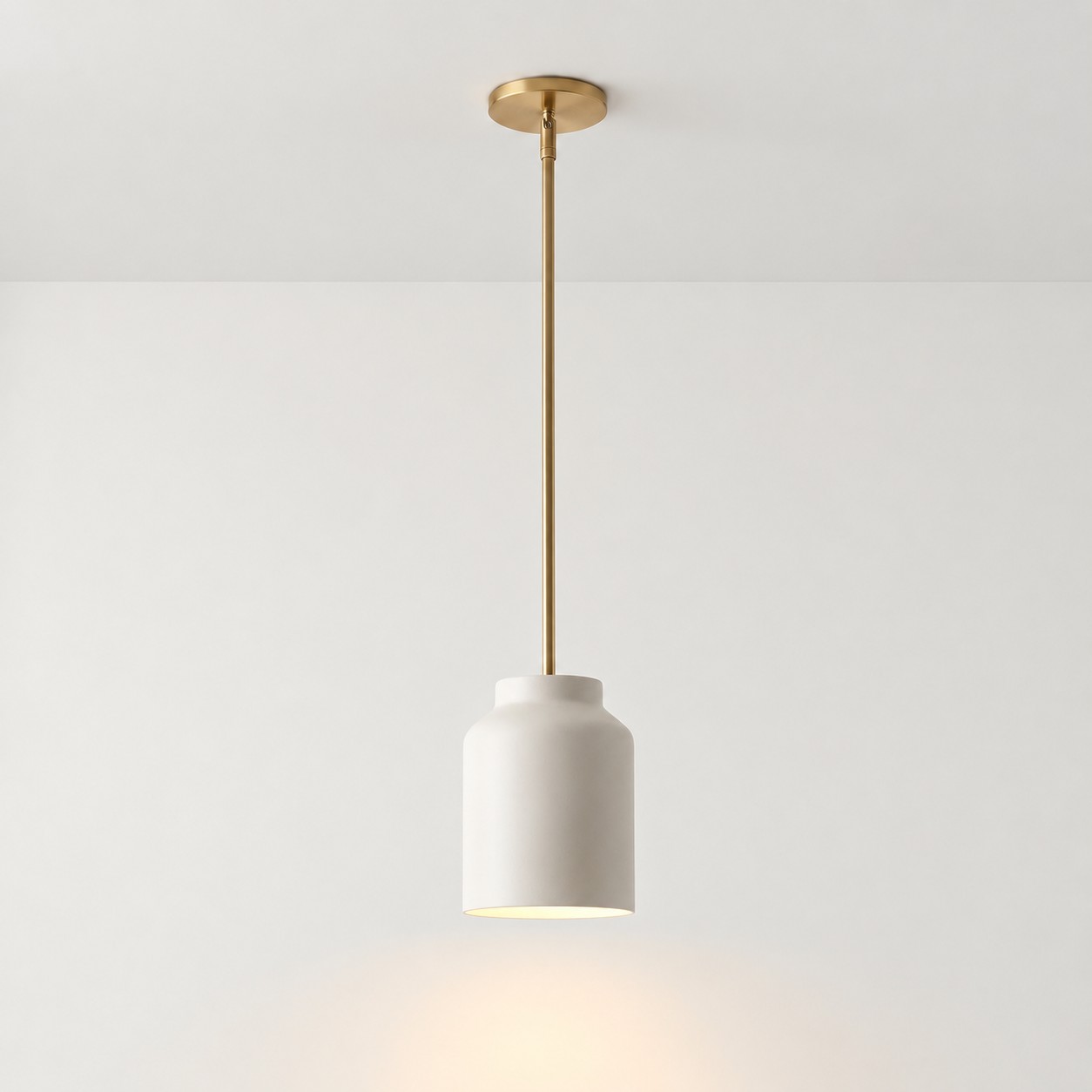
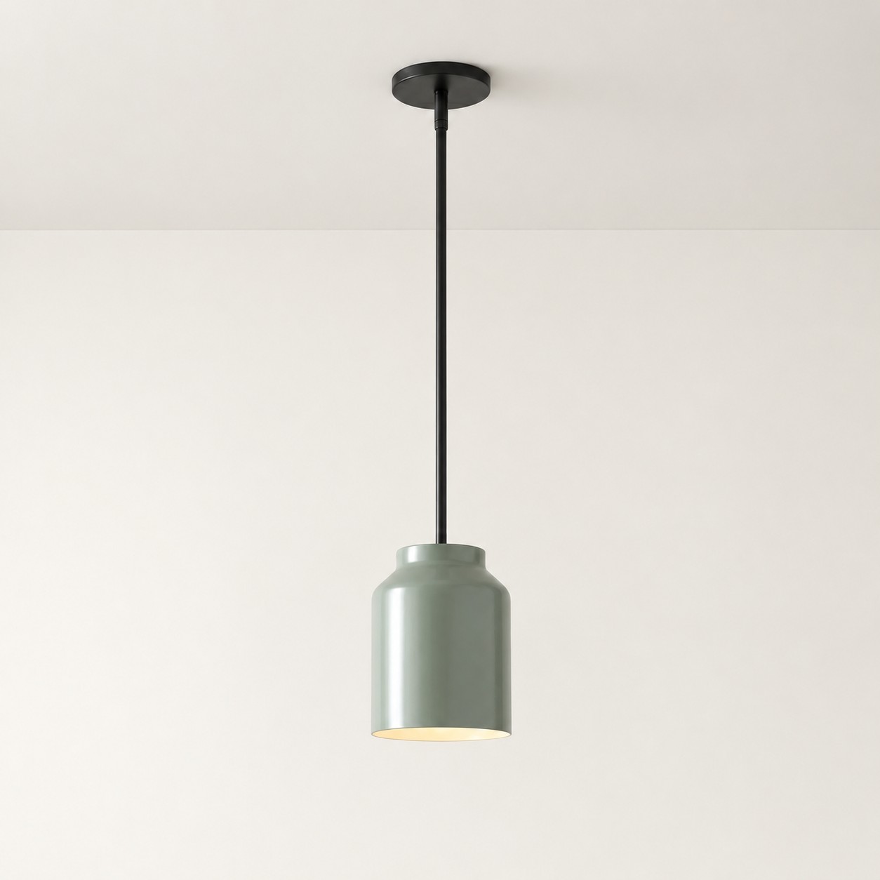
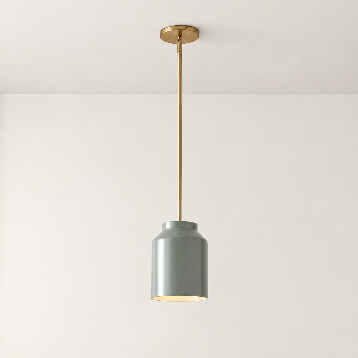
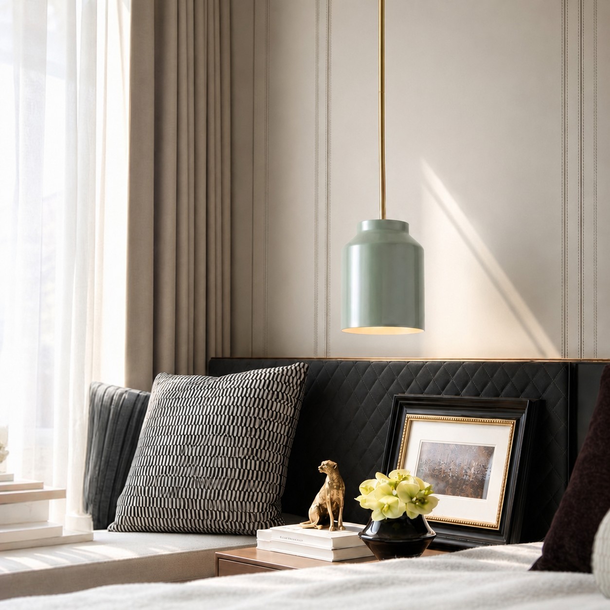
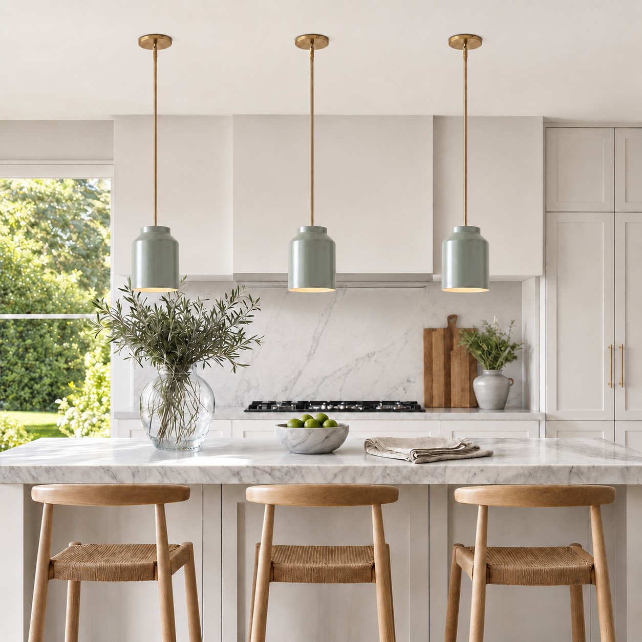
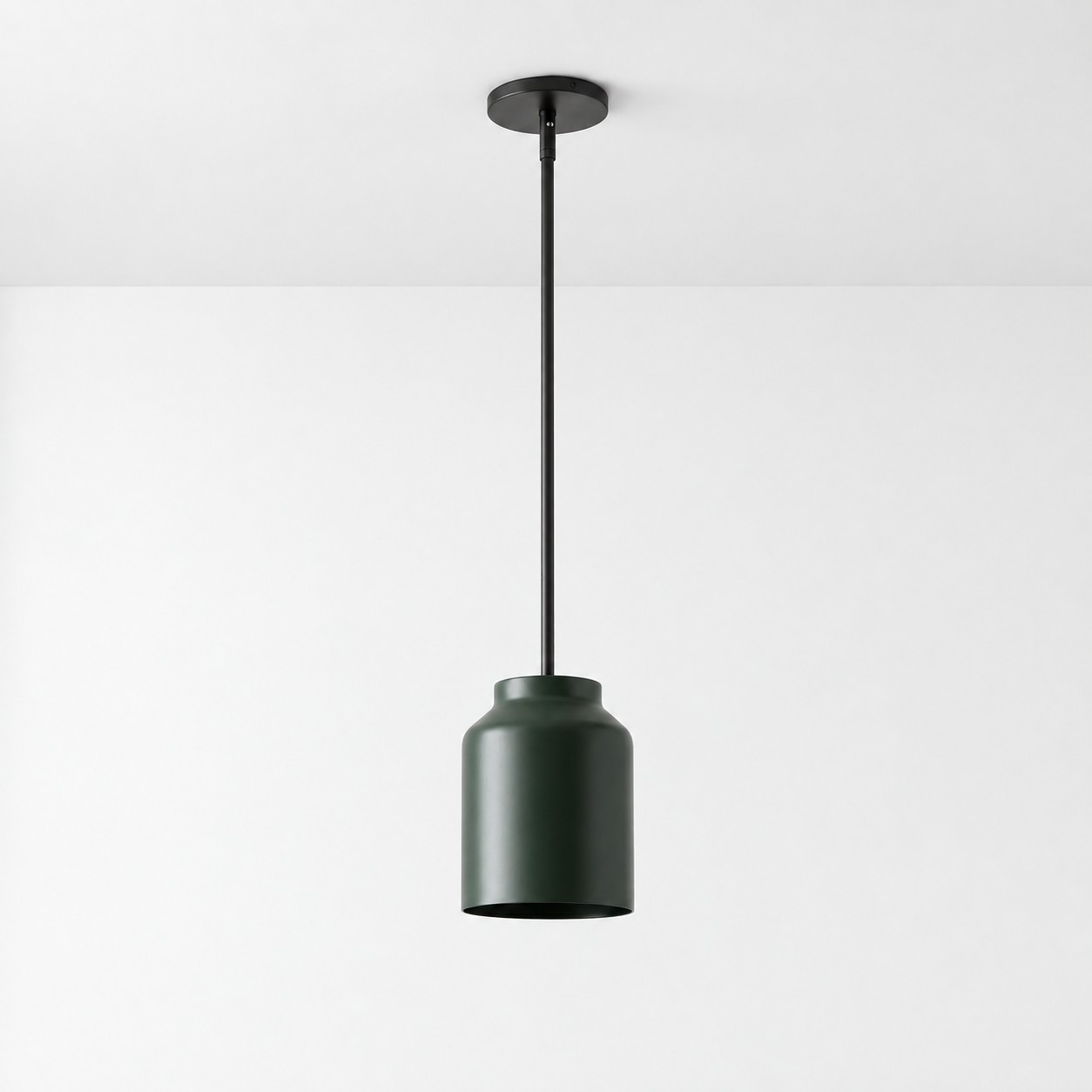
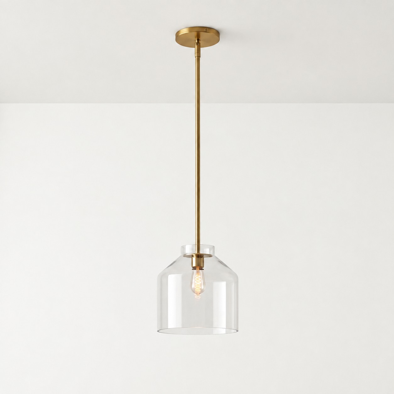
This is one reason a minimalist pendant can carry color successfully. The Hanton Nordic Minimalist Pendant Light, for example, uses a restrained metal form. A colored finish can provide personality while the straightforward silhouette gives the design a more stable foundation.
Try the Room-Anchor Test
A colored fixture often feels awkward not because the room contains too much color, but because the fixture has no relationship with anything around it.
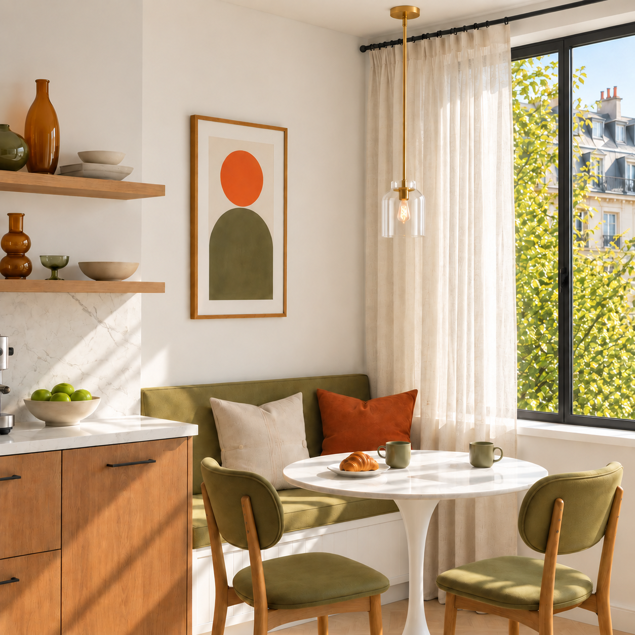
Before buying, look for at least two room anchors. They do not need to match the pendant exactly. They can belong to the same color family, share a similar undertone, or form a deliberate color relationship.
Possible anchors include:
- Dining chairs or curtains in a related color family
- Cabinetry, tile, or artwork that connects with the shade
- Timber and natural materials that share the warmth of a muted color
- A small repetition of the color in an adjoining room
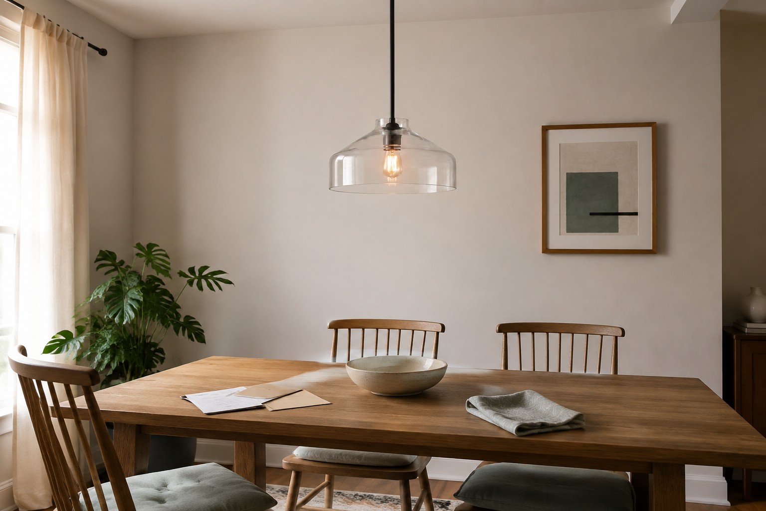
Two separated references are usually enough. Repeating the exact color across the rug, vases, tableware, artwork, and curtains can make the room look themed rather than naturally connected.
The purpose of an anchor is to make the pendant feel intentional—as though it belongs to the room instead of being added simply because the color was popular.
Do Colored Glass Pendants Date Faster Than Colored Metal Ones?
Material changes the way we perceive color, so colored glass and coated metal should not be compared only by looking at a color sample.
Colored metal pendant lights
A colored metal shade usually maintains a more consistent appearance when the light is on or off. Its outline remains clear, and the color is not dramatically transformed by light passing through it.
When combined with a simple form, colored metal can work in modern, Nordic, minimalist, and transitional interiors without relying on elaborate decorative details.
Colored glass pendant lights
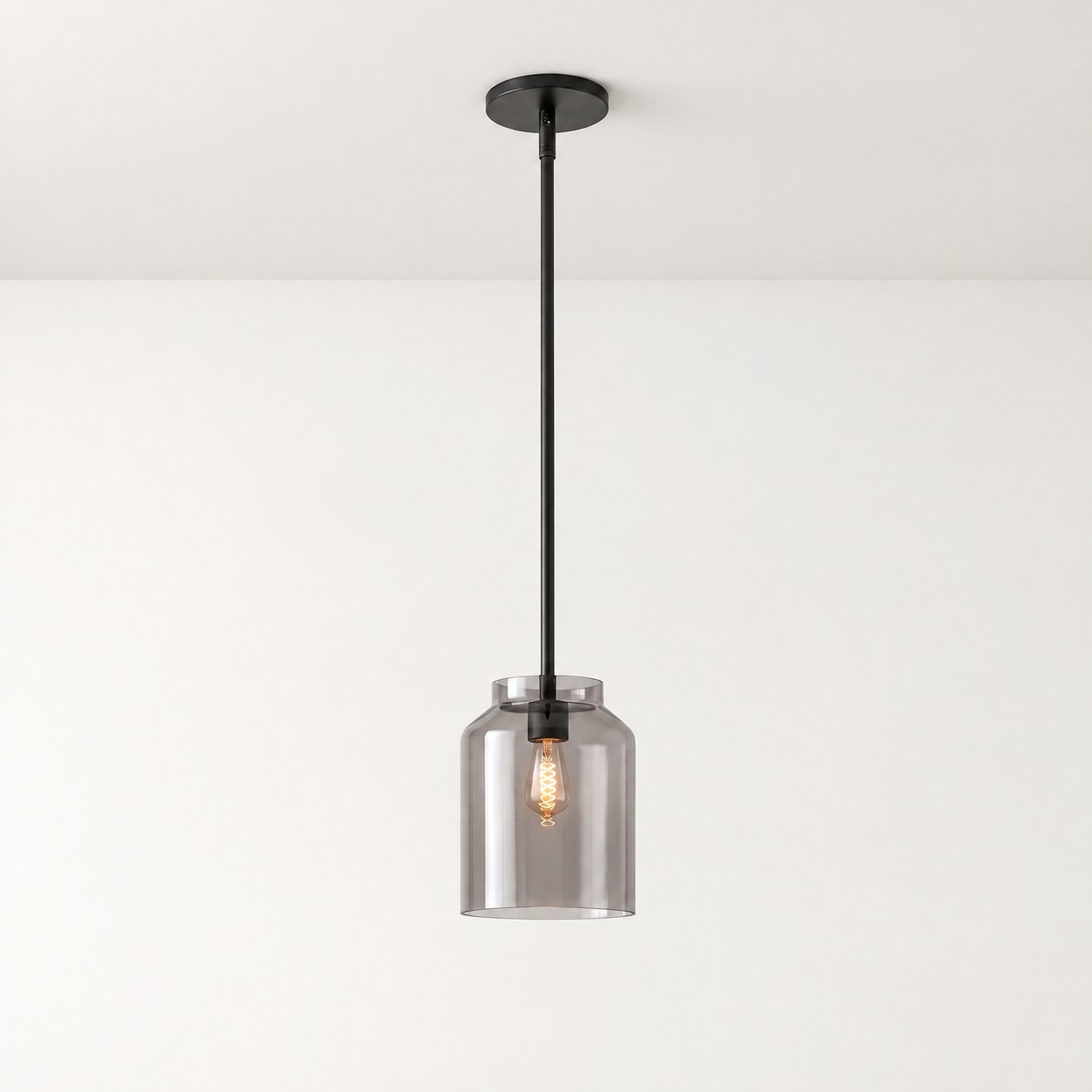
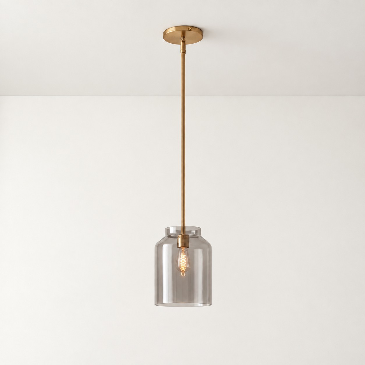
Colored glass is more responsive to light. Daylight, bulb color temperature, glass transparency, and nearby wall colors can all affect its appearance.
A shade that looks deep when switched off may become brighter when illuminated, while some colors shift noticeably under warm light.
This does not mean colored glass becomes dated sooner. Glass offers greater decorative and luminous variation, while metal offers more stable color and a clearer silhouette. In both cases, longevity depends on the relationship between material, color, form, and room.
Kitchen Islands and Dining Tables Need Different Color Strategies
Colored pendants over a kitchen island
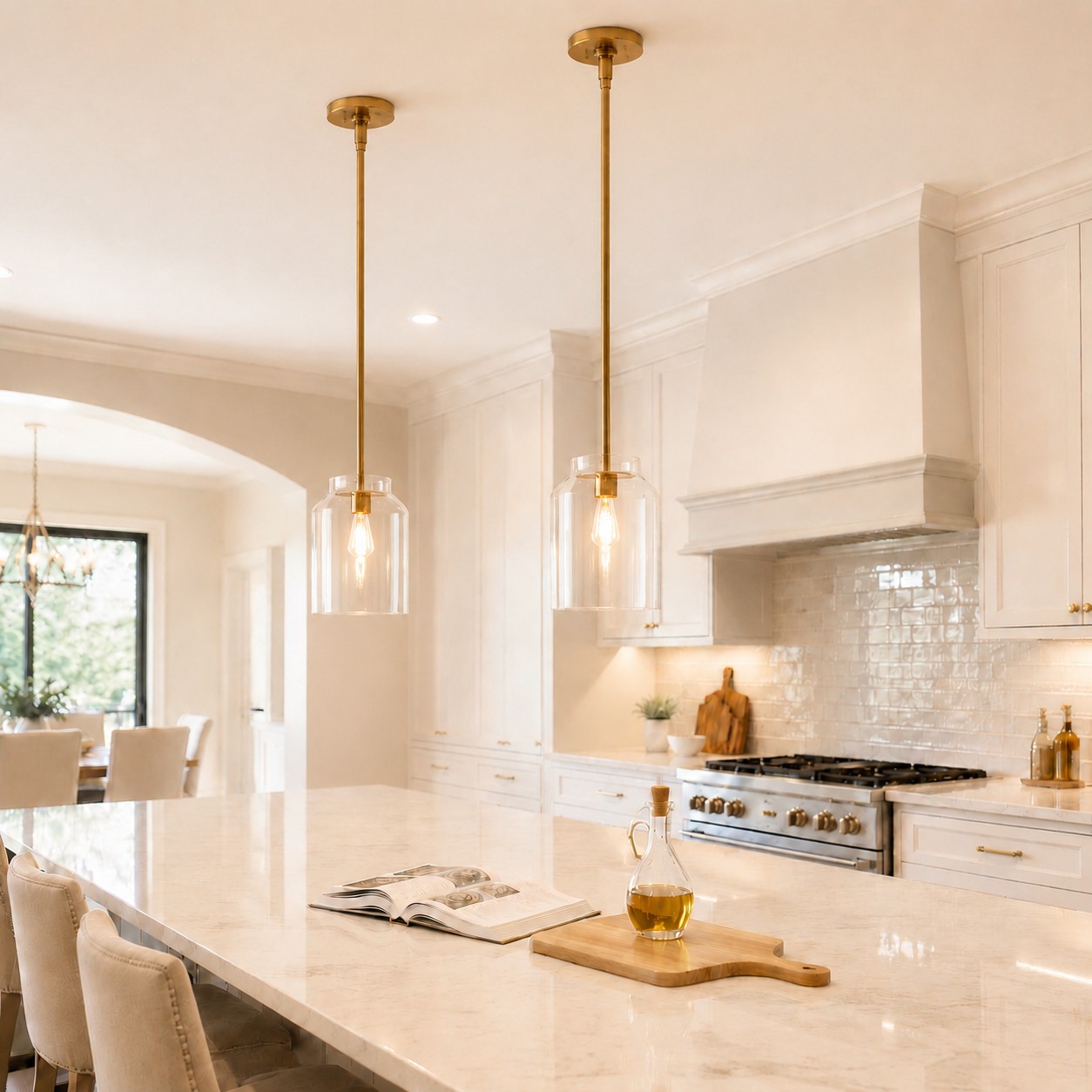
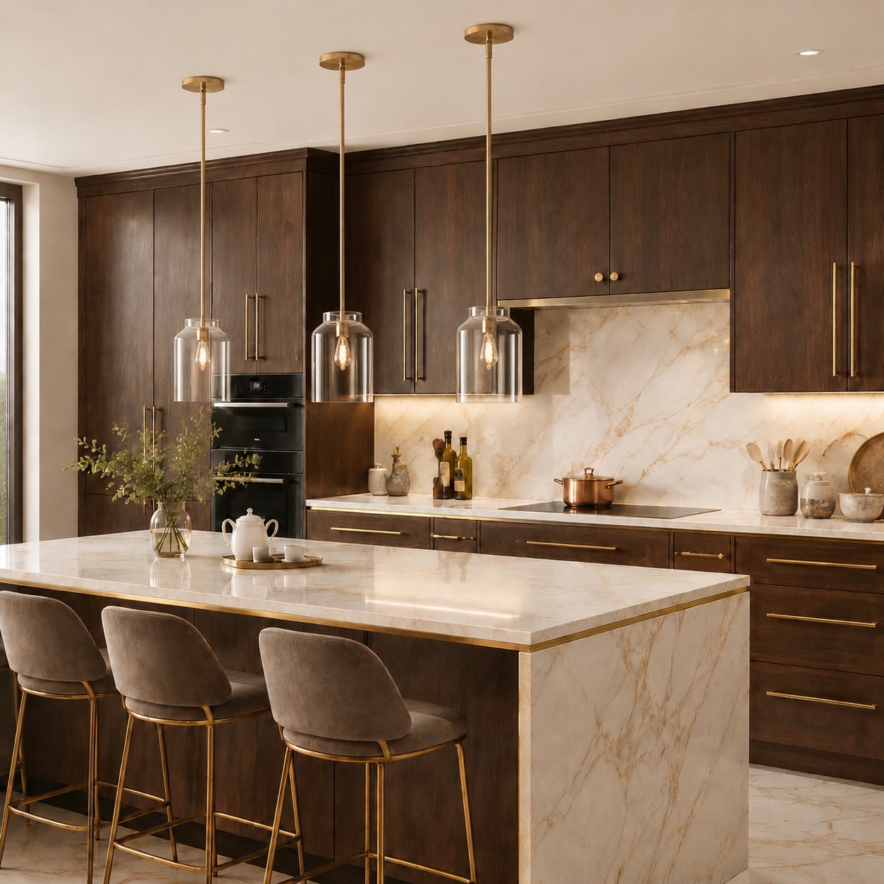
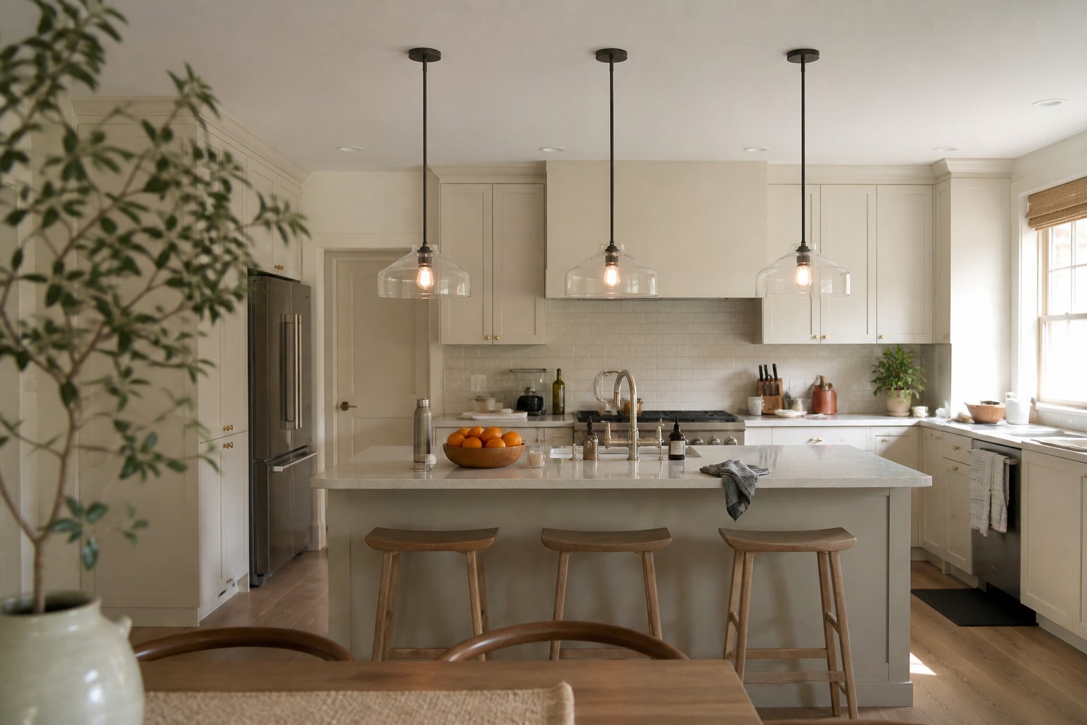
A kitchen-island pendant sits close to cabinets, countertops, and hardware—elements that are expensive and inconvenient to replace. Islands also commonly use two or three pendants, multiplying the amount of color in the room.
Colored kitchen pendants are generally easier to live with when they:
- Relate to the undertones of the cabinets or countertop
- Have a relatively uncomplicated shape
- Avoid stacking too many decorative details
- Look appropriate from the adjoining living or dining area
Colored pendants over a dining table
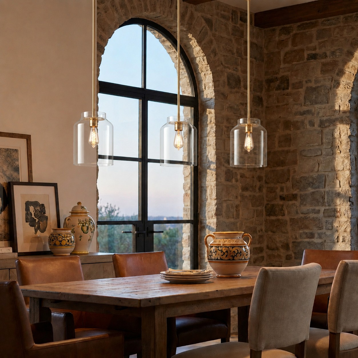
A dining table can usually support a stronger color statement. The table already needs a visual center, while chairs, linens, artwork, and accessories are comparatively easy to update.
One colored pendant is also easier to rebalance than three large island fixtures. The useful question is not whether color is allowed in a kitchen or dining room, but how much visual responsibility the fixture will carry.
What Can 2026 Lighting Trends Actually Tell Us?
Design coverage in 2026 continues to emphasize statement lighting, sculptural fixtures, individual expression, and interiors with greater personality. Colored and visually distinctive pendants have clearly not disappeared from contemporary design.
Current coverage from House Beautiful identifies statement lighting as a defining 2026 direction, while Homes & Gardens highlights expressive silhouettes, warmer light, mixed materials, and more personalized fixtures.
A yearly trend, however, can only show what the market currently welcomes. It cannot tell you whether you will still enjoy a specific color five years from now.
Searching for the pendant colors that are “in style now” can help you discover options, but it should not make the final decision. More durable questions include:
- Have you liked this color for more than one season?
- Does it work with the room’s permanent materials?
- Does the fixture look good in daylight as well as at night?
- Could it move to another room after a future renovation?
- Do you like the pendant itself, or only the styled room in the product photograph?
Trends are useful for inspiration. They should not decide which long-term commitment you bring into your home.
Should You Choose a Colored or Neutral Hanton Pendant?
Choose a neutral finish when:
- You regularly change wall colors, furniture, or decorative styles
- The room already contains several strong colors or textures
- You want the pendant to define the area without becoming its main focal point
- The fixture needs to coordinate with several zones in an open-plan room
- You have not yet established a long-term interior palette
Consider a softly colored finish when:
- The room is mostly neutral and needs one controlled point of interest
- You can identify at least two related colors or undertones in the space
- You have liked the color for longer than one trend cycle
- You want the pendant to remain decorative when switched off
- A simple metal silhouette fits your long-term style
Before choosing a colored Hanton, check three conditions:
- The room provides at least two related colors or undertones.
- You like the shade itself, not only the complete interior shown in a promotional image.
- The restrained metal form suits your long-term design preferences.
The value of the Hanton pendant light is not a promise that one finish will remain fashionable forever. Its relatively simple form reduces the number of trend-dependent decisions in the fixture. Color can provide expression without being combined with an overly complicated silhouette.
How Can You Update a Colored Pendant Without Replacing It?
If a colored pendant begins to feel disconnected from the room, start with reversible adjustments rather than immediate replacement.
1. Check the bulb
Color temperature affects the relationship between the shade, walls, and furniture. Warm light may strengthen some warm shades while shifting the appearance of cooler ones. A more neutral light source may make the finish look closer to its daytime color.
2. Reduce competing colors
When several large surfaces are all trying to become the focal point, the fixture can appear more chaotic than dated. Removing one or two competing colors may allow the pendant to make sense again.
3. Add small color connections
Introduce one or two references through a chair, piece of artwork, vase, or textile. The objective is not to reproduce the shade exactly. It is to rebuild a visual connection.
4. Reconsider the hanging height
A colored pendant placed too high may look like an isolated object floating in the room. If it hangs too low, its color and volume may feel disproportionately dominant. Correcting its relationship with the table can make a bigger difference than changing the palette.
5. Consider another room
Where the fixture and installation permit, moving the pendant to another room may extend its useful life. A shade that competes with kitchen cabinetry may work naturally in a simpler bedroom, reading corner, or dining space.
Safety note: Do not casually spray-paint a fixture or modify its electrical components. Any structural or surface alteration should first be checked against the manufacturer’s instructions, warranty conditions, and local electrical-safety requirements.
When Is Replacement the Better Decision?
Replacement may be more reasonable when the pendant conflicts with several permanent surfaces, such as the cabinetry, countertop, and flooring. Changing the surrounding room to accommodate one fixture could cost considerably more than choosing a better-suited pendant.
A fixture that is incorrectly sized, used in the wrong quantity, or unable to provide the required lighting should not be preserved through color adjustments alone.
Replacement also makes sense when the color, silhouette, and finish all feel disconnected from the current room. Continuing to buy accessories to accommodate it may make the interior increasingly complicated.
A missing color connection, unsuitable bulb, or poor hanging height, however, can often be corrected. Seeing a different color repeatedly on social media is not, by itself, a good reason to remove a pendant that still works in your home.
The Five-Question Regret Test
- Would I still like this color if it stopped appearing in trend reports next year?
- Does it relate to at least two elements already in the room?
- Are the color, silhouette, and finish all strongly trend-specific?
- Could the pendant work in another room after a future redesign?
- Do I like the actual fixture, or only the complete space used to advertise it?
If you have liked the color for some time, it has meaningful connections with your home, and the fixture has a simple, adaptable form, a colored pendant is unlikely to be significantly less practical than a neutral one.
Conclusion: Color Does Not Automatically Shorten a Pendant’s Design Life
Colored does not mean short-lived, and neutral does not mean permanent.
Fixtures tend to date quickly when too many trend signals are stacked together or when the pendant has no relationship with the room. If the color is expressive, the form and finish can remain restrained. If the silhouette is already highly decorative, a quieter color may create a better balance.
For homeowners who want personality without committing the entire room to a short-term trend, the Hanton Nordic Minimalist Pendant Light provides a useful middle ground: color can do the expressive work while the simple metal form provides stability.
The best choice is not necessarily the color that the internet calls safest or most fashionable. It is the one you are willing to keep living beneath after the trend cycle has moved on.
Frequently Asked Questions
Are colored pendant lights out of style?
No. Colored and decorative pendants continue to appear in contemporary interiors. Whether a fixture looks dated depends more on its shape, finish, and relationship with the room than on the presence of color alone.
Which pendant light colors are least likely to date?
No color is guaranteed to remain timeless. Colors that coordinate with timber, stone, cabinetry, and other permanent surfaces—and that reflect the homeowner’s long-term preferences—are generally easier to keep.
Are neutral pendant lights always safer?
Neutral finishes are usually easier to coordinate, but they cannot correct an unsuitable size, proportion, silhouette, or surface quality.
Do colored glass fixtures date faster than colored metal pendants?
Not necessarily. Colored glass changes more noticeably with light, while colored metal has a more stable appearance. The longevity of either material depends on the complete design and its surroundings.
Can changing the bulb improve the appearance of a colored pendant?
It can. Bulb color temperature and color rendering affect how the shade and nearby surfaces appear, although they cannot change the fixture’s physical size or silhouette.
Can colored pendants work in a farmhouse kitchen?
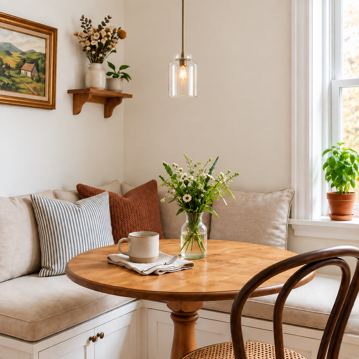
Yes. Choose a color that relates to timber, cabinetry, or another natural material, and avoid combining too many highly stylized details in one fixture.
How can I update a dated colored pendant without replacing it?
Try adjusting the bulb, hanging height, and surrounding palette. Add one or two small color connections or remove decorative elements that compete with the fixture.