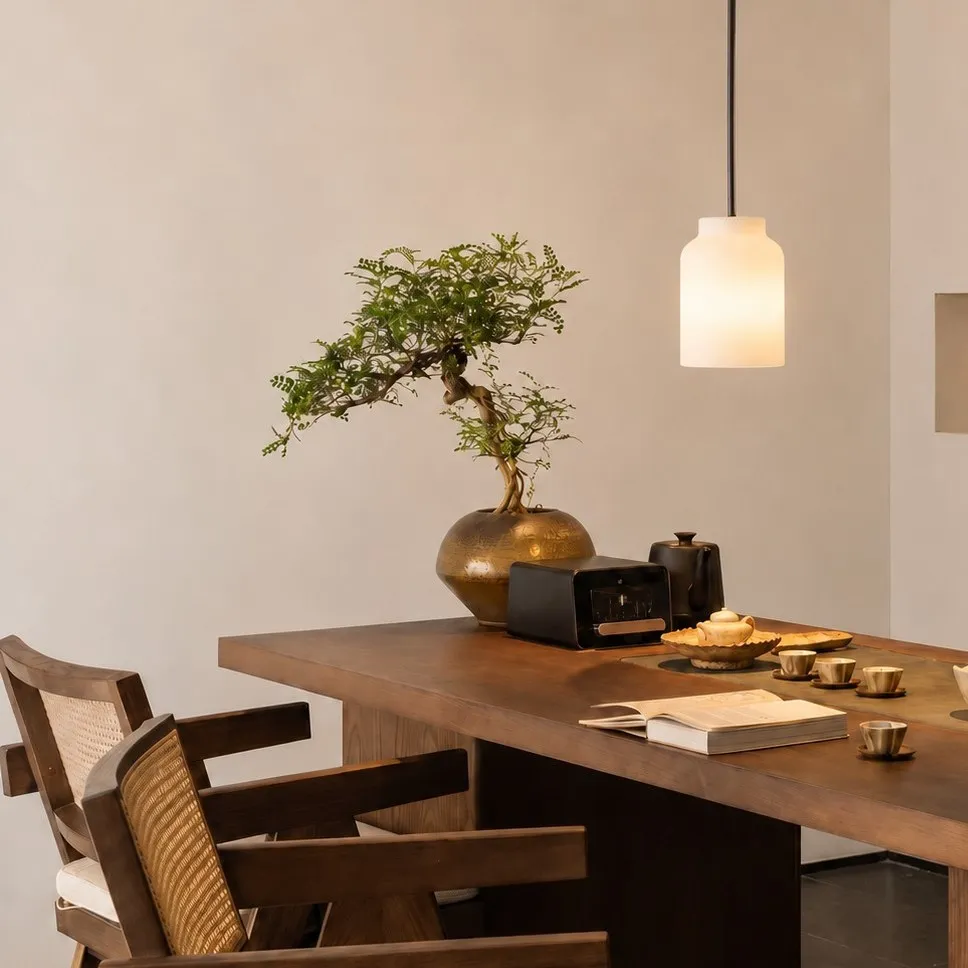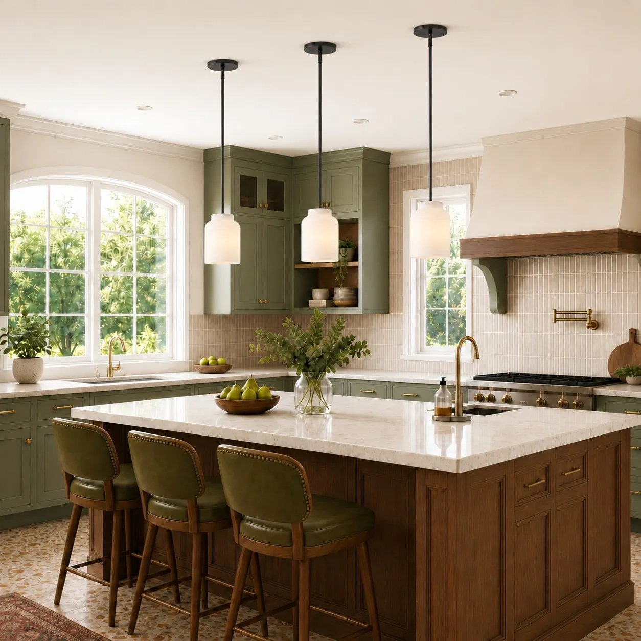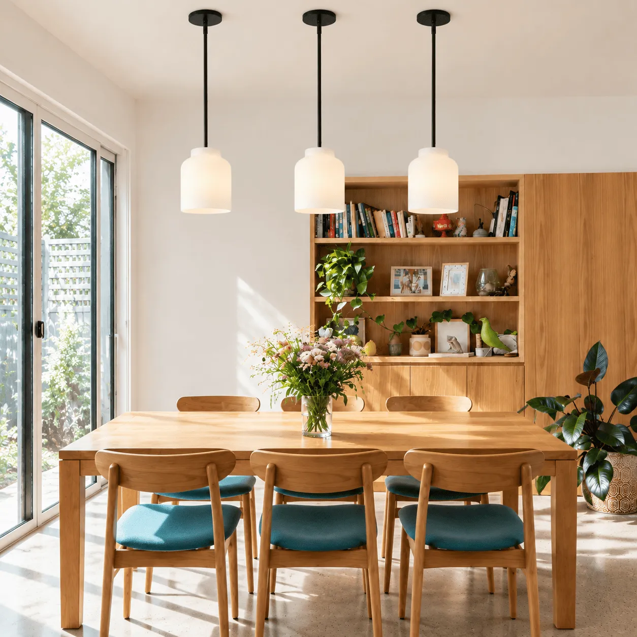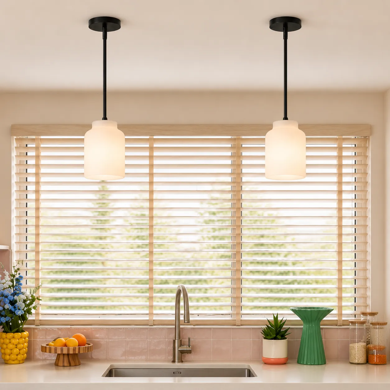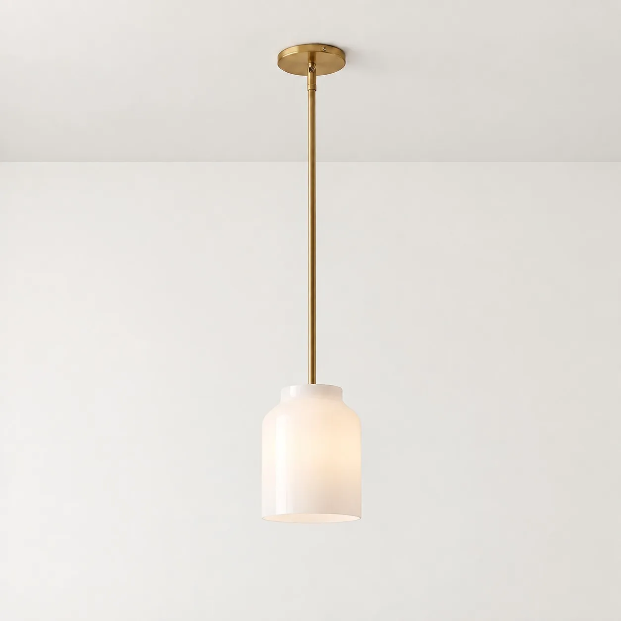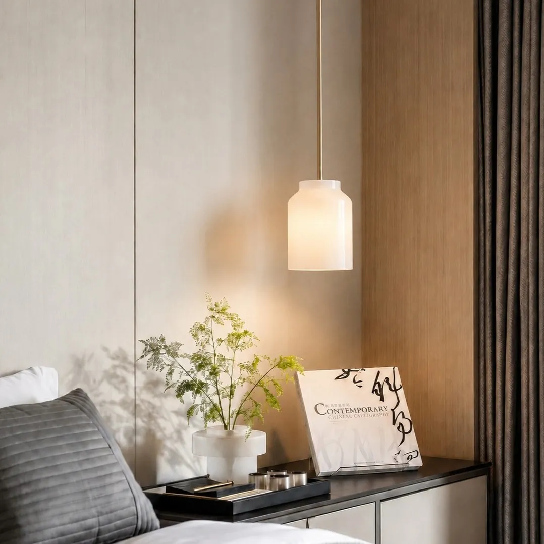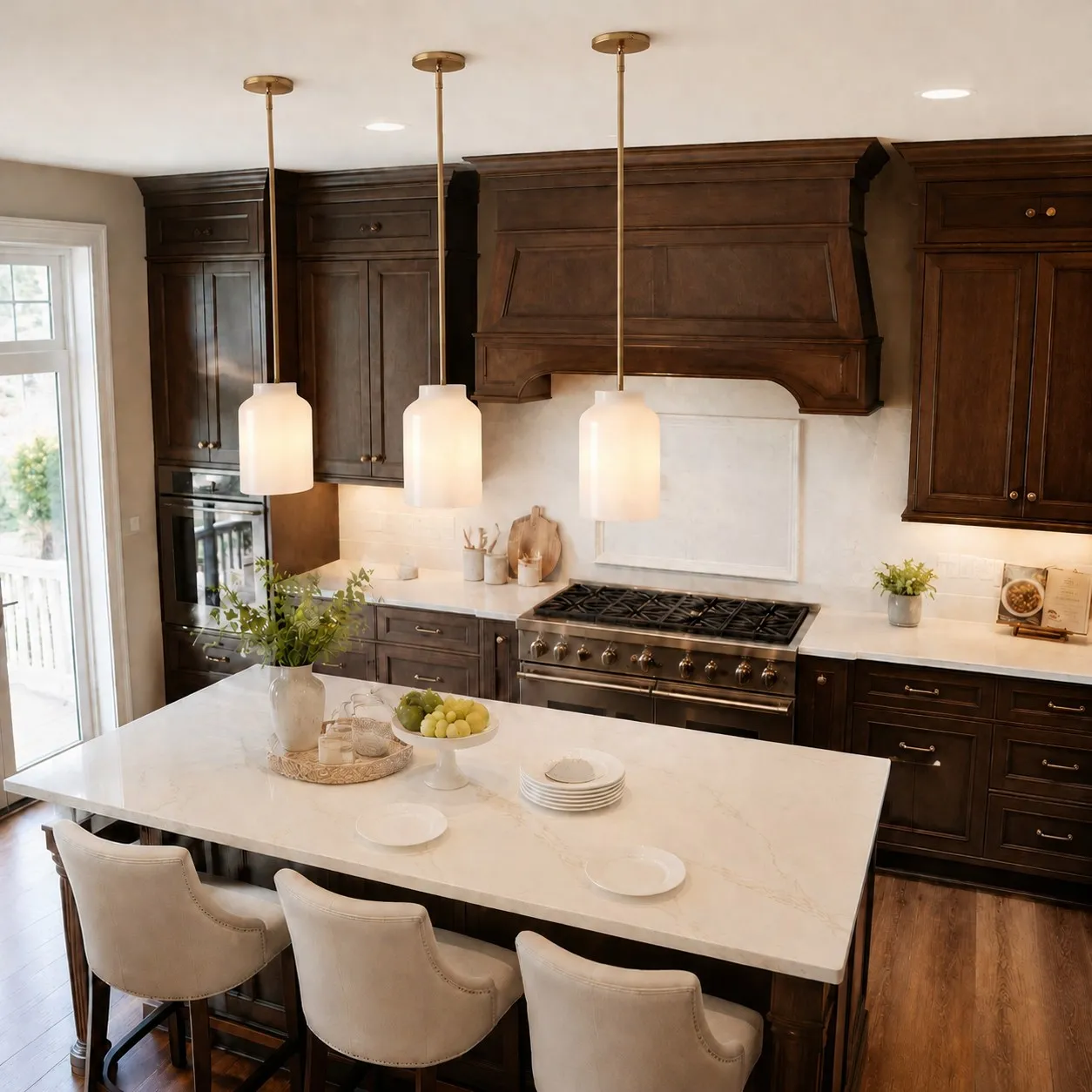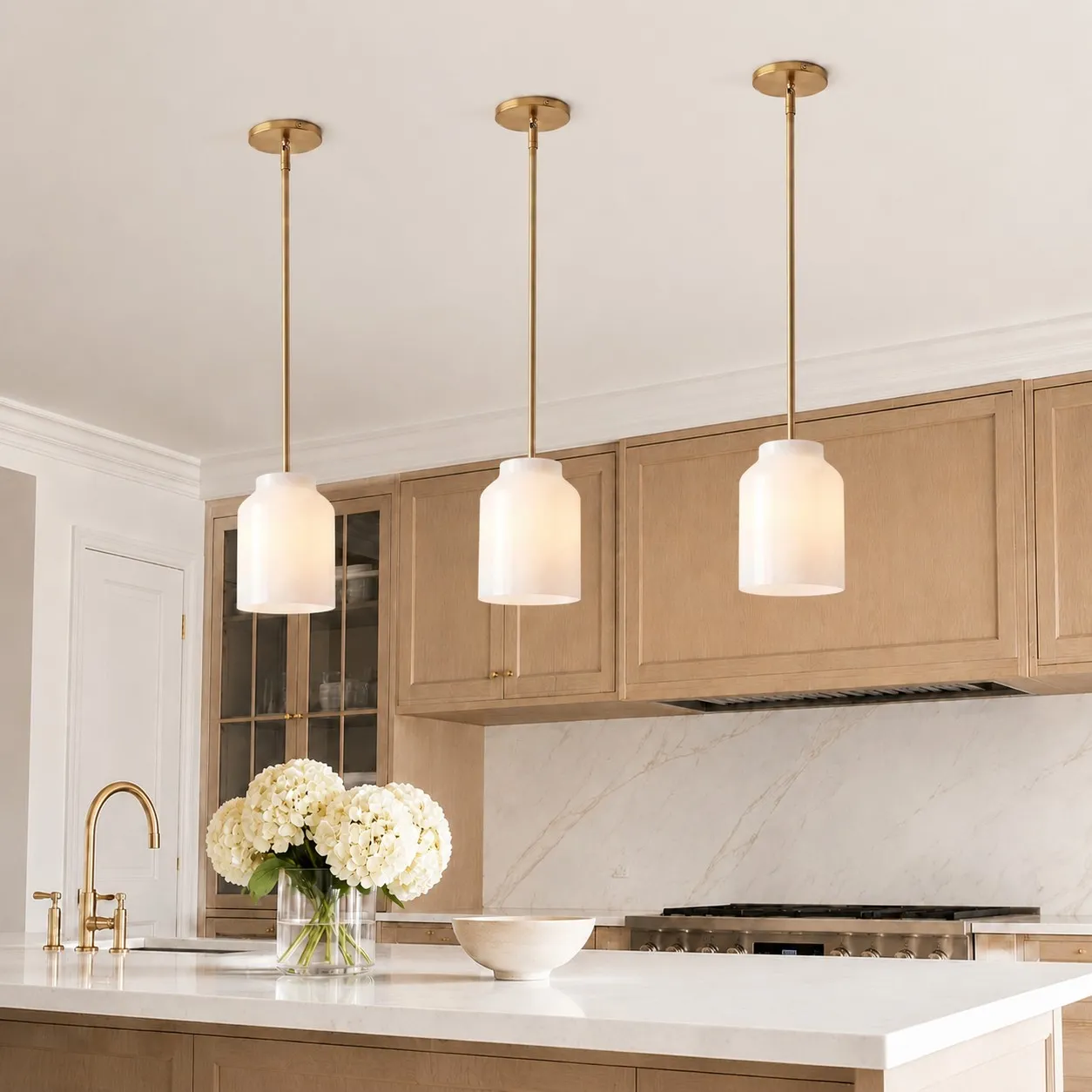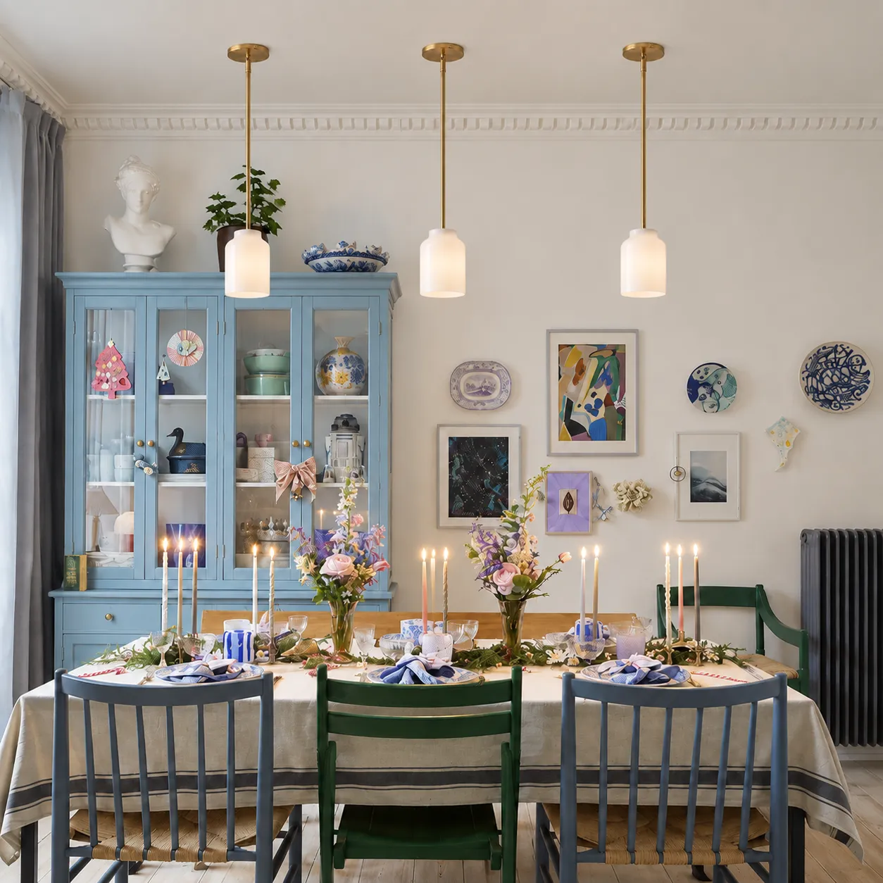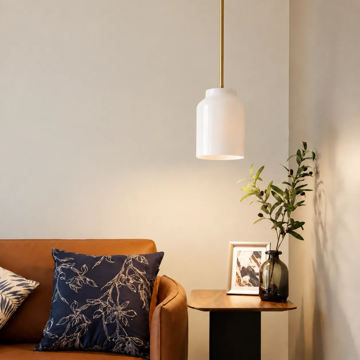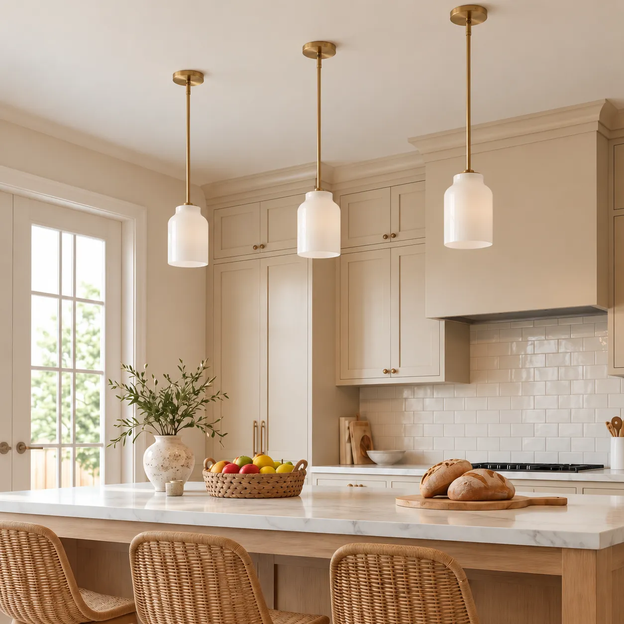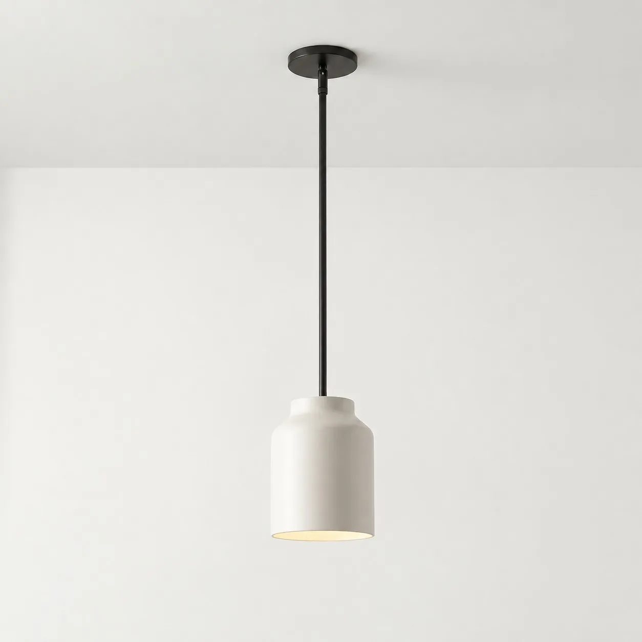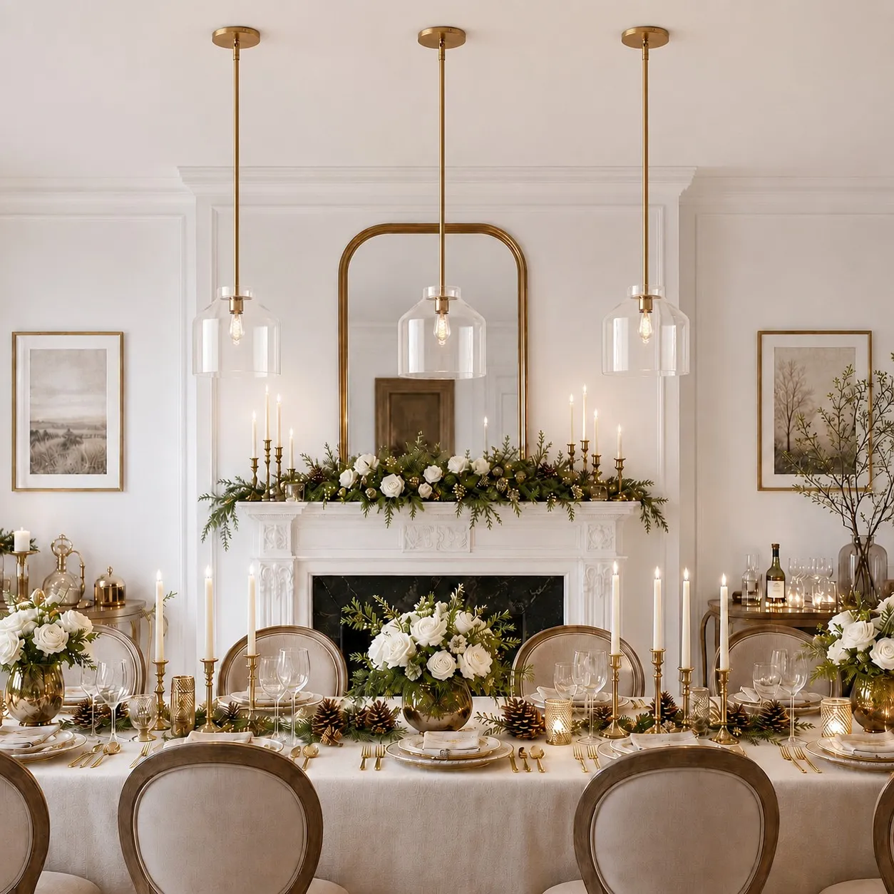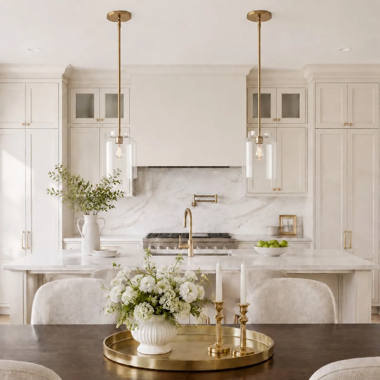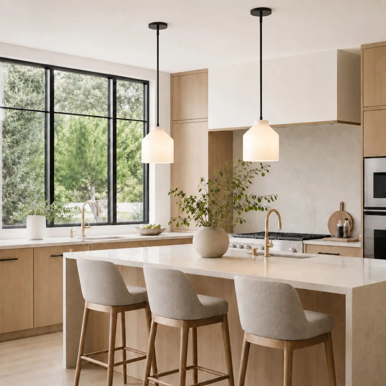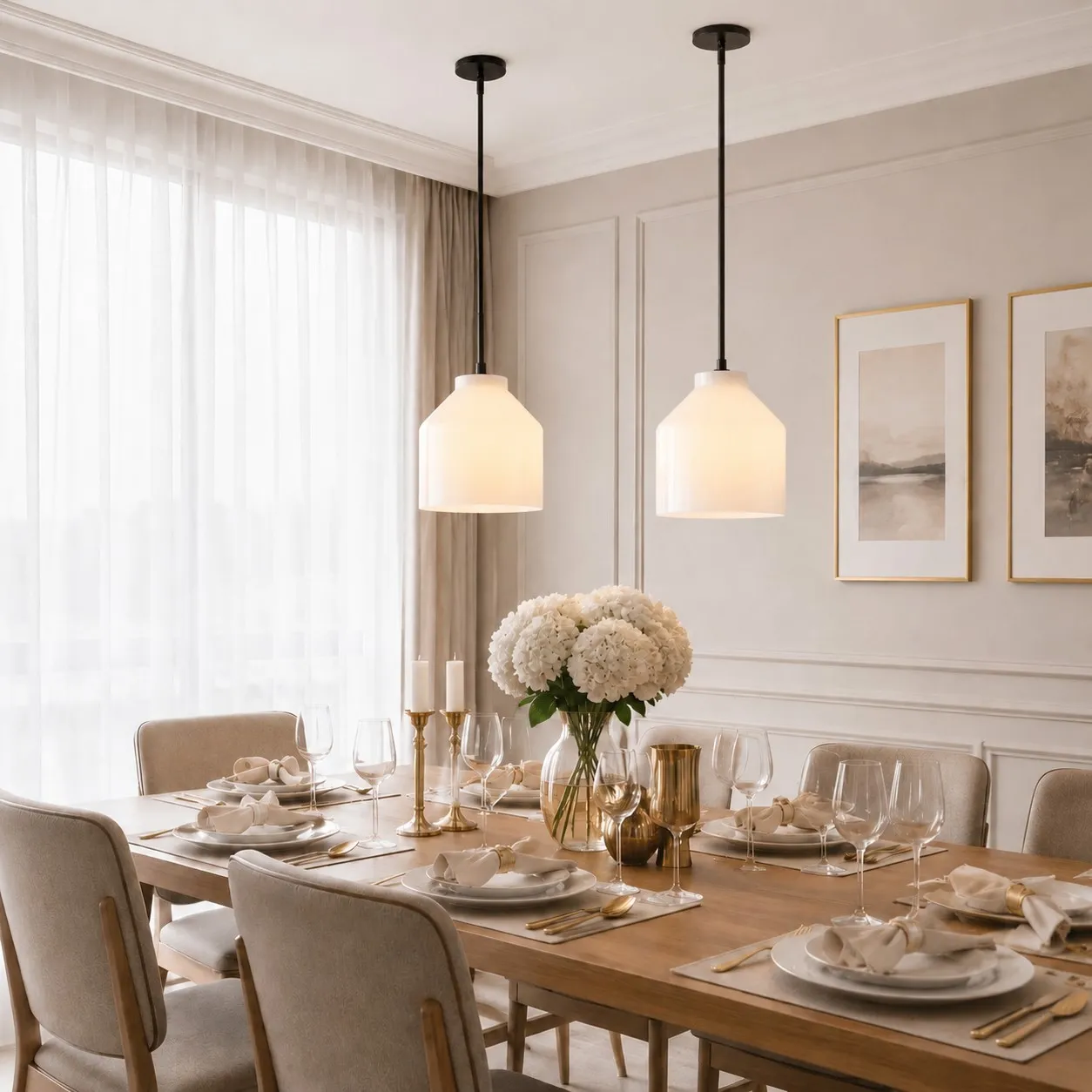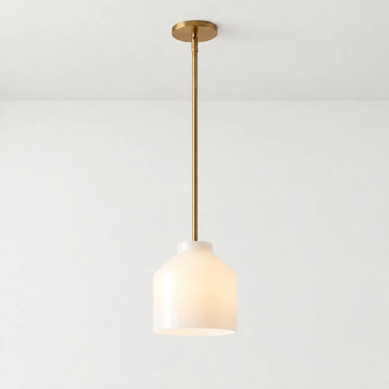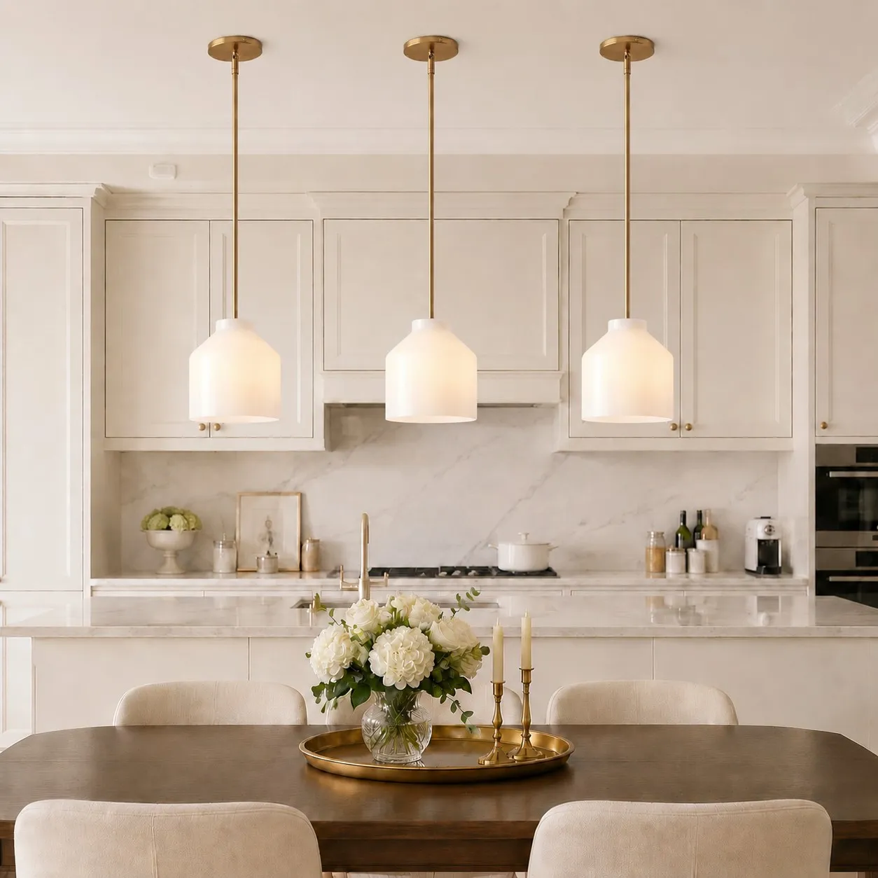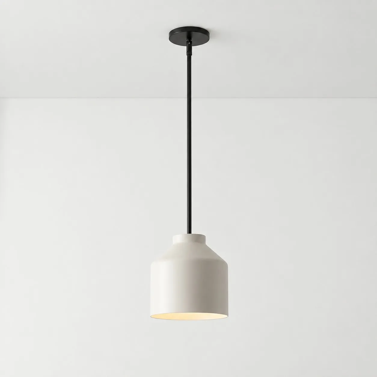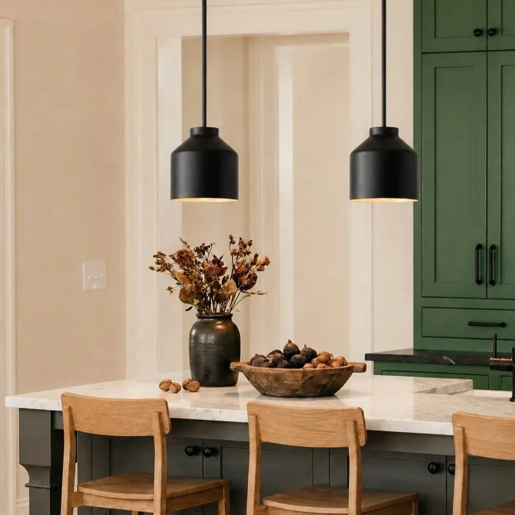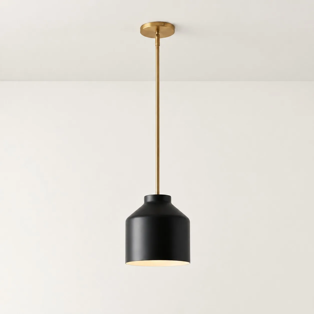
A pendant light may look softly colored, perfectly proportioned and carefully finished in an online photograph. Once it is installed at home, however, it may appear more yellow, more gray, too large or unexpectedly flat.
That does not necessarily indicate a product defect, nor does it automatically mean the online photograph was inaccurate. A product image is the combined result of the fixture, room, daylight, bulb, camera and image processing. The buyer receives only one part of that scene: the fixture.
Camera white balance, phone screens, bulb color temperature, reflected wall color, room scale and hanging height can all change how the same pendant is perceived.
Before deciding to return it, separate a genuine product mismatch from environmental factors that can still be adjusted.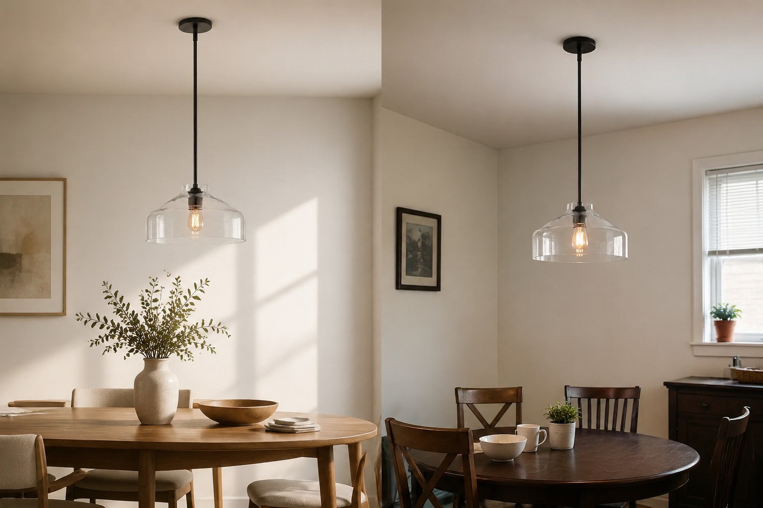
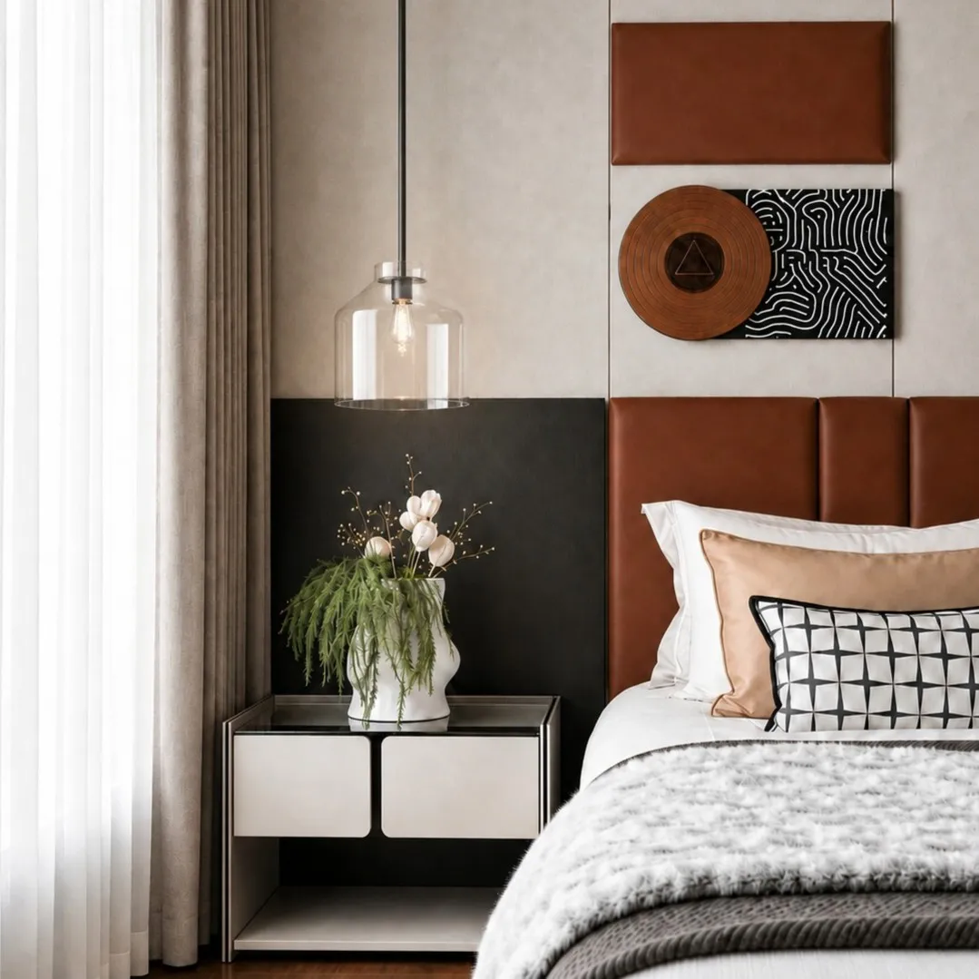
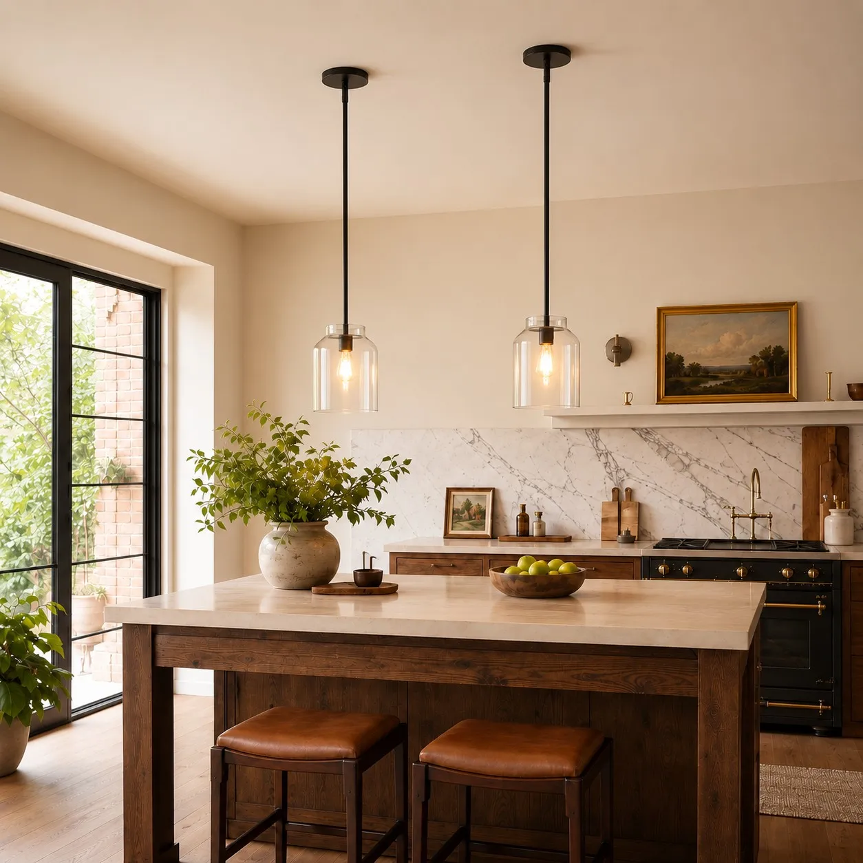
A Product Photo Shows a Complete Scene, Not Just the Pendant
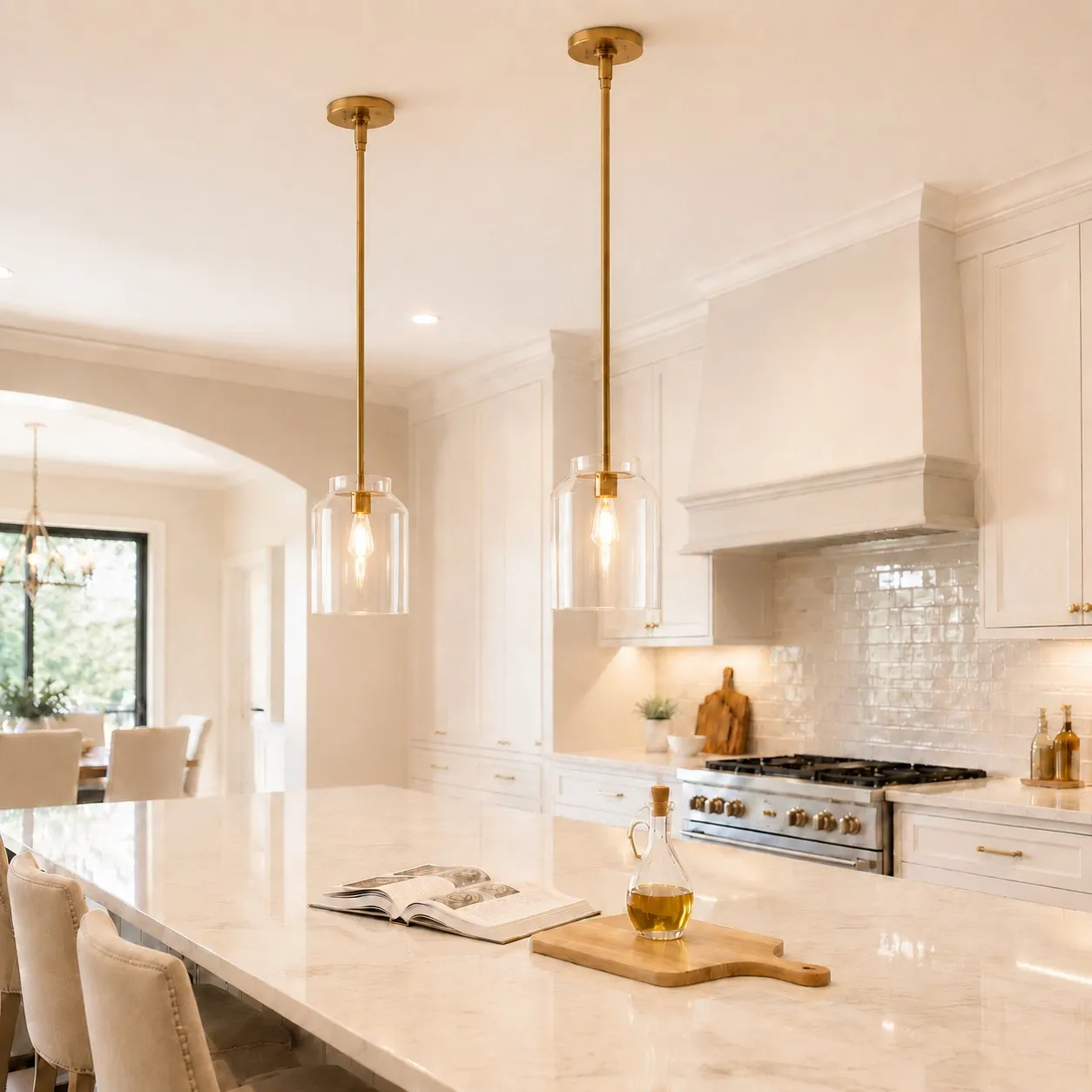
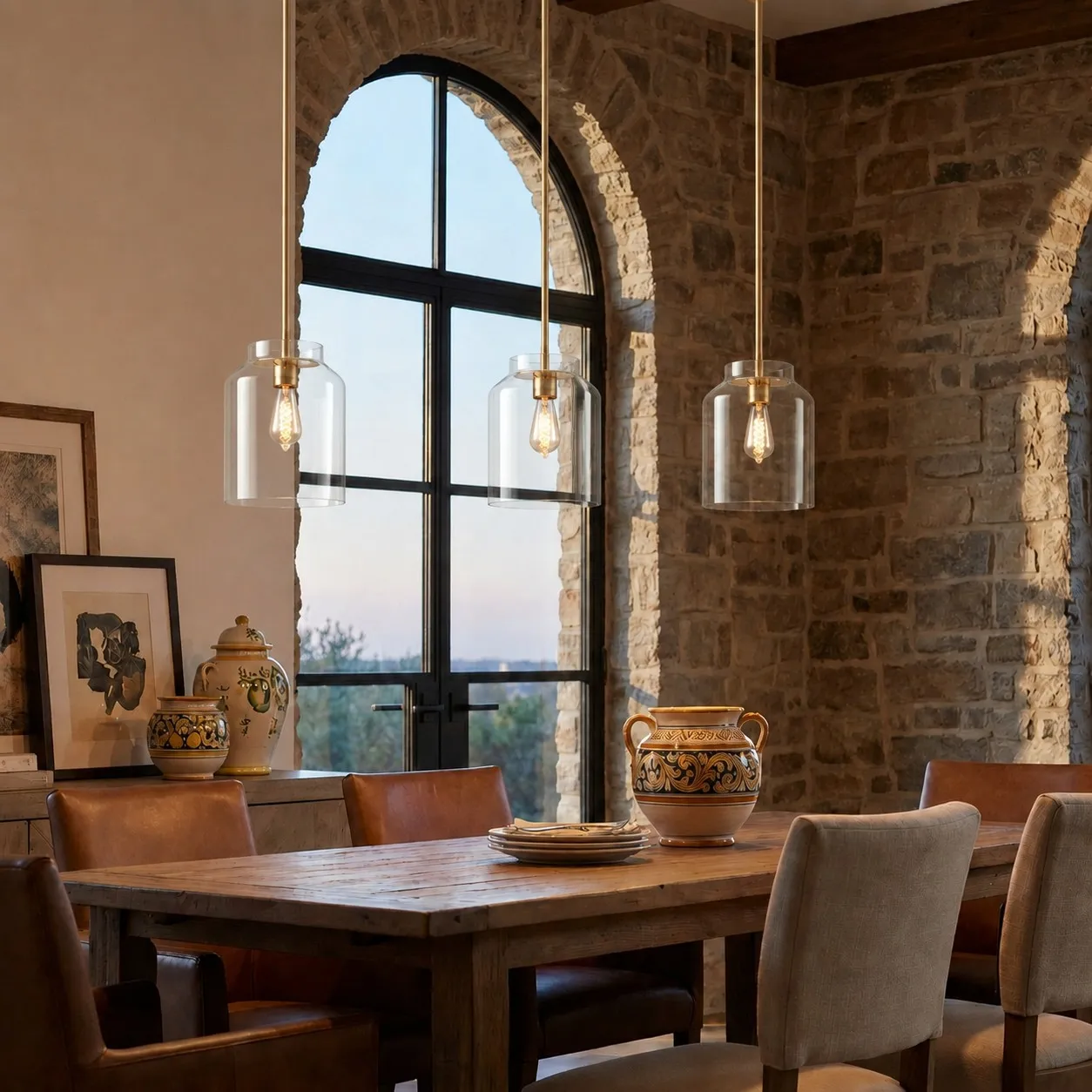
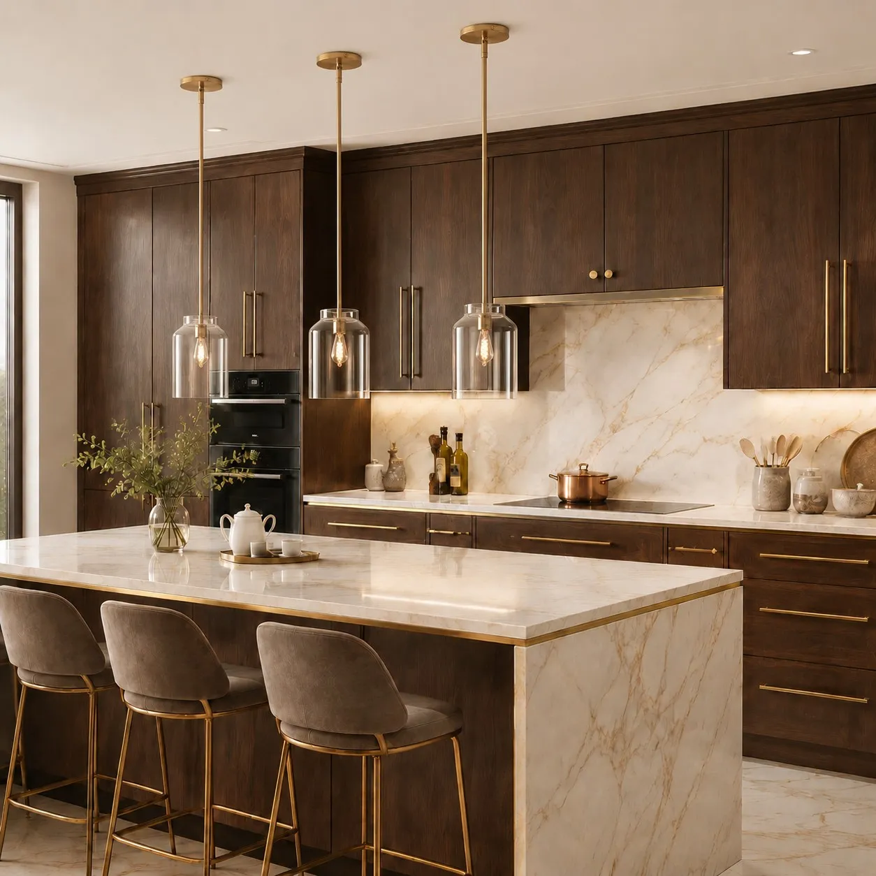
A carefully styled product photograph may include:
- The fixture;
- Room size;
- Ceiling height;
- Furniture scale;
- Wall and floor colors;
- Window orientation;
- Daylight;
- Supplemental photographic lighting;
- Camera lens;
- Exposure and white balance;
- Color editing;
- Image cropping.
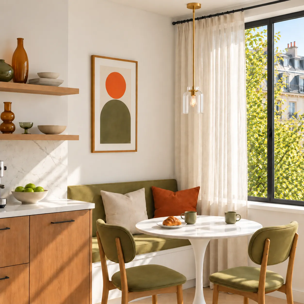
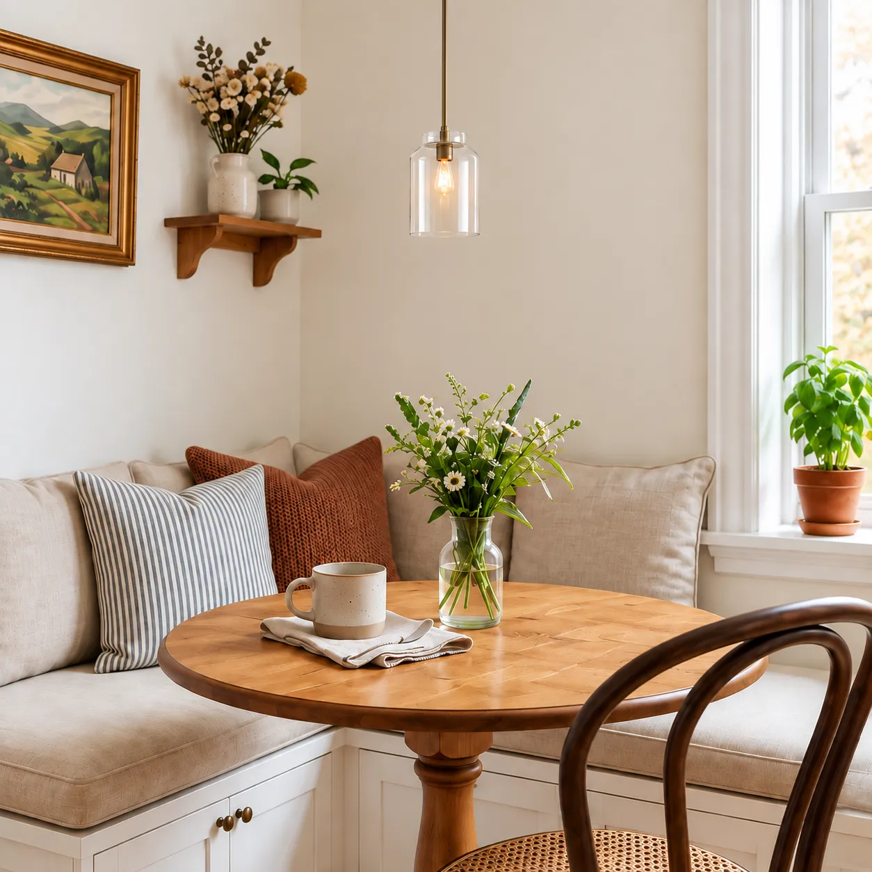
When you buy the pendant, you do not also receive the ceiling height, dining table, wall paint, window direction or photographic lighting used in the image.
Even when the correct product arrives, placing it in a different visual environment can produce a noticeably different result.
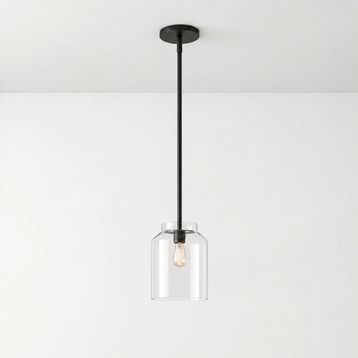
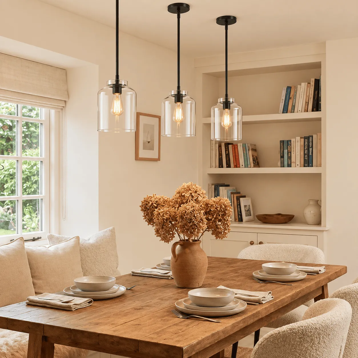
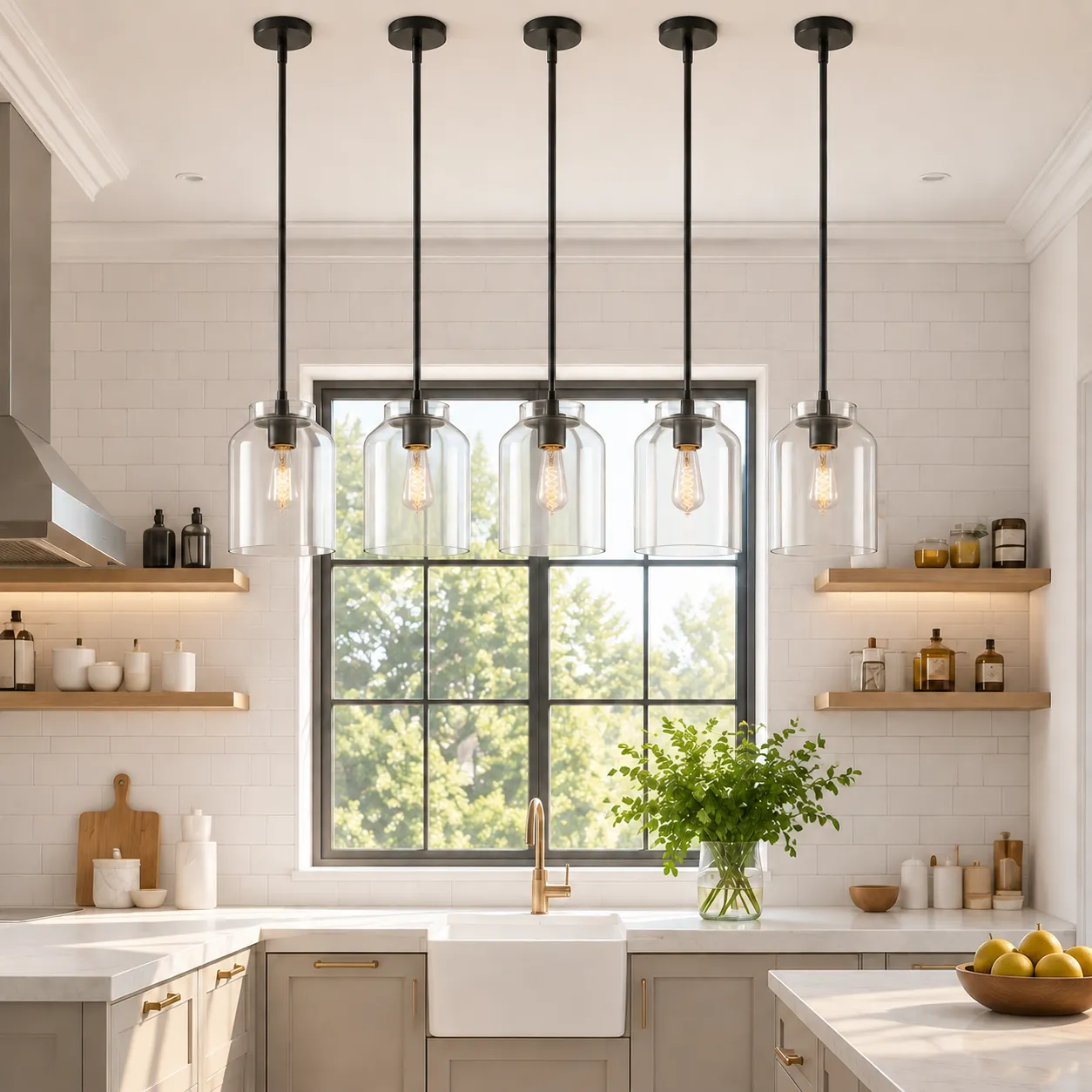
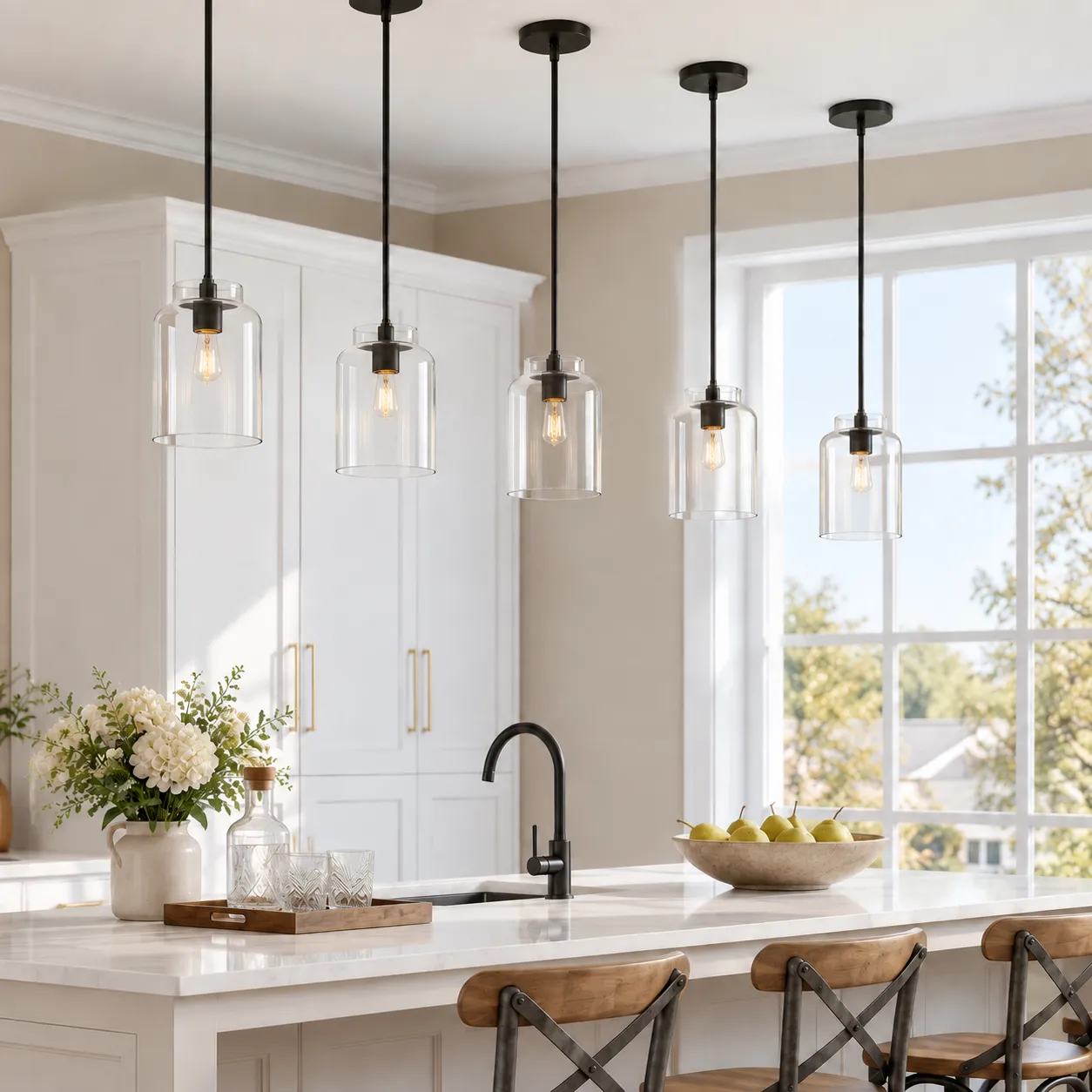
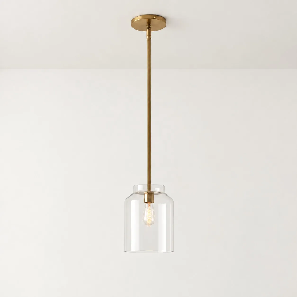
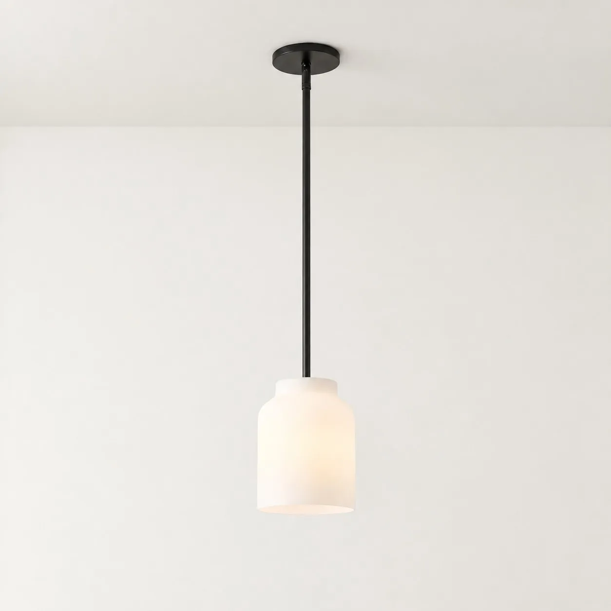
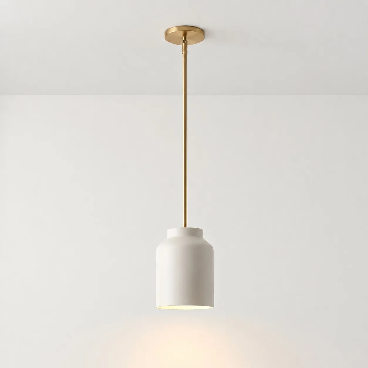
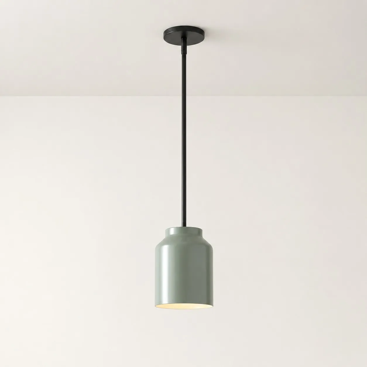
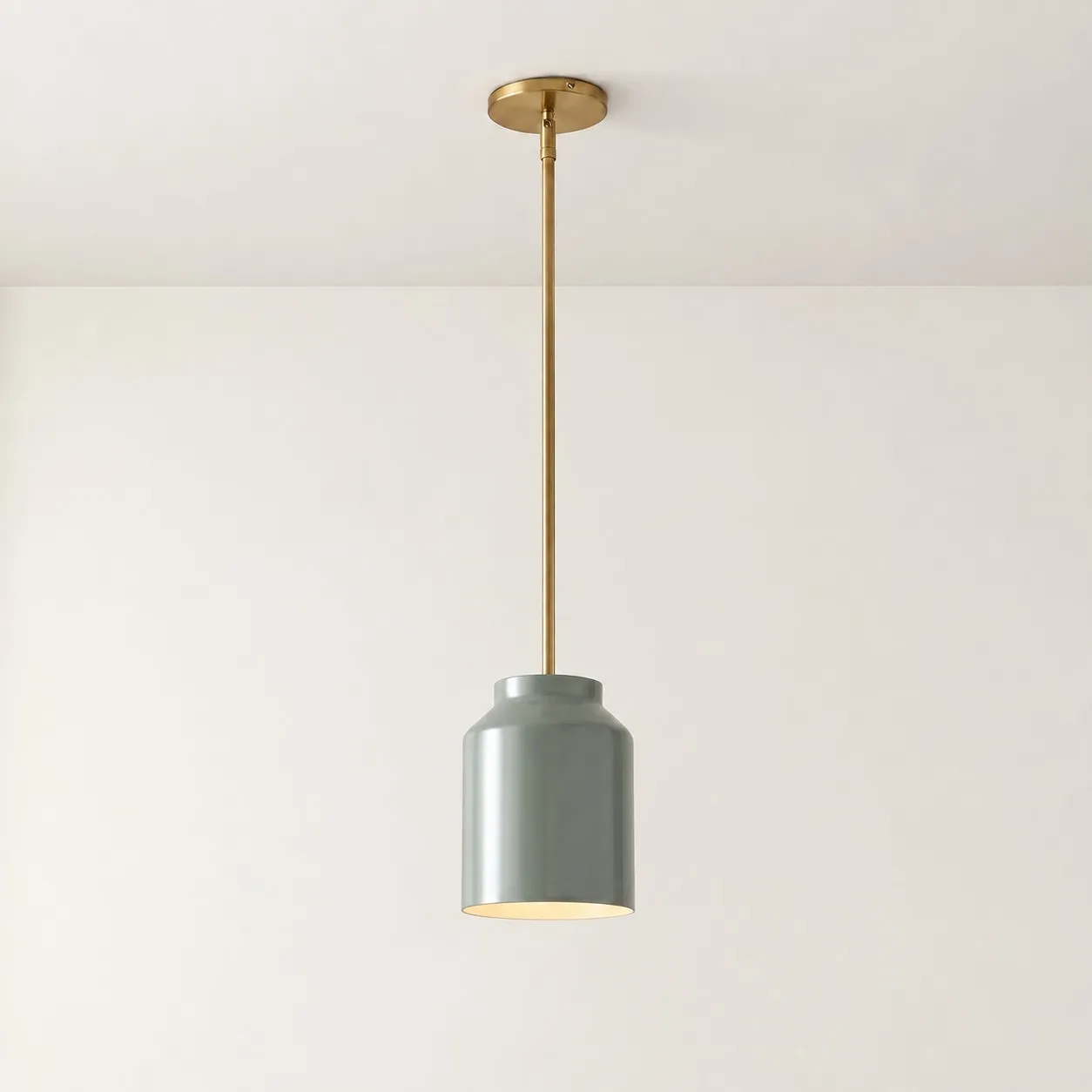
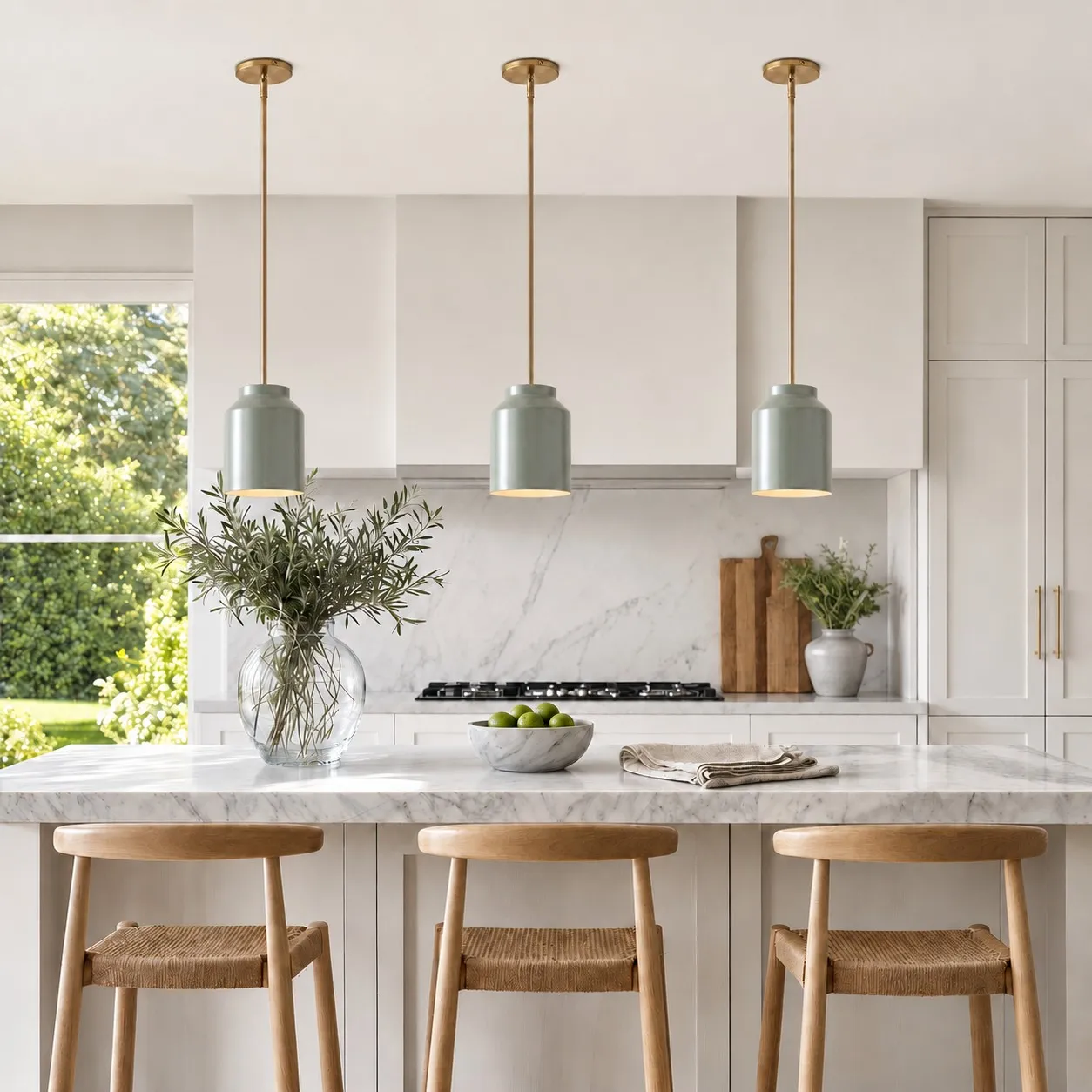
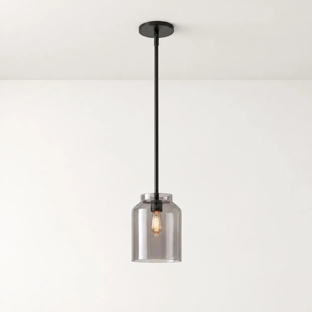
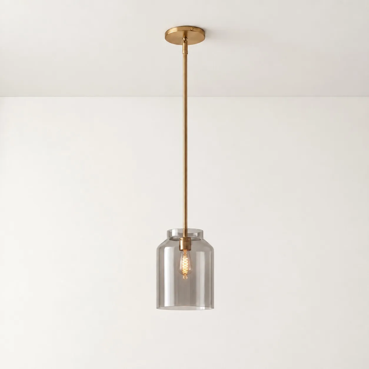
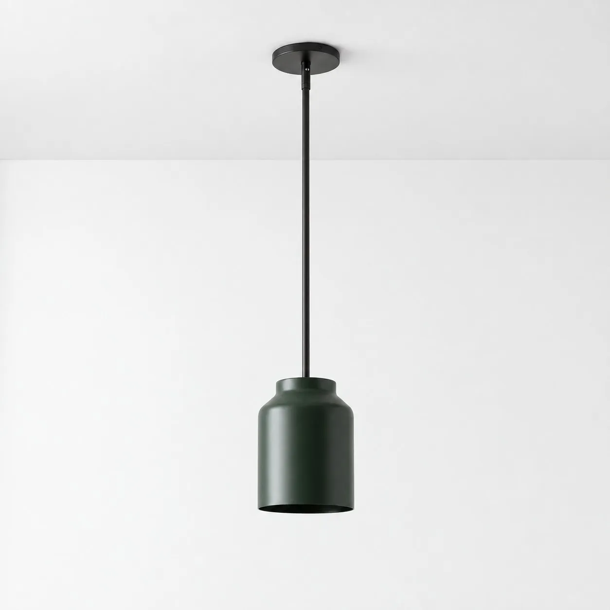
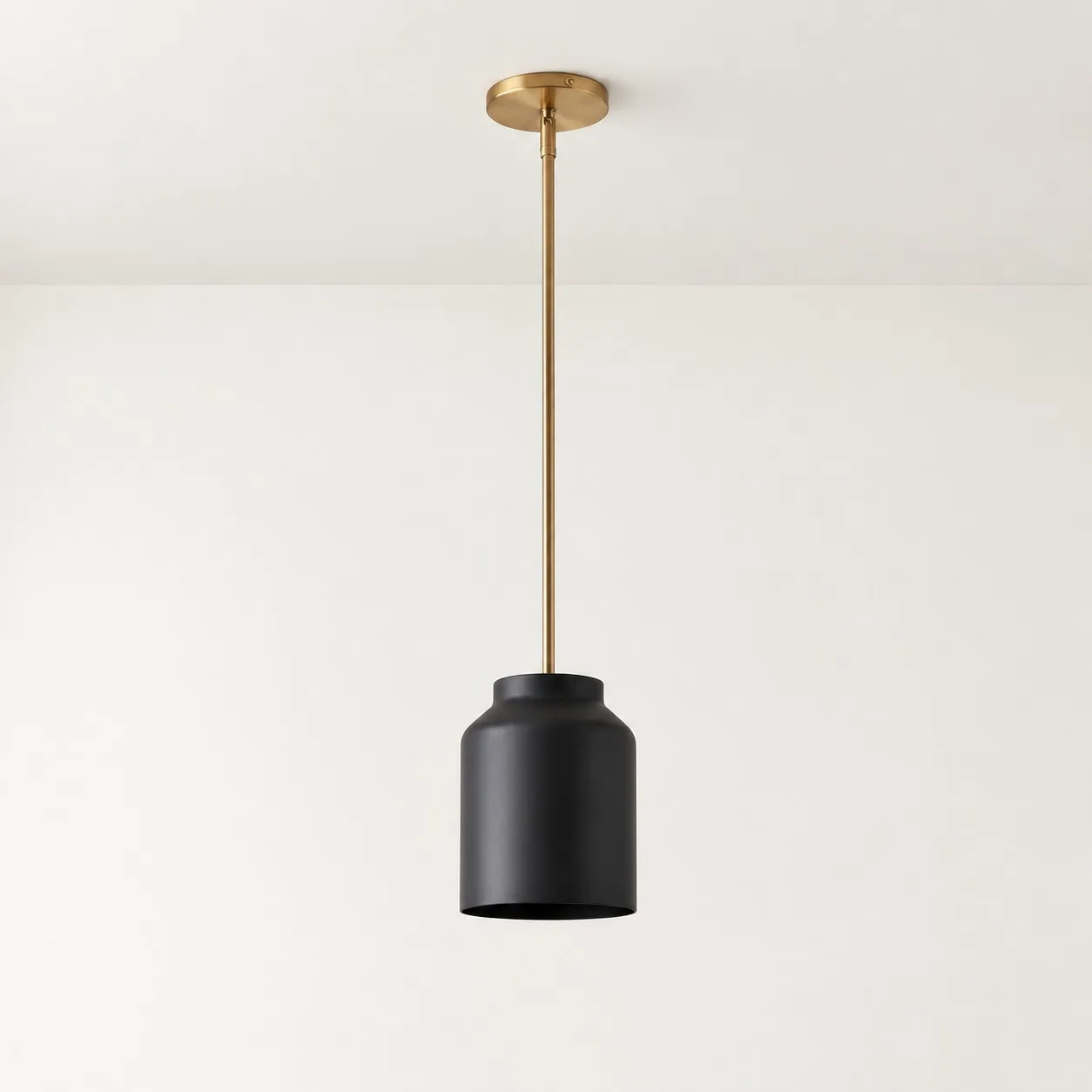
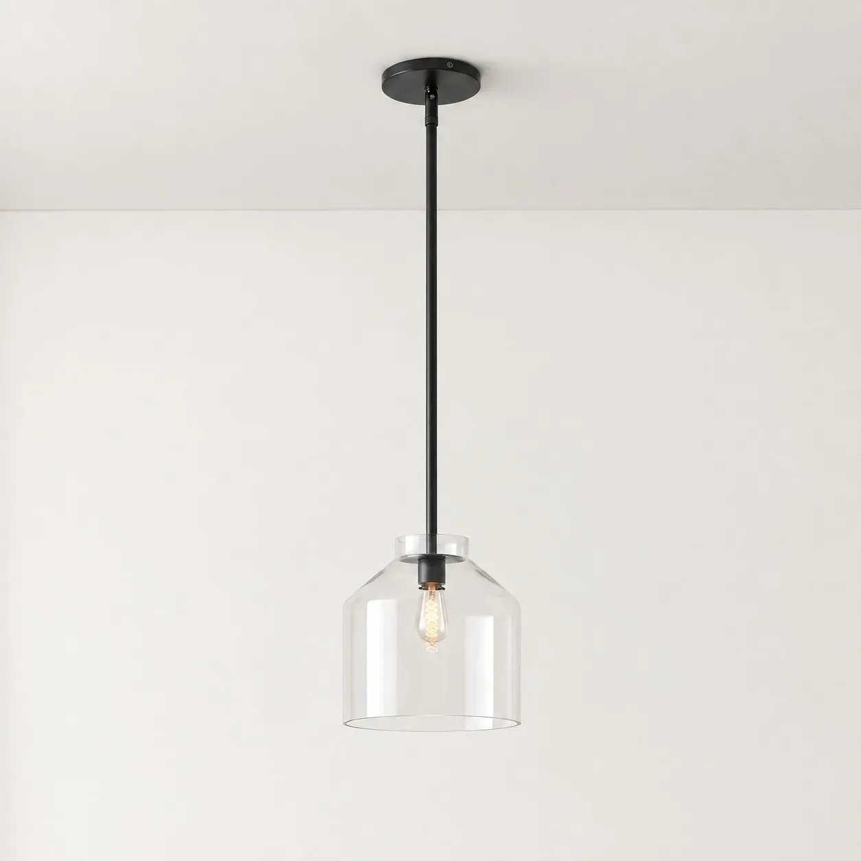
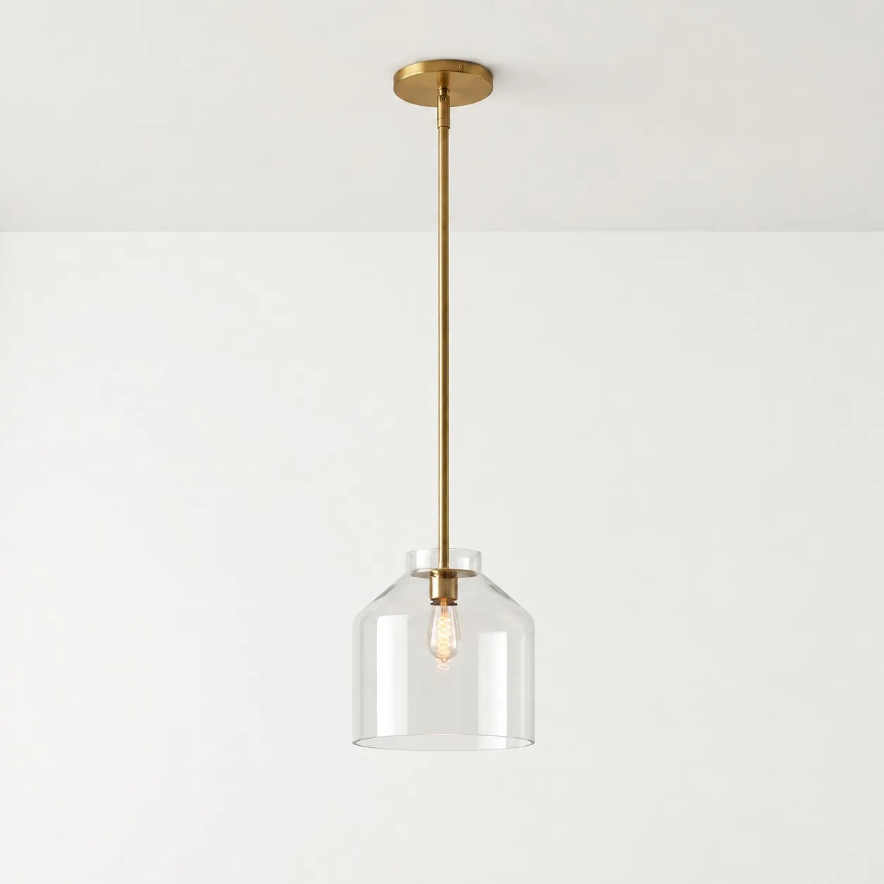
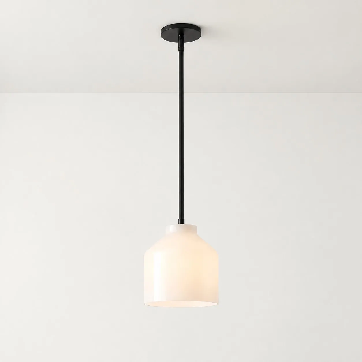
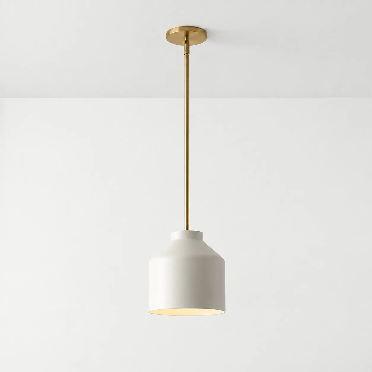
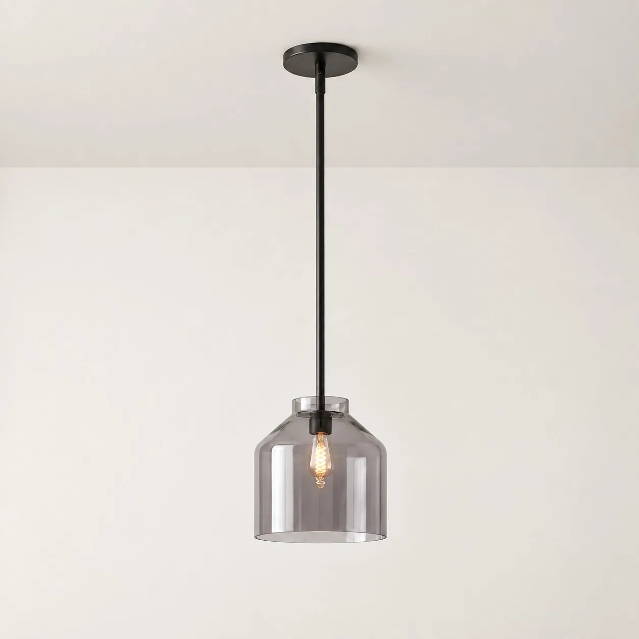
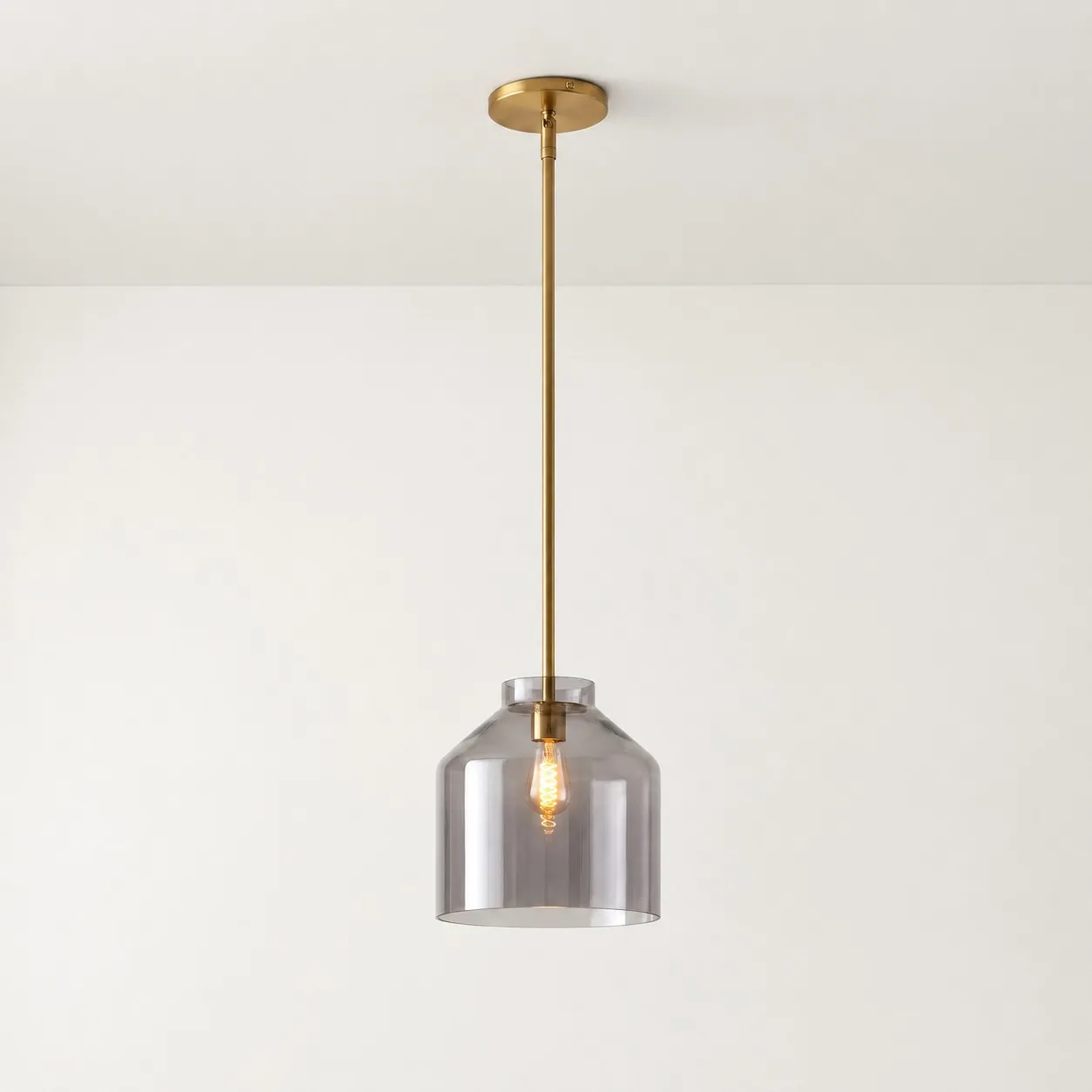
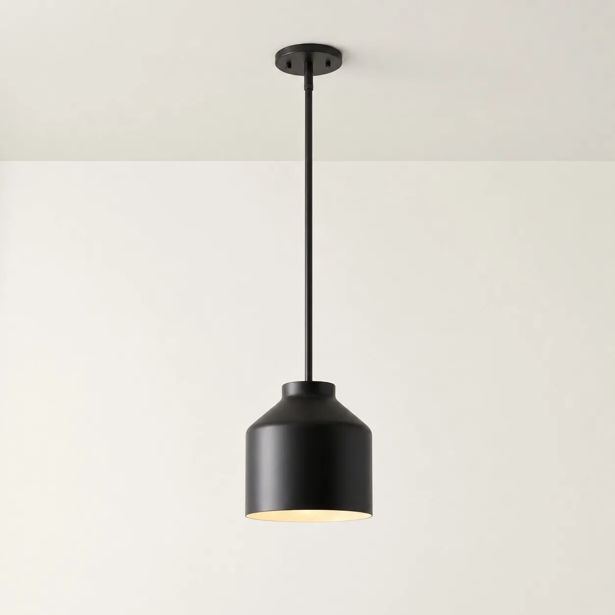
The Hanton Nordic Minimalist Pendant Light is a useful example. Its metal surface, muted color, open bottom and adjustable height can all be affected by ambient light, bulb choice and room proportions.
The goal should not be to turn your home into the room shown online. It should be to make the fixture look balanced, comfortable and appropriate in the home where it will actually be used.
1. Cameras and Screens Change Color Before You Order
An online product image is not a direct copy of what the human eye saw. Light first passes through a camera and is then processed, compressed and displayed on a screen.
How cameras change a pendant’s appearance
A camera or editing process may adjust:
- White balance;
- Exposure;
- HDR;
- Shadow brightness;
- Highlights;
- Saturation;
- Contrast;
- Sharpness;
- Background blur.
These adjustments are not necessarily intended to conceal the product. They may simply make the photograph easier to view. Even so, they affect the result.
For example:
- Raised shadows reveal more detail in a black shade;
- Reduced highlights make a metal surface appear softer;
- Warm white balance makes beige and muted green feel warmer;
- Increased contrast makes the edge of a curved shade more defined;
- Added saturation makes muted colors appear more vivid.
The screen changes it again
Even an accurate original image can look different on another device.
Common causes include:
- Night mode;
- Eye-comfort settings;
- Screen brightness;
- Display color temperature;
- Different color gamuts;
- Image compression;
- Browser rendering.
When a product image is viewed with night mode enabled, white may appear yellow, muted green may look gray or olive, and beige may appear warmer than the physical finish.
Before ordering:
- View the product on at least two devices;
- Turn off night mode and eye-comfort settings;
- Compare white-background, detail and lifestyle images;
- Do not judge color from one photograph;
- Confirm which size and finish each lifestyle image shows.
2. Daylight Changes the Pendant Throughout the Day
A pendant will not maintain one fixed appearance after it is installed.
Daylight is affected by:
- Window orientation;
- Time of day;
- Weather;
- Season;
- Curtain color;
- Nearby buildings;
- Reflections from walls and floors.
Morning or overcast light may feel cooler and make gray or metallic characteristics more visible. Afternoon sun is often warmer and may deepen beige, yellow or warm-gray finishes. Strong side light can reveal the curve of a shade, while flat frontal light may make a metal surface appear less dimensional.
The Hanton’s metal shade and muted finishes can change visually as daylight changes. An online image may have captured the product during the most flattering light for that particular finish, while the buyer first sees it under entirely different conditions.
Do not judge the installed pendant from one brief viewing. Examine it:
- During daylight with the bulb switched off;
- At dusk when daylight and electric light mix;
- At night under indoor lighting only.
If the fixture looks different under only one lighting condition, the environment is more likely to be responsible than an incorrect finish.
3. Bulb Color Temperature Can Make the Shade Look Like a Different Color
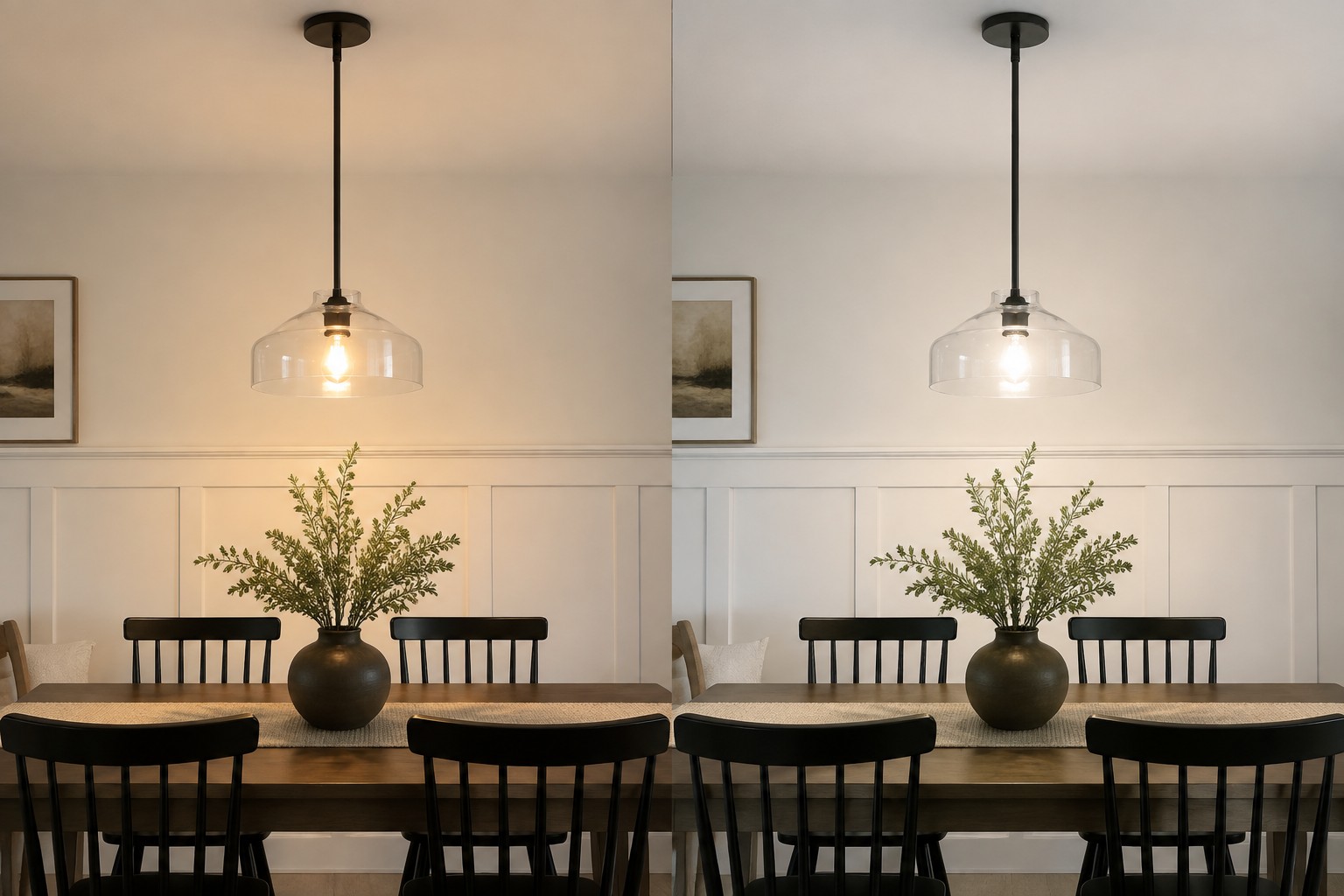
A bulb does more than illuminate the room. It changes the perceived color of everything it lights.
Typical appearances include:
- Around 2700K: distinctly warm, with more yellow or orange;
- Around 3000K: warm but often clearer than 2700K;
- Around 3500K: between warm and neutral;
- Around 4000K: more neutral and crisp, but potentially cooler.
Color temperature may affect a pendant shade in several ways:
- Off-white may look yellow under 2700K;
- Muted green may shift toward olive under warm light;
- Gray may look slightly blue under cooler light;
- Black metal may reflect a subtle brown tone under warm light;
- White may appear creamy or cool depending on the bulb.
This explains why a pendant can look accurate while switched off but appear different as soon as the bulb is turned on.
The Hanton uses an E26 socket, so the owner can test another compatible bulb. If the first bulb makes the shade look too yellow, gray or cold, try a different color temperature before deciding that the fixture itself is the wrong color.
Change only one variable at a time. Keep the height and other room lighting unchanged so that you can see whether the bulb was genuinely responsible.
4. CRI Affects How Accurately You See the Pendant and the Room
Two bulbs labeled 3000K may still render the same pendant differently.
Color temperature describes whether nominally white light appears warmer or cooler. It does not fully describe how the source renders object colors.
CRI, or color rendering index, describes how faithfully a light source renders colors. The U.S. Department of Energy generally recommends a minimum CRI of 80 for interior lighting, while 90 or higher indicates excellent color fidelity.
Lower color-rendering quality may cause:
- Muted colors to appear dull;
- Wood to lose some warmth;
- Food to look less natural;
- Green or red finishes to shift;
- Subtle differences in metal finishes to become harder to see.
If accurate pendant, wall, wood and food colors matter, a higher-CRI bulb can be a sensible choice.
High CRI cannot guarantee a perfect match with an online photograph. Screens, daylight, color temperature and nearby surfaces still affect the result. It only reduces some of the distortion introduced by the light source.
5. Walls, Cabinets and Furniture Change the Color by Contrast
The eye does not judge a pendant’s color in isolation. It compares the fixture with its background.
The same light-colored pendant may:
- Appear darker against a white wall;
- Appear brighter against a dark wall;
- Feel warmer around natural wood;
- Look grayer in a cool-gray kitchen;
- Lose some green contrast near green cabinets;
- Develop a stronger outline against black.
The pendant itself has not changed. The background has changed how the color is perceived.
Surrounding surfaces also reflect color onto the shade:
- Wood floors and furniture create warm reflections;
- Green walls may cast a subtle green tint;
- White counters increase overall reflected brightness;
- Stainless steel introduces cooler reflections;
- Colored curtains may tint nearby daylight.
When selecting a Hanton finish, do not ask only whether the color looks attractive on its own. Consider how it will relate to the largest surfaces in the actual room:
- Walls;
- Cabinets;
- Dining table or island;
- Flooring;
- Large furniture.
A practical approach is to connect the pendant finish to at least two elements that are likely to remain in the room instead of copying the palette of an unrelated product photograph.
6. Matte Metal Needs the Right Light to Show Its Texture
Product photographers can use side light, rim light and large soft light sources to reveal the curve and edge of a metal shade.
If the home provides only flat overhead illumination, or the window is directly in front of the fixture, matte metal may appear less dimensional than it did online.
Side lighting often reveals:
- The curve of the shade;
- Edge definition;
- Surface coating;
- Gradual light and shadow;
- A sense of material thickness.
This is why a fixture may look detailed in daylight from the side but ordinary at night under a single flat ceiling light.
A pendant that “looks cheap at home” is not necessarily suffering from a price problem. Other causes include:
- Poor scale relative to the table;
- An unsuitable hanging height;
- A bulb extending below the shade;
- Untidy suspension cable;
- A crooked canopy;
- Flat room lighting;
- A lack of supporting textures and colors.
Check scale, installation and light before trying to solve the problem with more decoration.
7. Wide-Angle Product Photos Distort Size and Distance
Interior product photography frequently uses a wide-angle lens to capture more of the room.
A wide-angle lens may:
- Enlarge objects close to the camera;
- Push the background farther away;
- Make the room appear larger;
- Exaggerate distances between the fixture and furniture;
- Reduce the apparent pressure of a low ceiling;
- Change the visual relationship between the pendant and table.
Cropping may also hide:
- The full ceiling height;
- Actual suspension length;
- Real table dimensions;
- The scale of the fixture relative to people;
- Room boundaries.
Why does the pendant look too large at home?
Possible reasons include:
- The real ceiling is lower;
- The dining table is narrower;
- The pendant is hanging lower;
- Nearby walls are closer;
- The viewer stands closer to the fixture;
- A larger shade variant was selected.
Why can it look too small?
Possible reasons include:
- The table is longer;
- The ceiling is higher;
- The room is larger;
- The product image uses several pendants;
- The fixture is hanging too high;
- A smaller variant was selected.
Never estimate size from a lifestyle image alone. Actual measurements are more reliable than visual proportions in a photograph.
8. Hanging Height Changes Scale, Shape and Light
The same pendant can look very different at different heights.
When the Hanton hangs lower:
- The shade occupies more of the visual field;
- Its relationship with the table becomes stronger;
- It acts more clearly as a focal point;
- Its pool of light may feel more defined.
When it hangs higher:
- The shade may appear smaller;
- Its relationship with the table becomes weaker;
- The open bottom and bulb may become more visible to seated diners;
- Light may spread more before reaching the table.
Height also changes how much of the upper surface, lower opening and internal bulb the viewer can see.
After installation, inspect the pendant from two positions:
- Standing at the room entrance;
- Sitting at the dining table.
A pendant may appear perfectly proportioned from the entrance yet feel too low, too bright or visually oversized from a seat.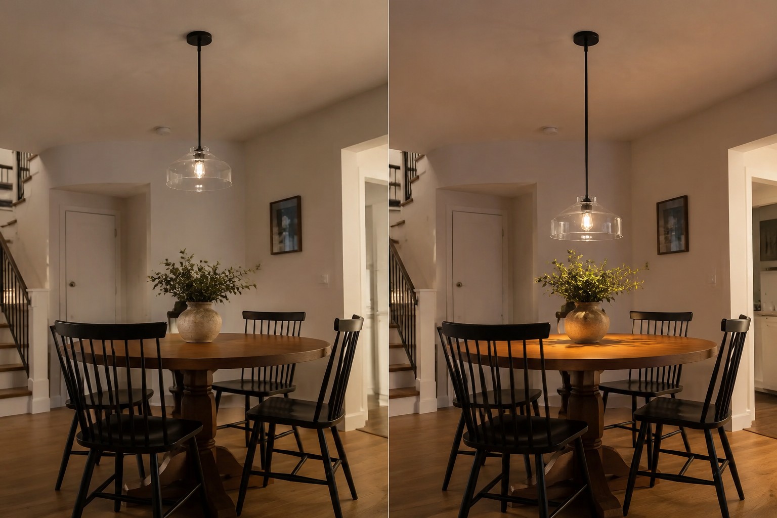
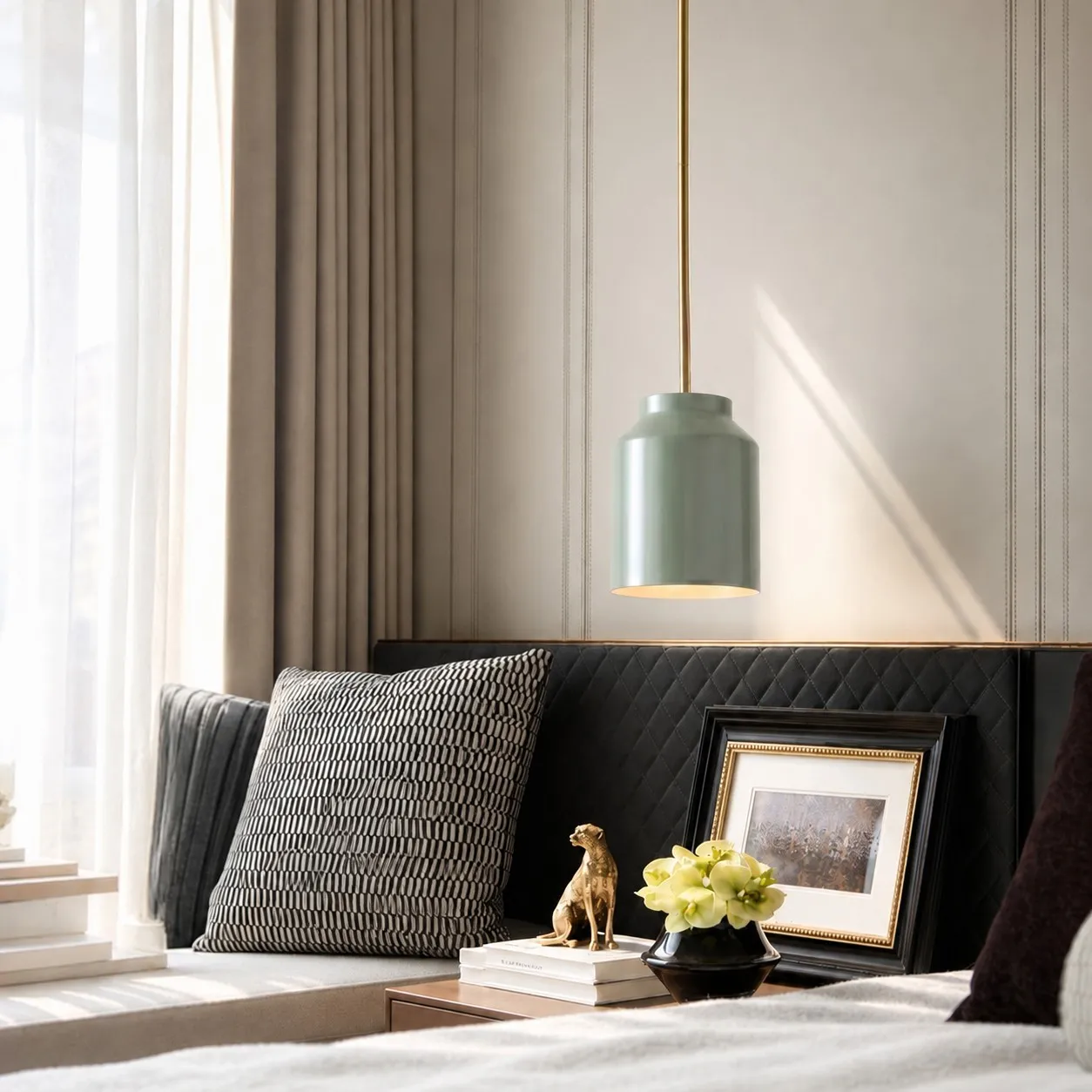
9. The Room in the Product Photo Is Usually Fully Styled
The polished look of a product photograph rarely comes from the pendant alone.
The scene may already include:
- Properly scaled furniture;
- A rug;
- Curtains;
- Plants;
- Wall art;
- Tableware;
- Wood and textiles;
- Supporting light sources;
- Decorative elements that repeat the pendant color.
If the fixture has just been installed while the room still has empty walls, unfinished furniture placement, untidy suspension cables or no ambient lighting, the pendant may look isolated or abrupt.
Do not judge the final result within the first five minutes after installation. First complete:
- Canopy and cable adjustment;
- Bulb selection;
- Basic furniture placement;
- Simple tabletop styling;
- Daytime and nighttime observation.
Styling cannot correct the wrong size or an incorrect product, but it can help the pendant become part of the room instead of remaining an isolated object.
10. Make Sure You Received the Exact Variant Shown Online
Sometimes the difference is not caused by lighting. The wrong option may have been selected or delivered.
Check:
- Product name;
- Shade color;
- Shade dimensions;
- Single- or multi-light version;
- Canopy finish;
- Cable color;
- Included components;
- Installation version;
- The option shown in each product image.
Some product pages use the same lifestyle photograph for several sizes and finishes. If the photograph shows a larger shade while you selected the smaller version, the installed proportions will not match.
Confirming the variant is the first step in separating environmental differences from a genuine order problem.
How to Preview a Pendant Before You Order
1. Do not estimate size from a lifestyle image
Read the actual measurements and create a simple front-view outline using cardboard, newspaper, kraft paper or removable painter’s tape.
The model does not need to look attractive. It only needs to approximate the shade’s real width and height.
2. Simulate the hanging position
Suspend the lightweight template at the intended location. Inspect it from the room entrance and from the seats.
Look for:
- Visual pressure;
- Relationship with the table;
- Blocked sightlines;
- Whether one pendant is enough;
- Whether several pendants would feel balanced.
3. Check three lighting conditions
Observe the intended area during daylight, mixed light at dusk and electric light at night. This helps predict how color and material may change.
4. Make a simple phone mock-up
Take a straight-on photograph of the room and place the product image into it at an approximate real-world scale.
The mock-up cannot predict true material or lighting, but it can help evaluate quantity, visual size, hanging height and relationship with the table.
5. Decide on the bulb before installation
At minimum, confirm:
- Socket type;
- Color temperature;
- Lumen output;
- CRI;
- Clear or frosted glass;
- Dimming requirements;
- Whether the bulb physically fits the shade.
Already Installed? Diagnose One Variable at a Time
If the pendant is already installed, do not simultaneously change the bulb, height, furniture and wall color. You will not know which variable caused the improvement.
If the color looks wrong
- Switch off the pendant and inspect the shade in daylight;
- Test a different bulb color temperature;
- Turn off night mode and compare the online image again;
- Hold white paper near the shade to reveal an environmental color cast;
- Confirm the finish variant you received.
If it looks too large or too small
- Check the actual shade dimensions;
- Confirm the variant used in the online photograph;
- Measure the table width and length;
- Review the hanging height;
- Compare standing and seated views;
- Check whether the photograph showed one or several fixtures.
If it looks flat or inexpensive
- Check whether the bulb extends below the shade;
- Make sure the suspension is tidy;
- Confirm that the canopy is level;
- See whether the fixture receives any side light;
- Consider whether the room is still unfinished;
- Check whether the fixture is properly scaled to the furniture.
If the light effect looks different
- Check color temperature;
- Check lumen output;
- Check CRI;
- Compare clear and frosted bulb finishes;
- Identify other light sources in the room;
- Check whether the product photograph was taken during the day or at night;
- Consider whether supplemental photographic lighting was used.
What Can Be Adjusted—and What May Justify a Return?
Issues that can often be adjusted
- Unsuitable bulb color temperature;
- Excessive bulb output;
- A clear bulb that creates glare;
- Poor hanging height;
- Untidy suspension cable;
- Insufficient ambient light;
- Incomplete furniture and styling;
- A strongly tinted screen.
Issues that may justify a return or exchange
- The wrong finish was delivered;
- The wrong size was delivered;
- The shade shape does not match the selected variant;
- The material differs from the product description;
- The fixture is damaged;
- The actual dimensions cannot safely fit the room;
- The structure remains unsuitable after reasonable bulb and height adjustments.
Helping buyers distinguish an adjustable environmental problem from a genuine product mismatch is more useful than automatically encouraging them to keep the fixture.
How to Make the Hanton Look More Like the Online Photos
If the Hanton is installed but looks different from what you expected, adjust it in this order:
- Confirm the selected finish and shade size;
- Use an E26 bulb that meets the product specifications;
- Test approximately 2700K to 3000K for a softer, warmer result;
- Try a more neutral bulb if the finish looks too yellow or gray;
- Use a frosted bulb in the open-bottom shade to reduce glare;
- Adjust the suspension according to the table proportions;
- Inspect bulb visibility from a seated position;
- Connect the pendant color with at least two room elements;
- Observe it during both day and night;
- Change only one variable at a time.
No home can reproduce a product photograph exactly unless the room, camera, daylight, bulb, furniture and image processing are also identical.
A more realistic goal is to help the Hanton achieve balanced proportions, comfortable light and an honest material appearance in your own home—not to reproduce a commercial photograph of another room.
Final Thoughts
A pendant light does not have one permanently fixed appearance. It changes with the light source, walls, furniture, viewing angle, hanging height and camera around it.
Online images can help explain the design, but they cannot replace:
- Actual measurements;
- Material specifications;
- Room proportions;
- Bulb selection;
- Daylight direction;
- Hanging height;
- Exact variant information.
The Hanton’s E26 socket and adjustable suspension leave some room for correction. If the color, brightness or proportions feel wrong, test the bulb and installation variables individually before deciding that the fixture itself is unsuitable.
If the wrong size or color arrived, the product is damaged, or its material does not match the description, the difference is no longer simply environmental and may provide a reasonable basis for a return or exchange.
Frequently Asked Questions
Why does my pendant light color look different than online?
Camera white balance, screen settings, daylight, bulb color temperature, CRI and reflected color from walls and furniture can all change the perceived finish.
Can a different bulb make the pendant shade look better?
Yes. Bulb color temperature and CRI affect how the shade and surrounding materials appear. They cannot change the fixture’s actual material or basic structure.
Why does my pendant light look too big at home?
Common causes include a lower ceiling, narrower table, wide-angle product photography, a lower hanging position or a different shade-size variant.
How can I check pendant size before ordering?
Create a paper or cardboard template using the actual product dimensions and suspend it in the intended position. Inspect it from both standing and seated viewpoints.
Does high CRI make pendant colors more accurate?
Higher CRI generally improves color fidelity, but screen display, daylight, bulb color temperature and surrounding surfaces still influence the final appearance.
Why can an inexpensive pendant look good while another looks cheap?
The final result depends on more than price. Scale, installation quality, bulb choice, cable management, background materials and lighting layers all affect perceived quality.