Black, White, or Colored Pendant Lights: Which Is Easiest to Style?
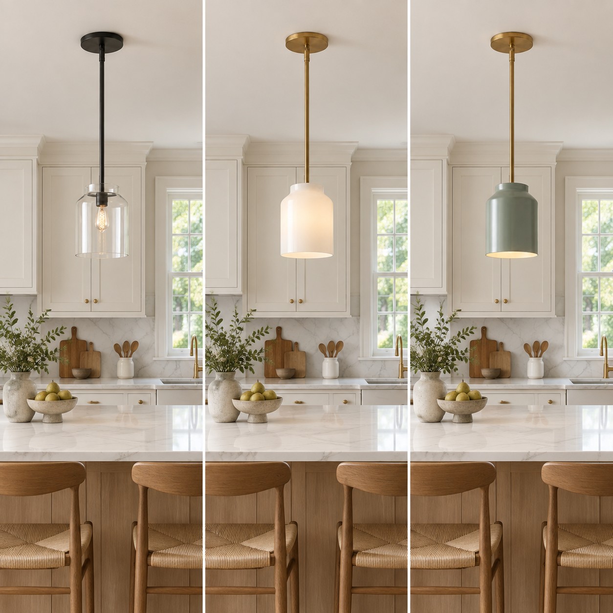
A white pendant is not automatically the safest choice, and a colored one is not automatically difficult. The easiest shade to style is the one that has a clear relationship with the room around it. Look at your cabinets, hardware, chairs, and adjoining rooms before judging a pendant against a white product-page background.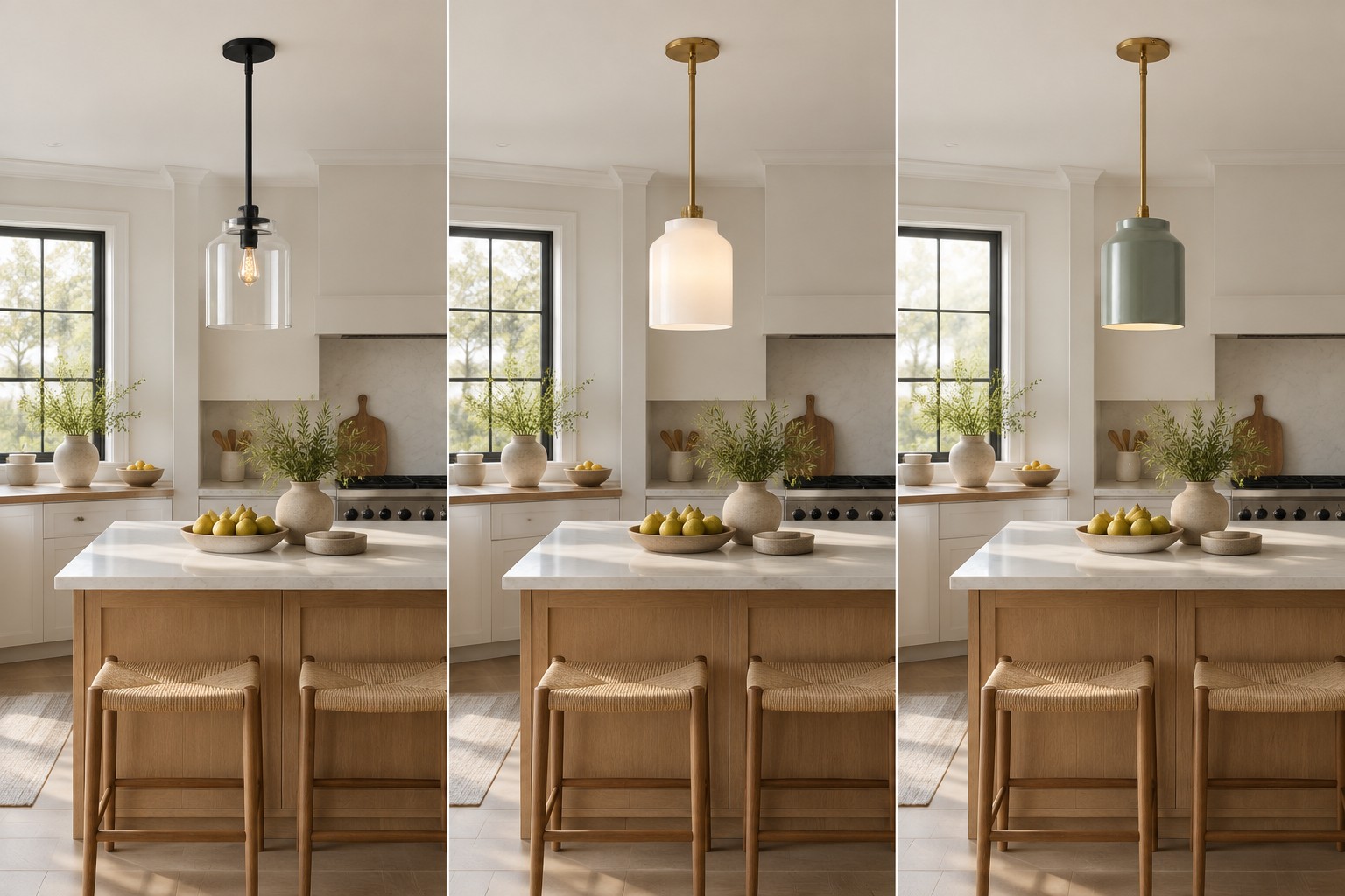
Start with what is already in the kitchen
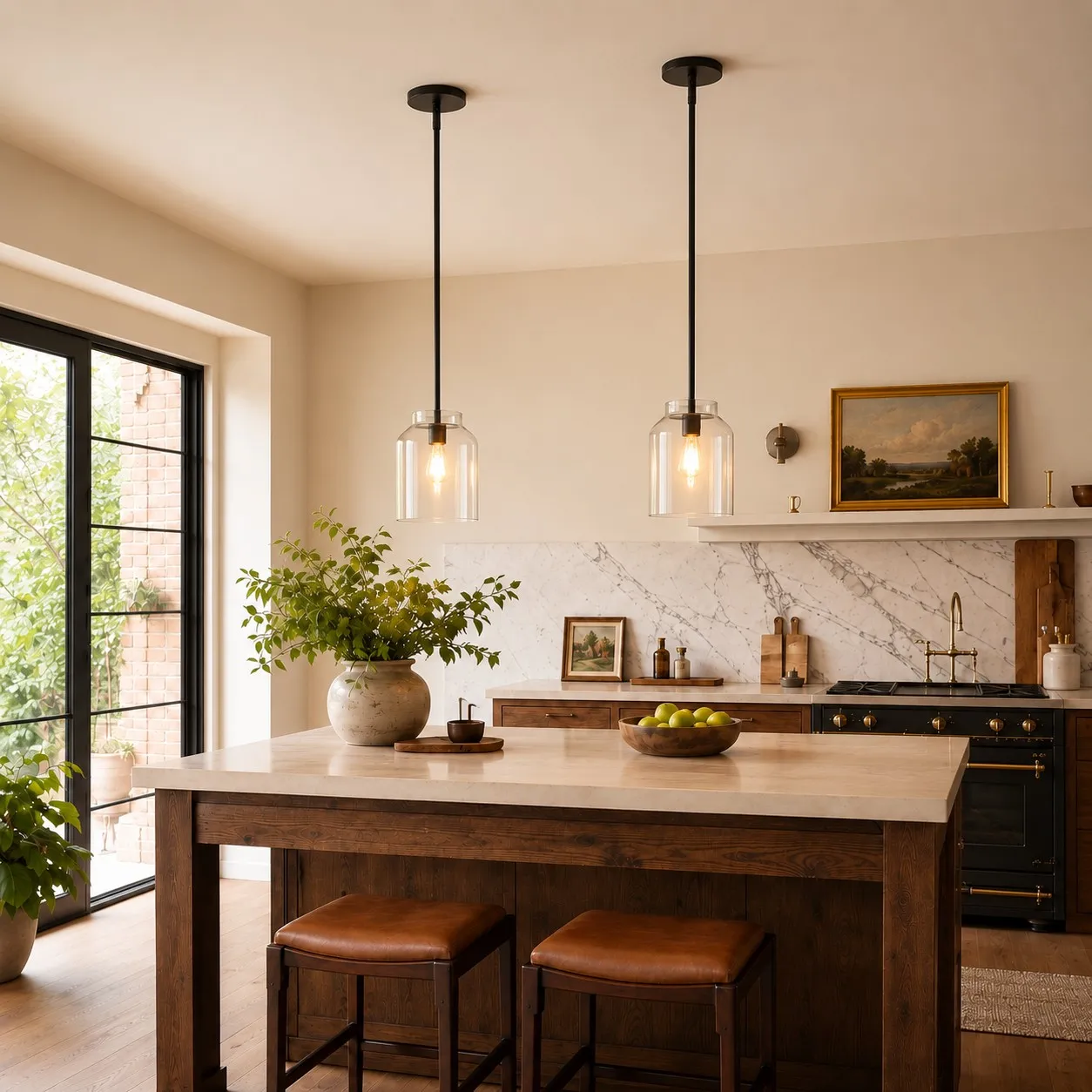
Stand where you first see the island. What catches your eye: the stone countertop, dark window frames, painted cabinets, or the view beyond them? A pendant can repeat an existing visual cue, soften it, or deliberately introduce a new one. The decision becomes much easier once you know which job it needs to do.
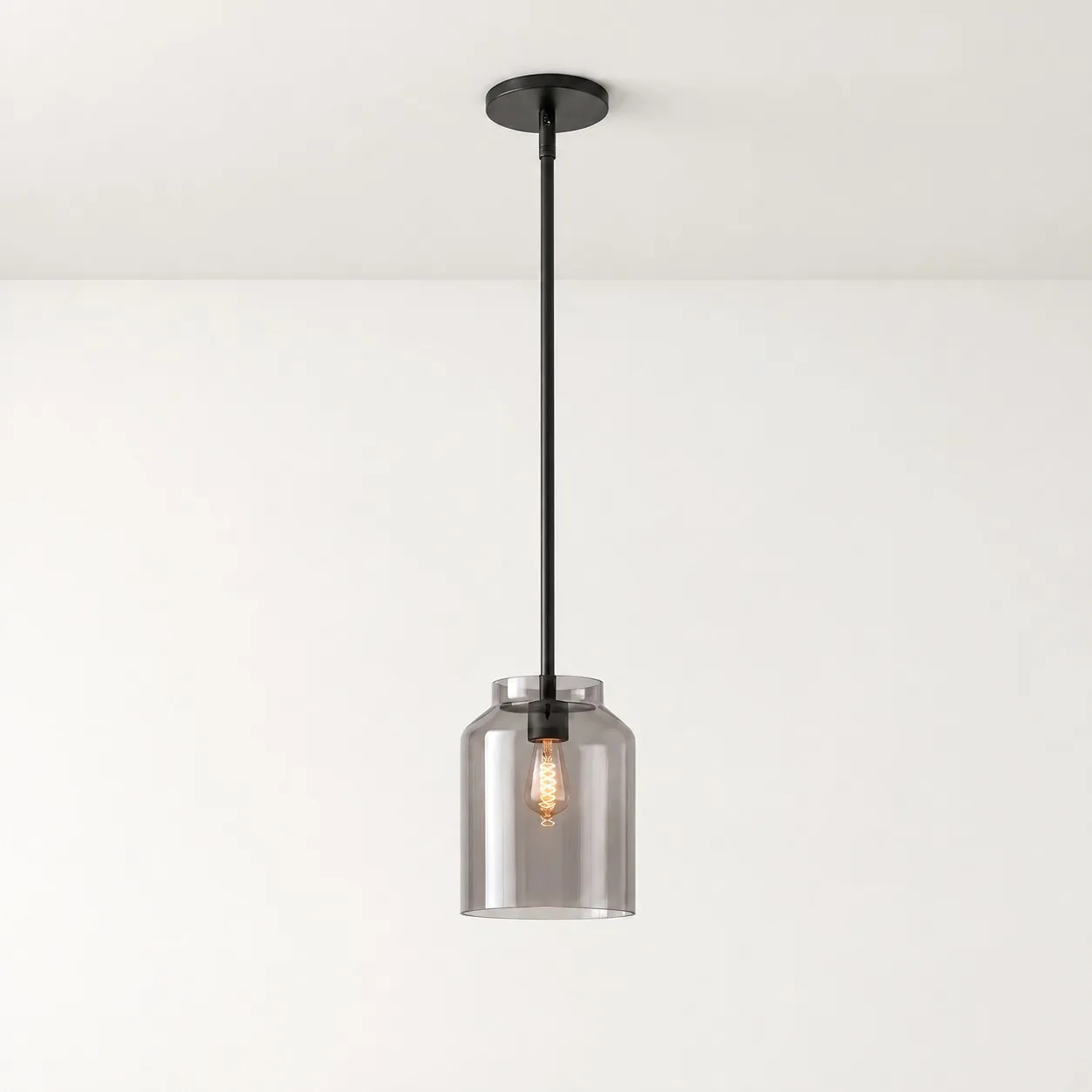
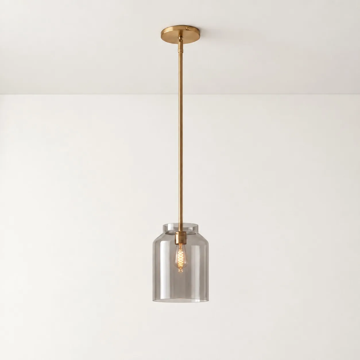
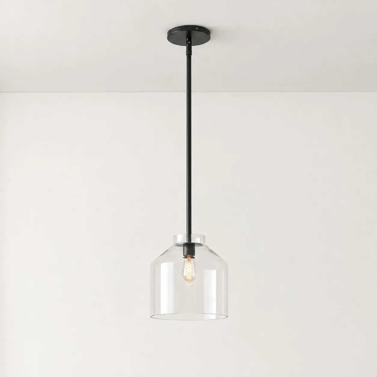
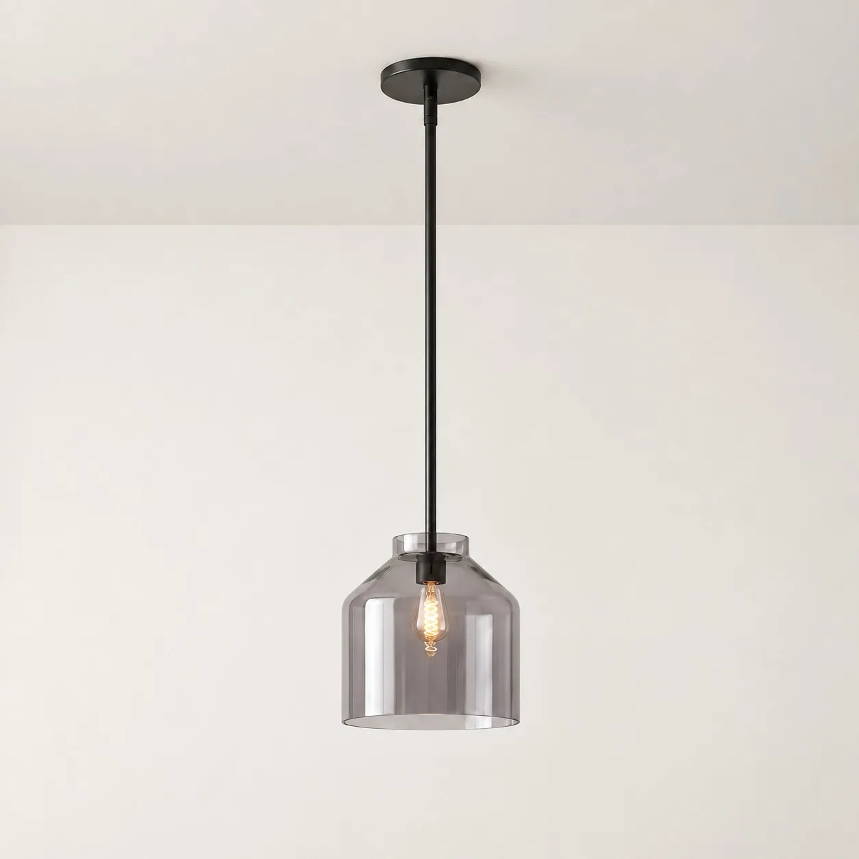
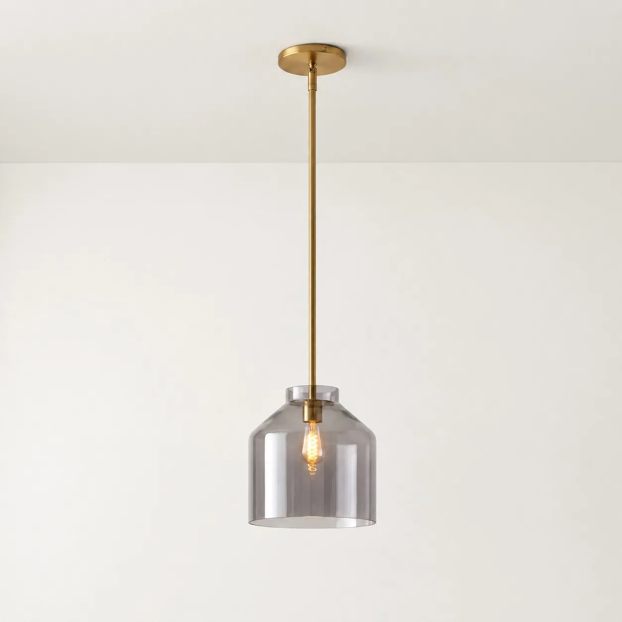
Color is only part of that job. A large white shade can have more visual weight than a small olive one, while clear glass may expose the bulb and change how prominent the fixture feels at night.
When black is easiest to style
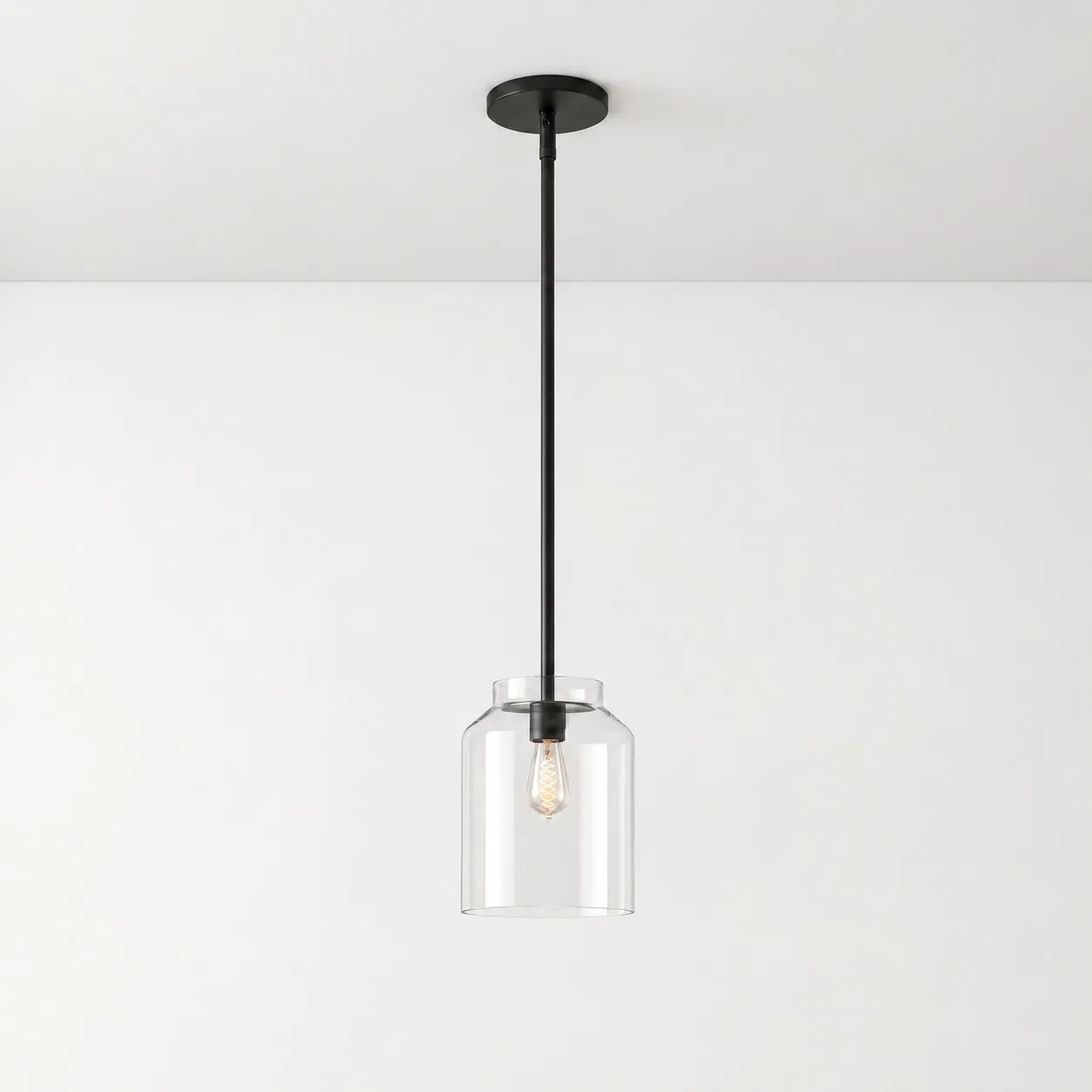
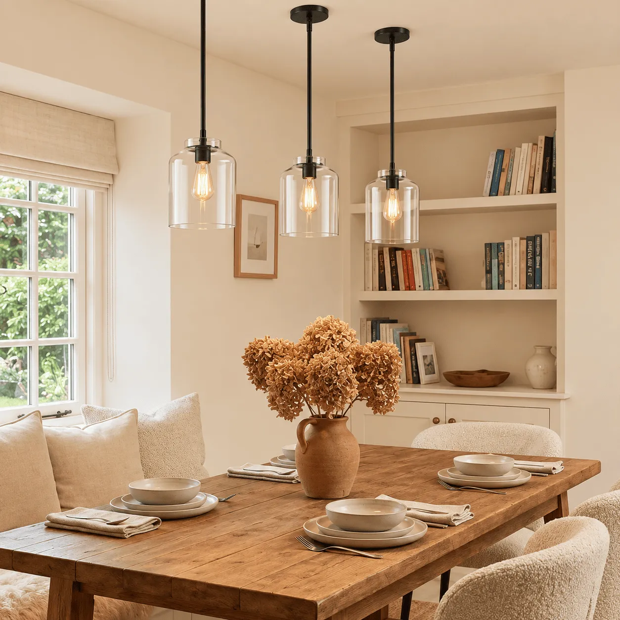
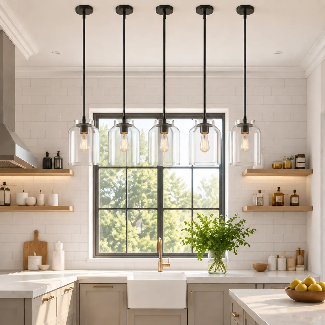
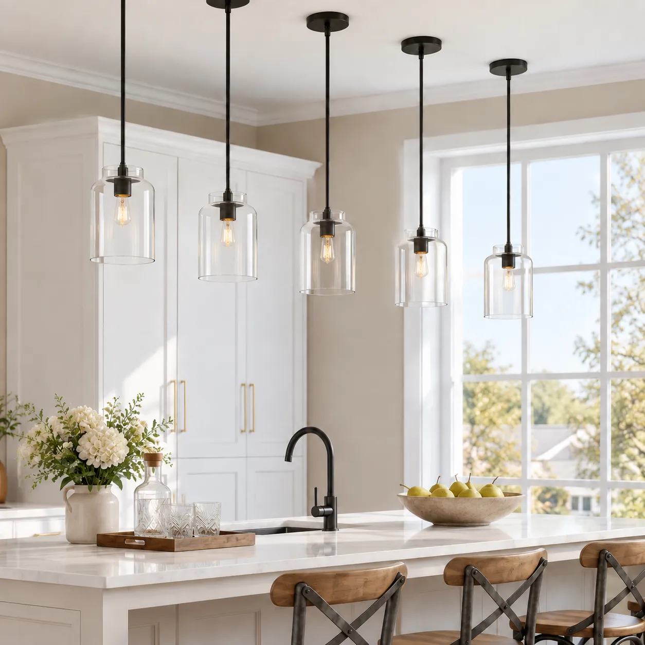
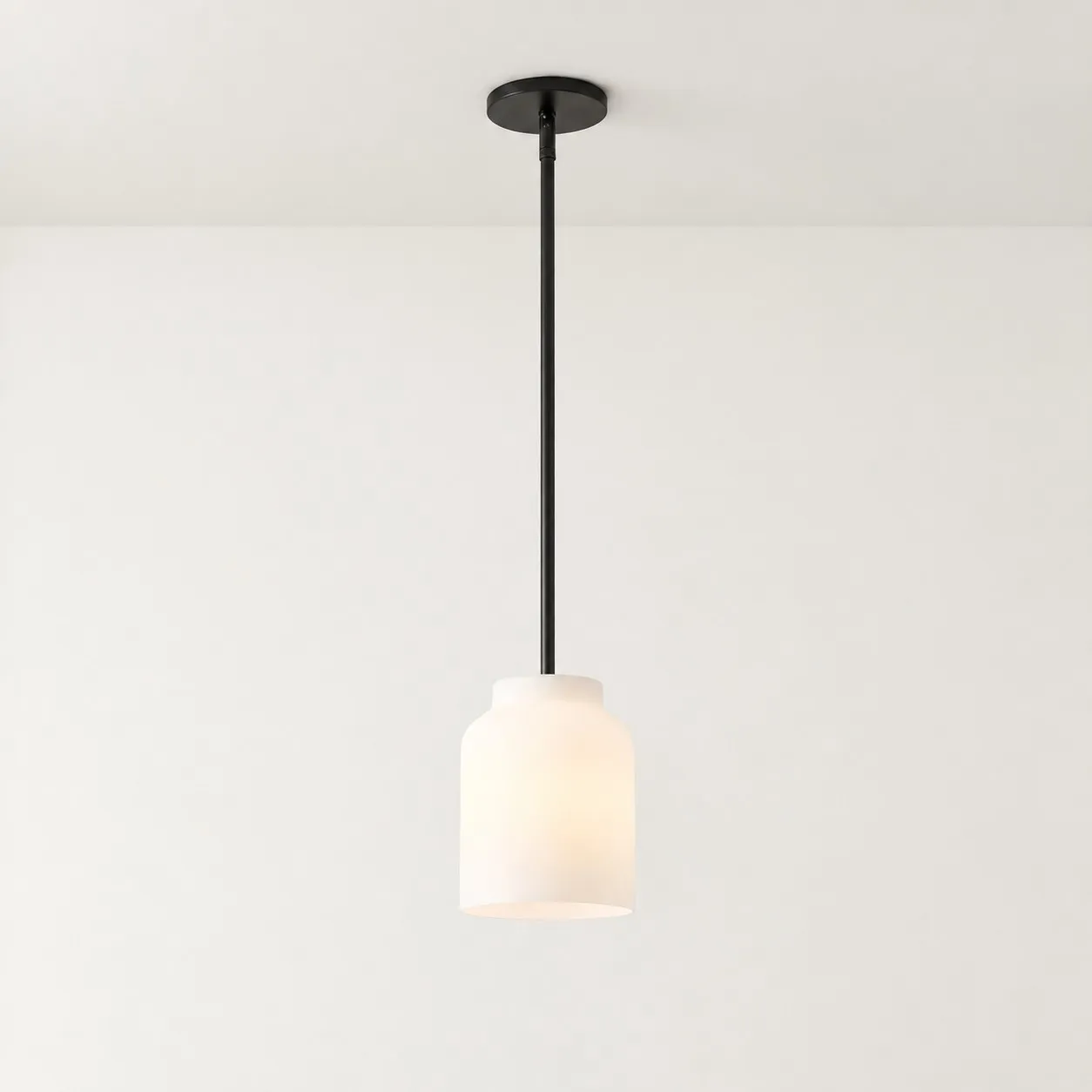
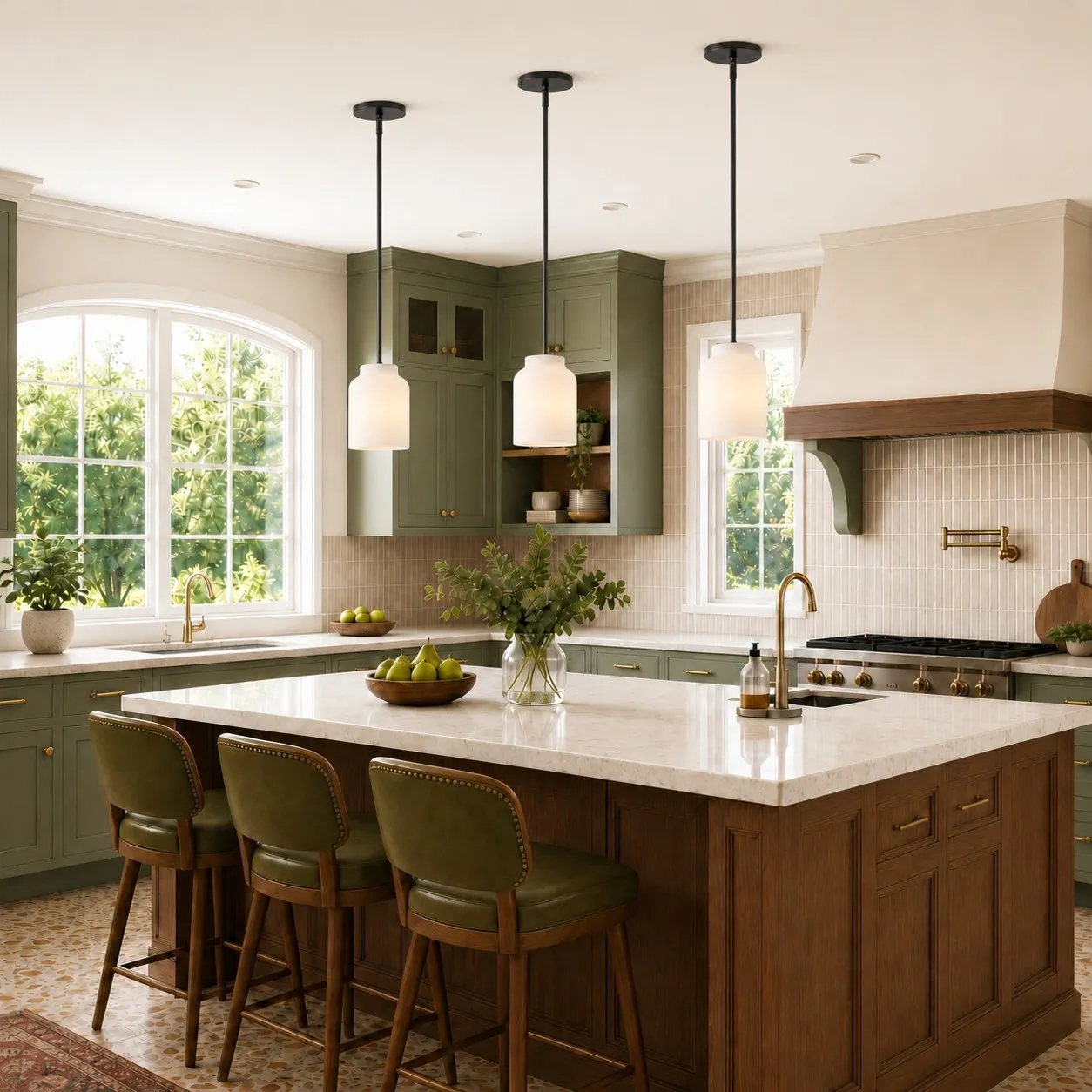
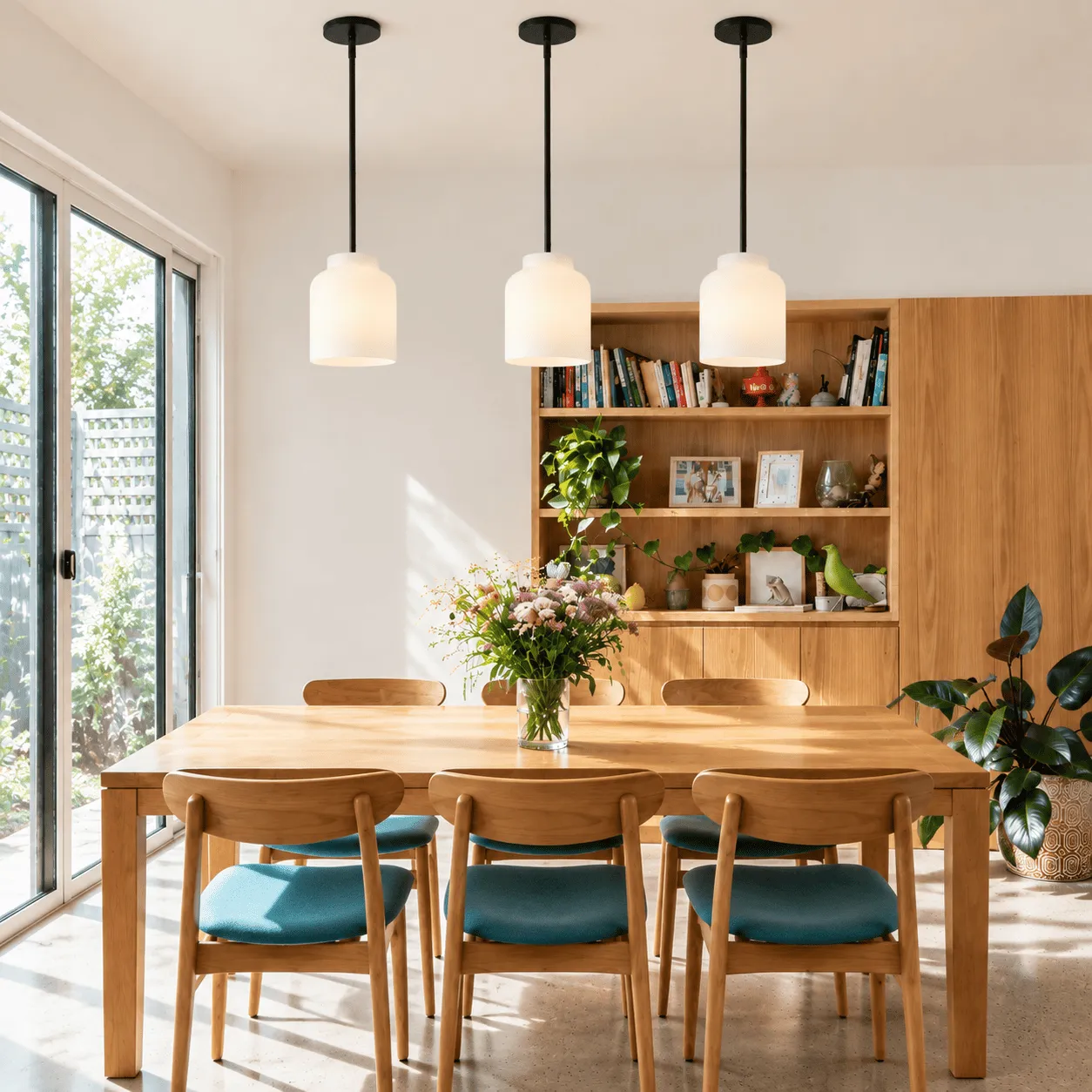
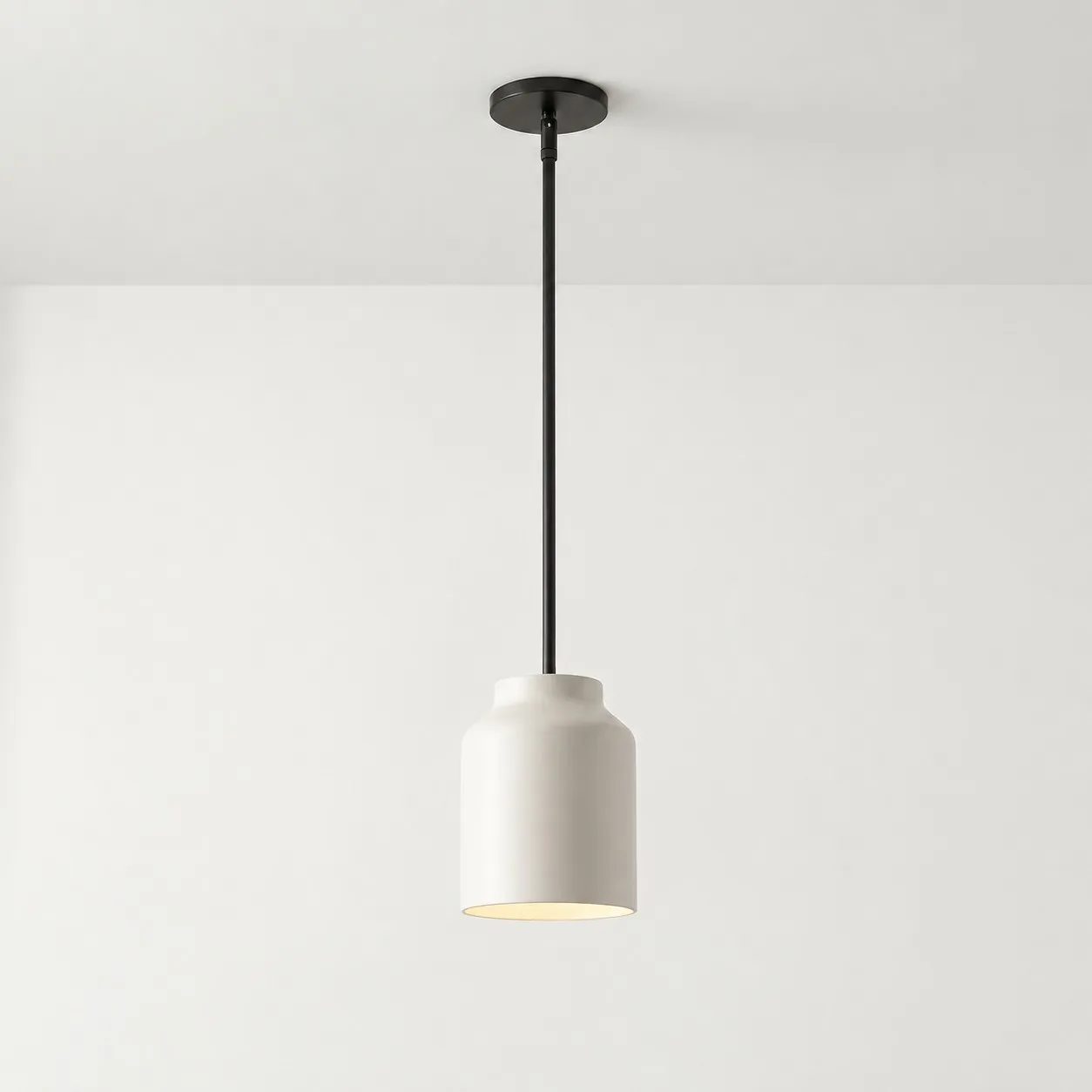
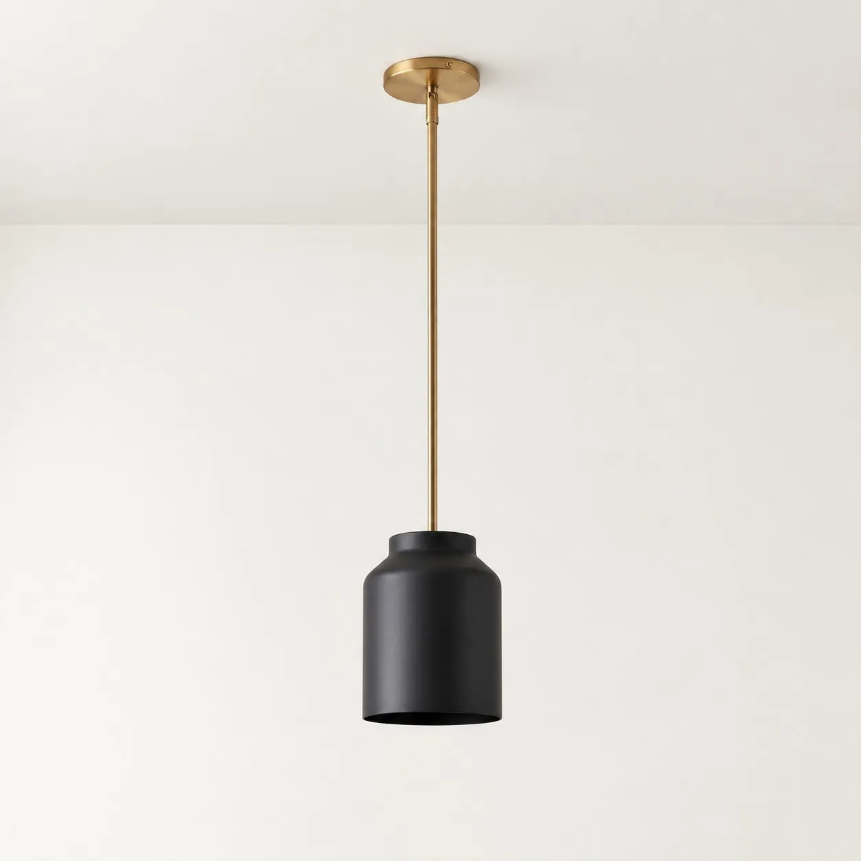
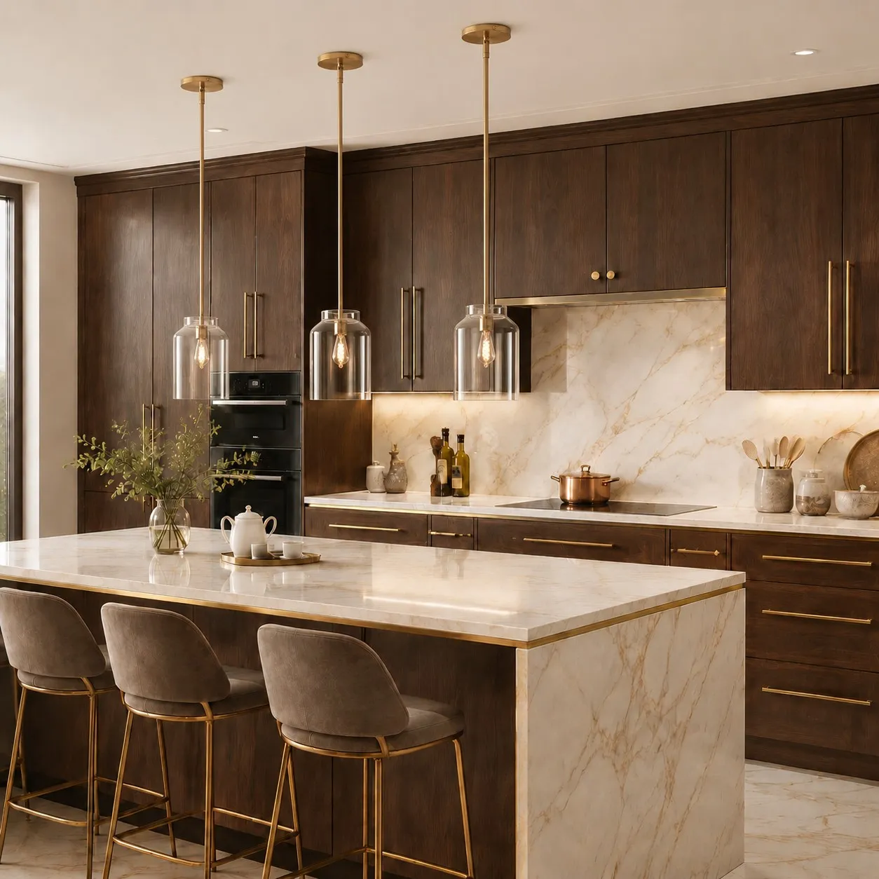
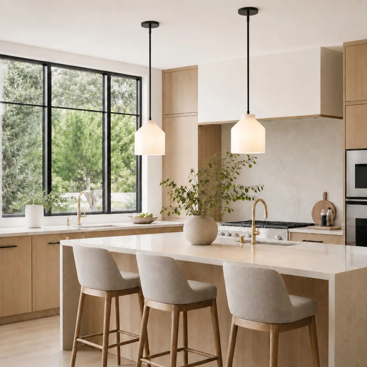
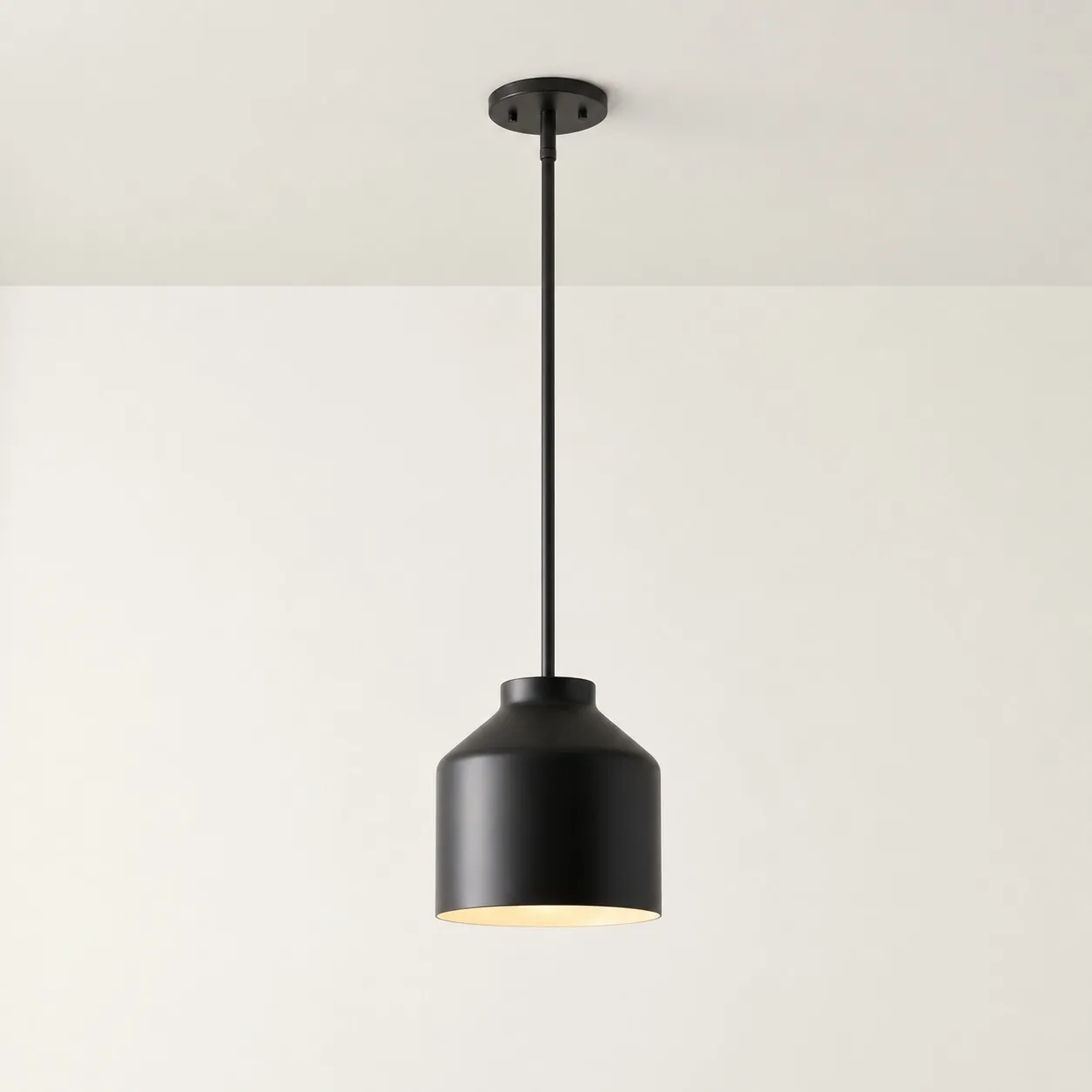
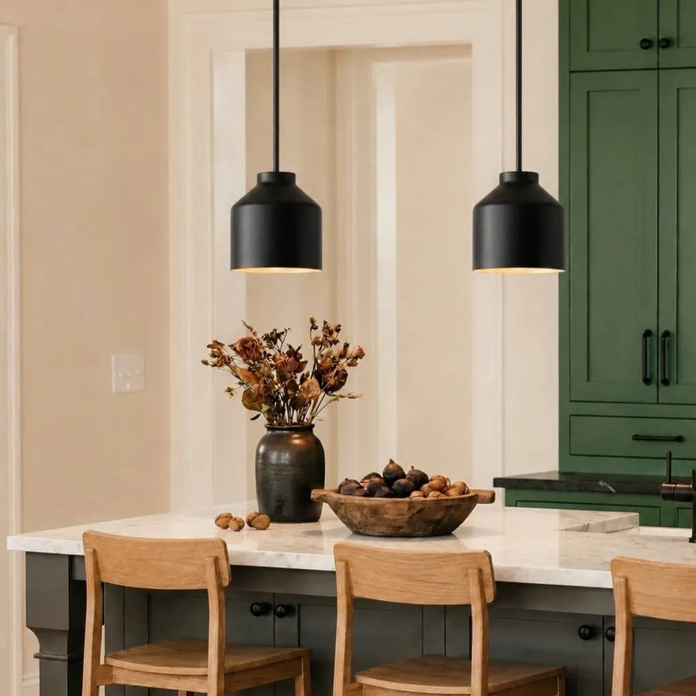
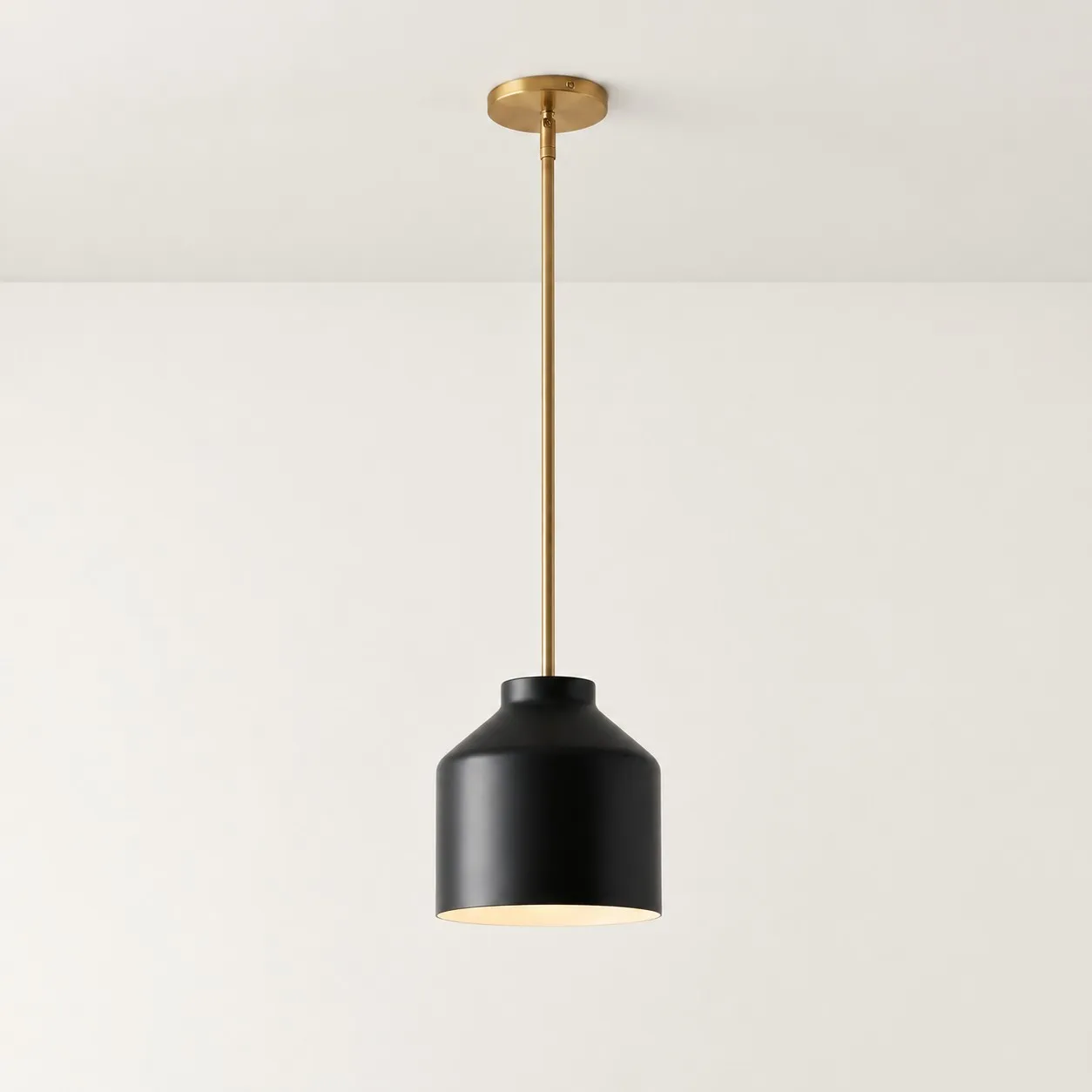
Black works especially well when the room already has dark lines: a faucet, cabinet pulls, window frames, stool legs, or a slim dining chair frame. The pendant connects those details above the island and gives the eye a reason to move through the space.
In an otherwise pale kitchen with no dark accents, black may become the focal point. That can be an excellent choice if you want the island to stand out. If you want the fixture to recede, check its size and silhouette as carefully as its color.
When white is easiest to style
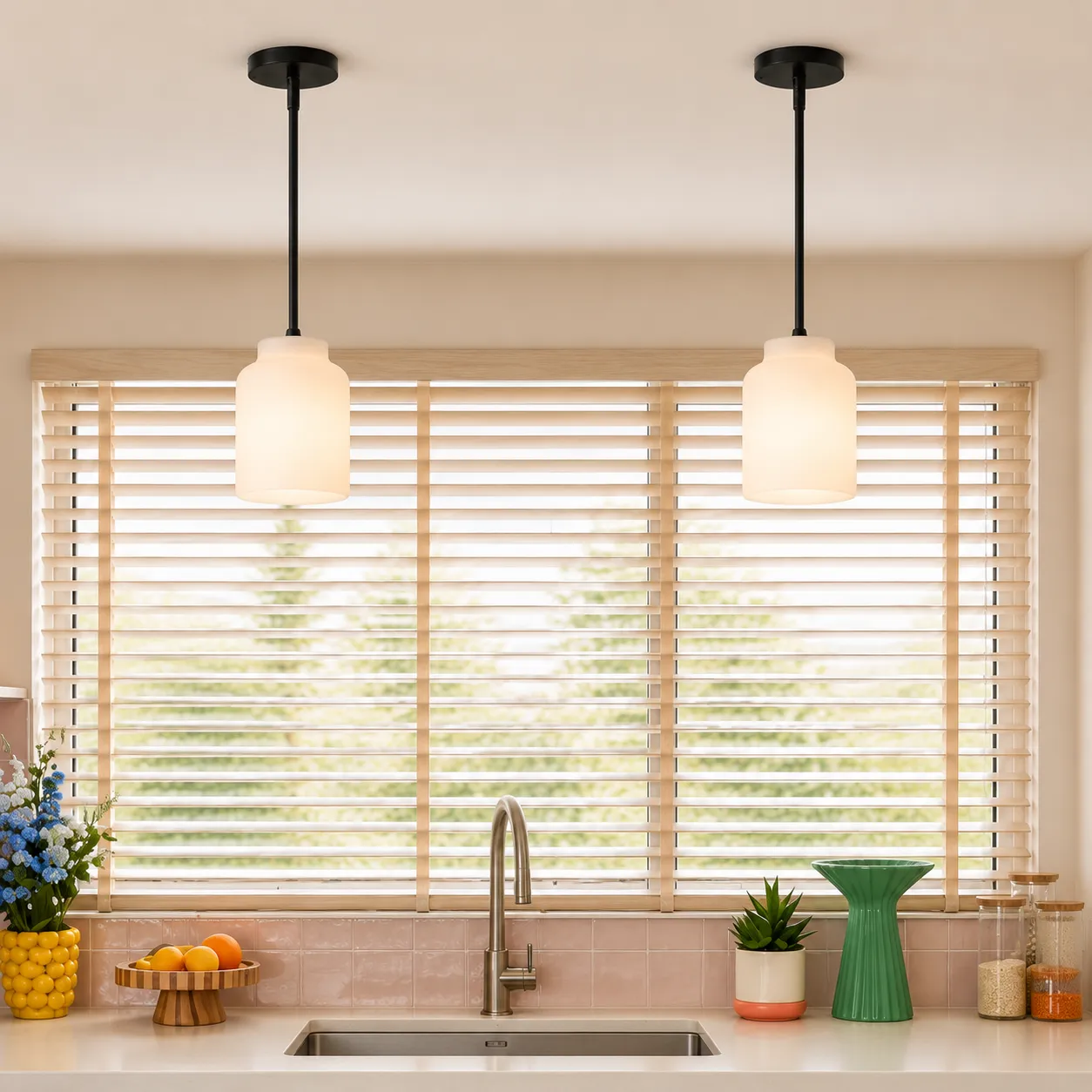
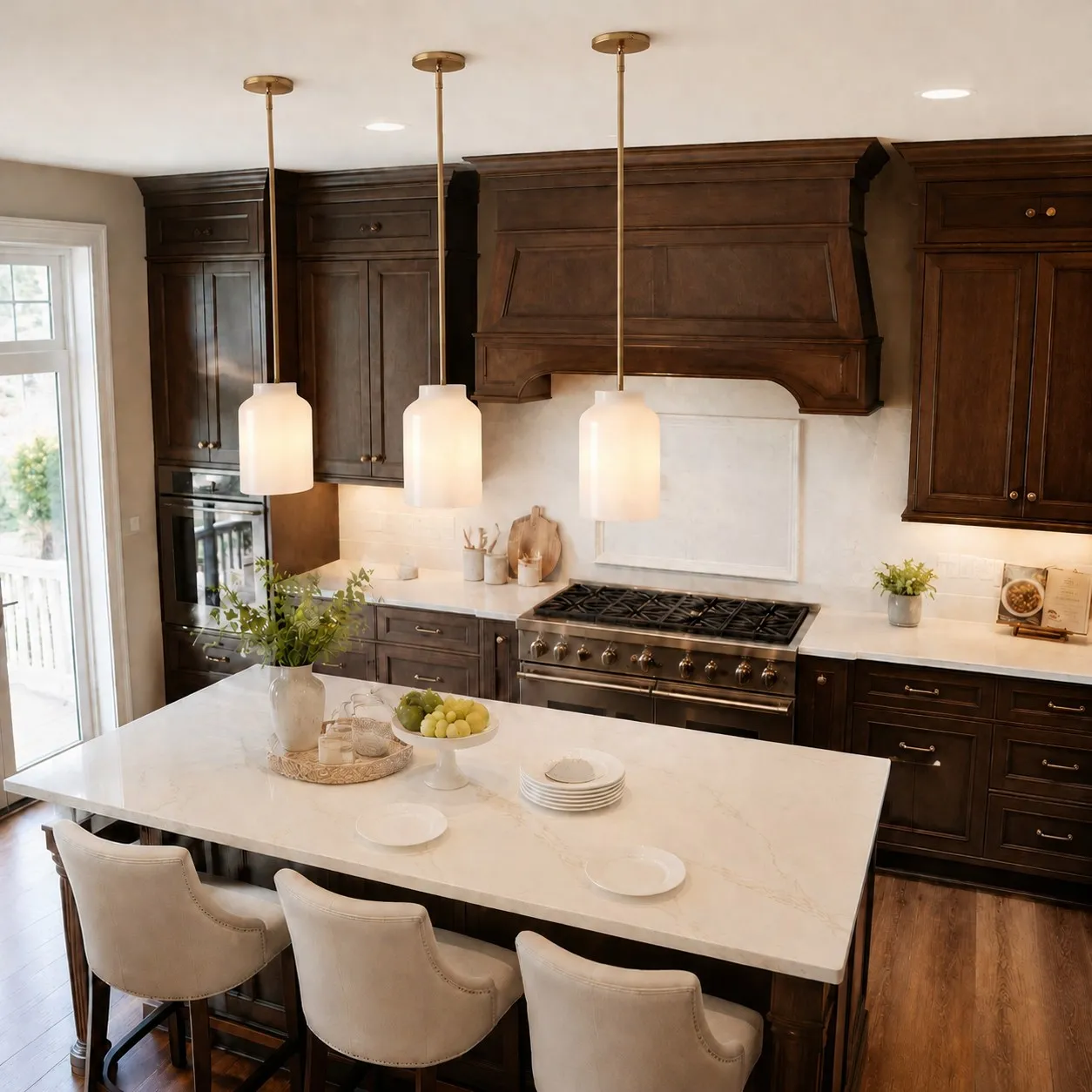
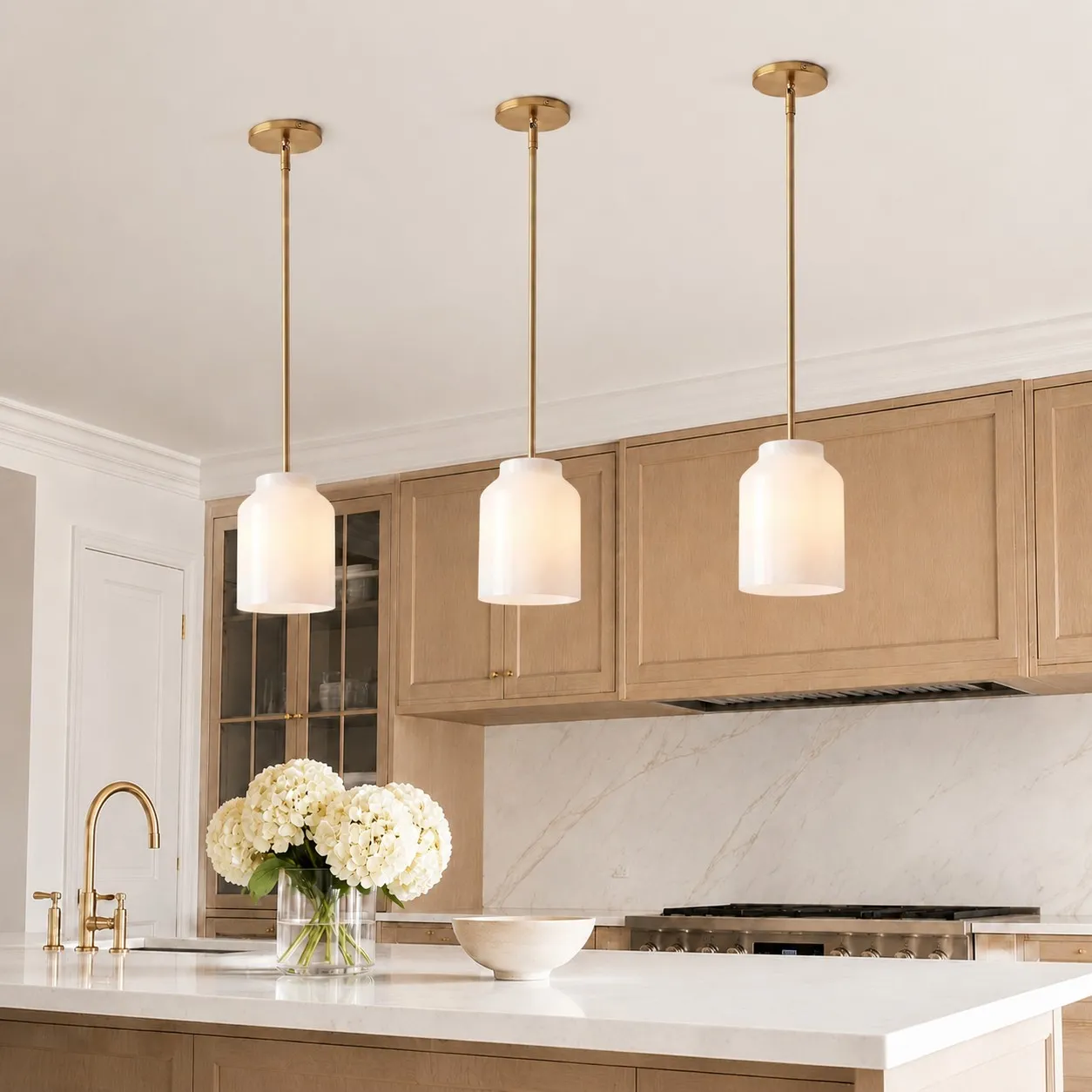
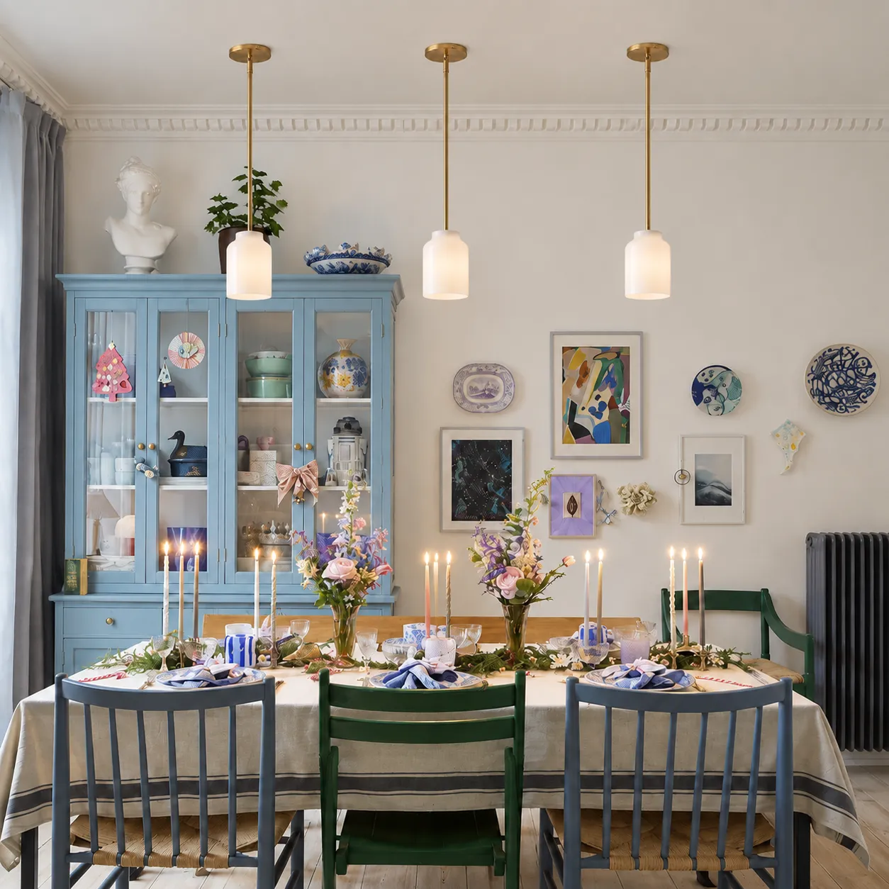
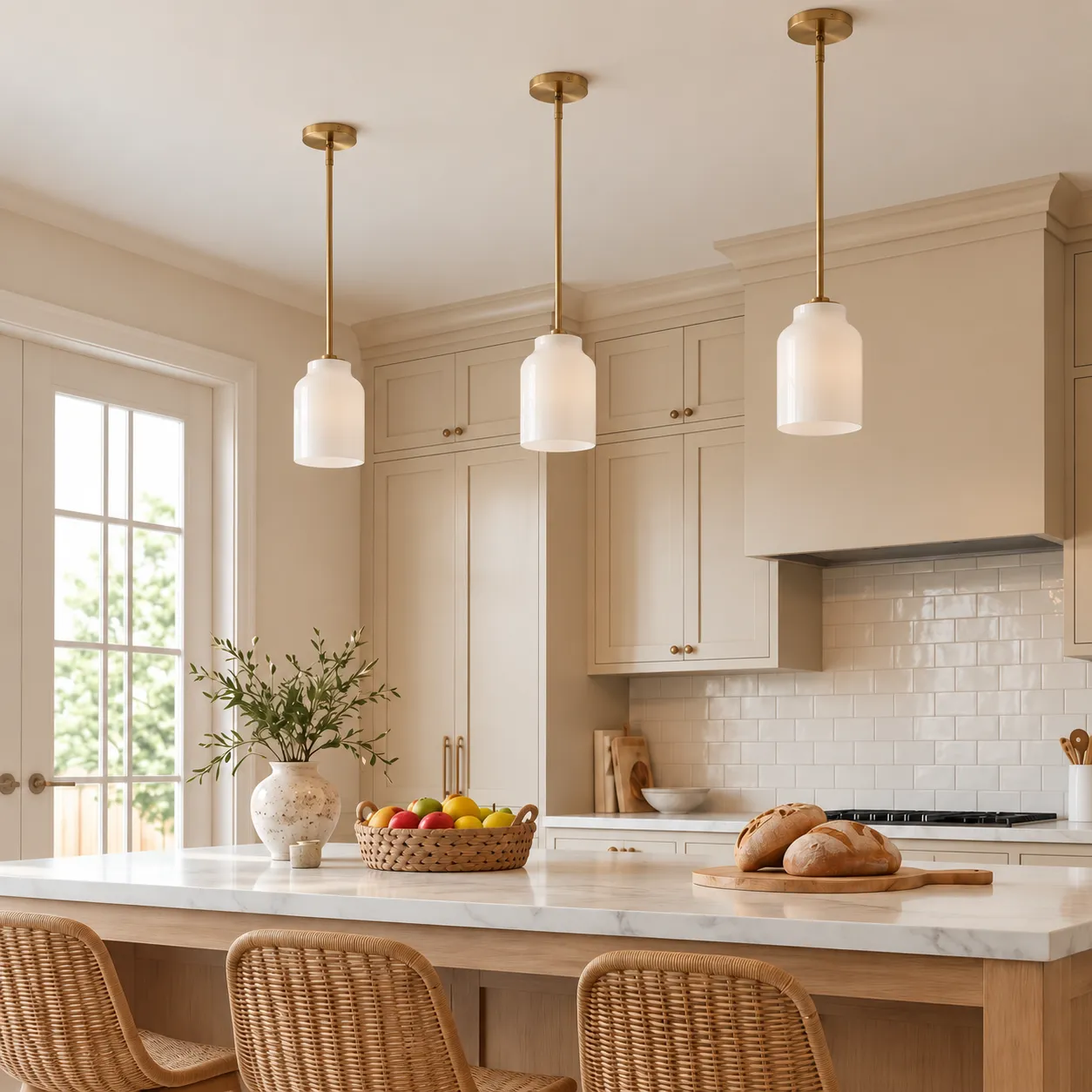
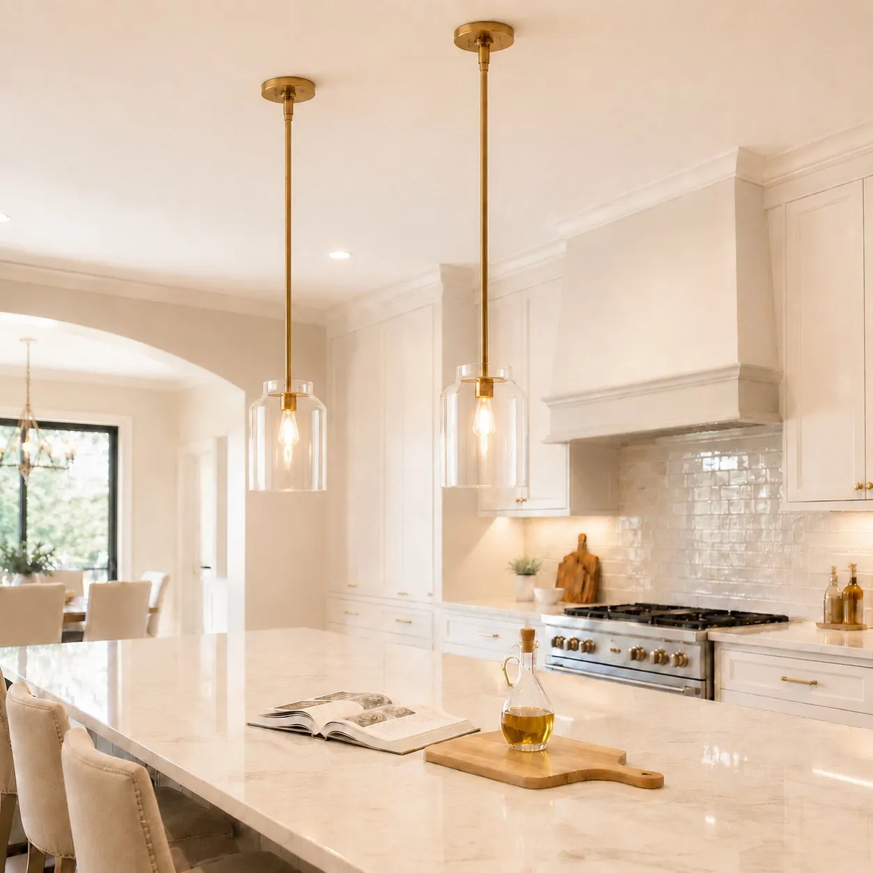
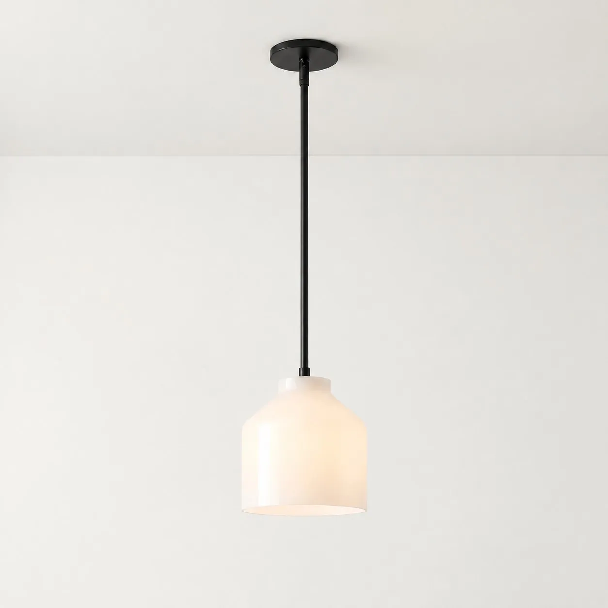
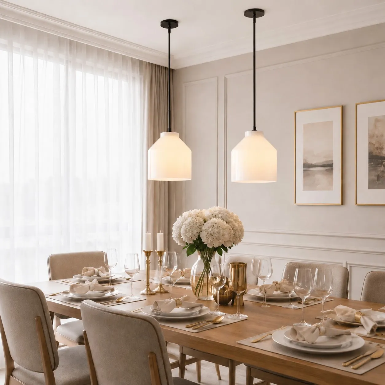
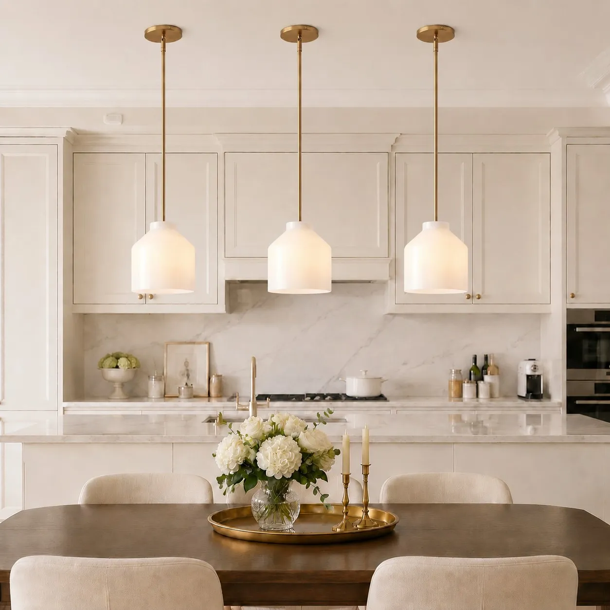
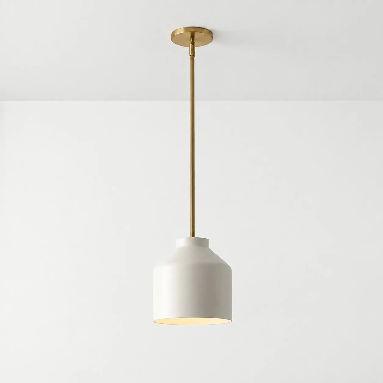
A white shade can sit quietly among light cabinets and walls while still giving the island a defined shape overhead. But white-on-white only looks effortless when the undertones work together. Warm ivory next to cool, bright-white cabinetry will be noticeable, even if both are described simply as “white.”
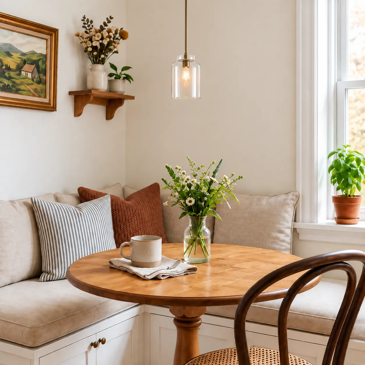
Compare the shade against the actual cabinets and backsplash in daylight. Then consider the evening view: an opaque white shade and a milk-glass shade may look similarly light when switched off but behave differently once illuminated.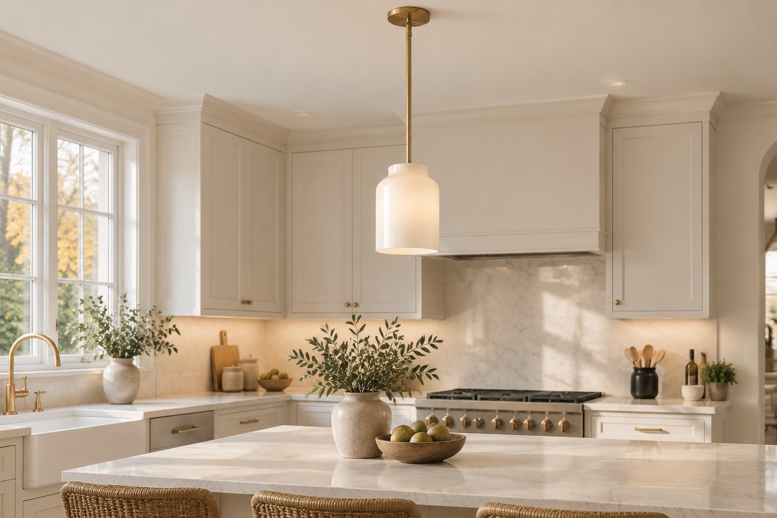
When a colored pendant is surprisingly easy
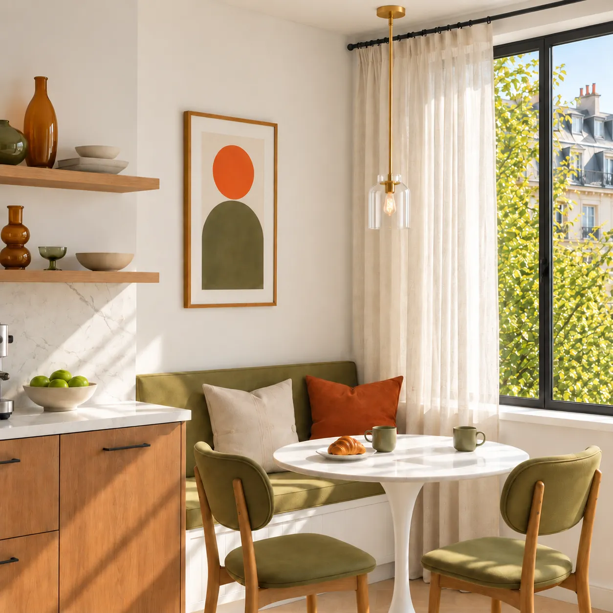
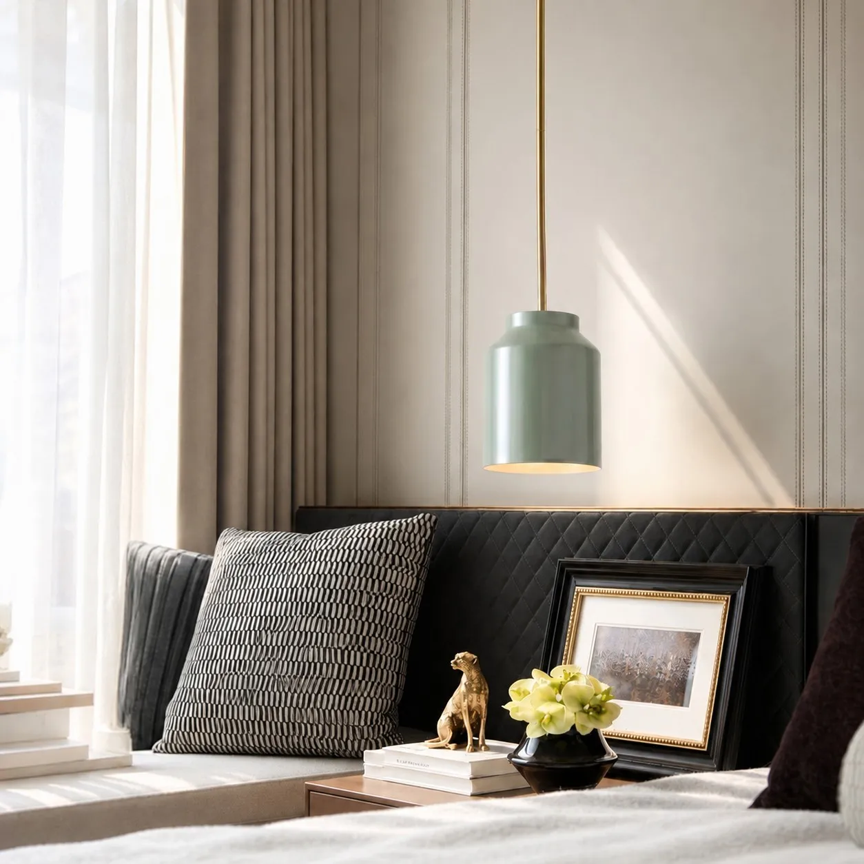
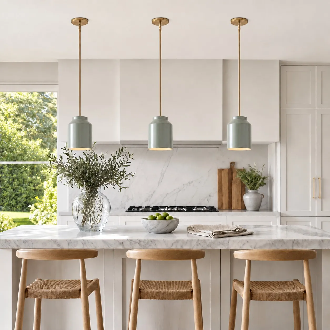
Color is easier to live with when it has one credible connection to the space. A muted green might pick up a tile, artwork, dining chair, or color in an adjoining room. It does not need to match exactly. Repeating the same color everywhere can make a kitchen feel more rigid than choosing a related tone.
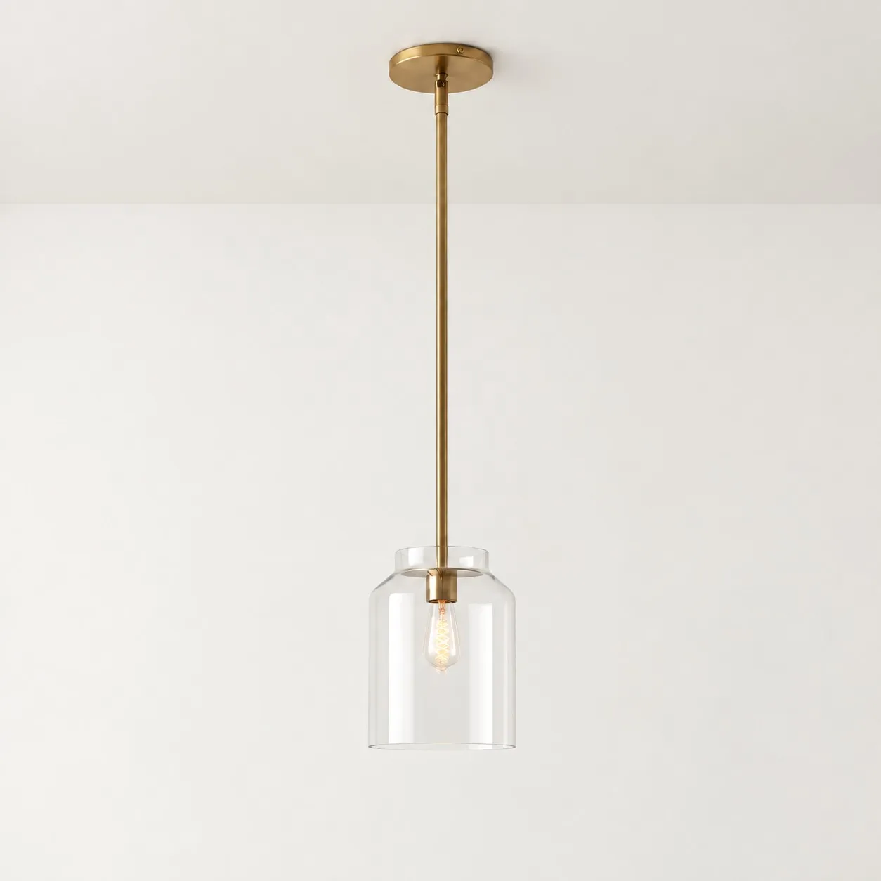
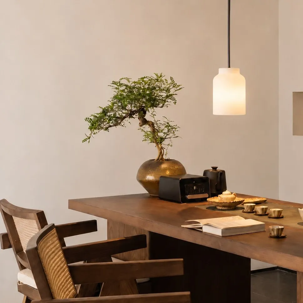
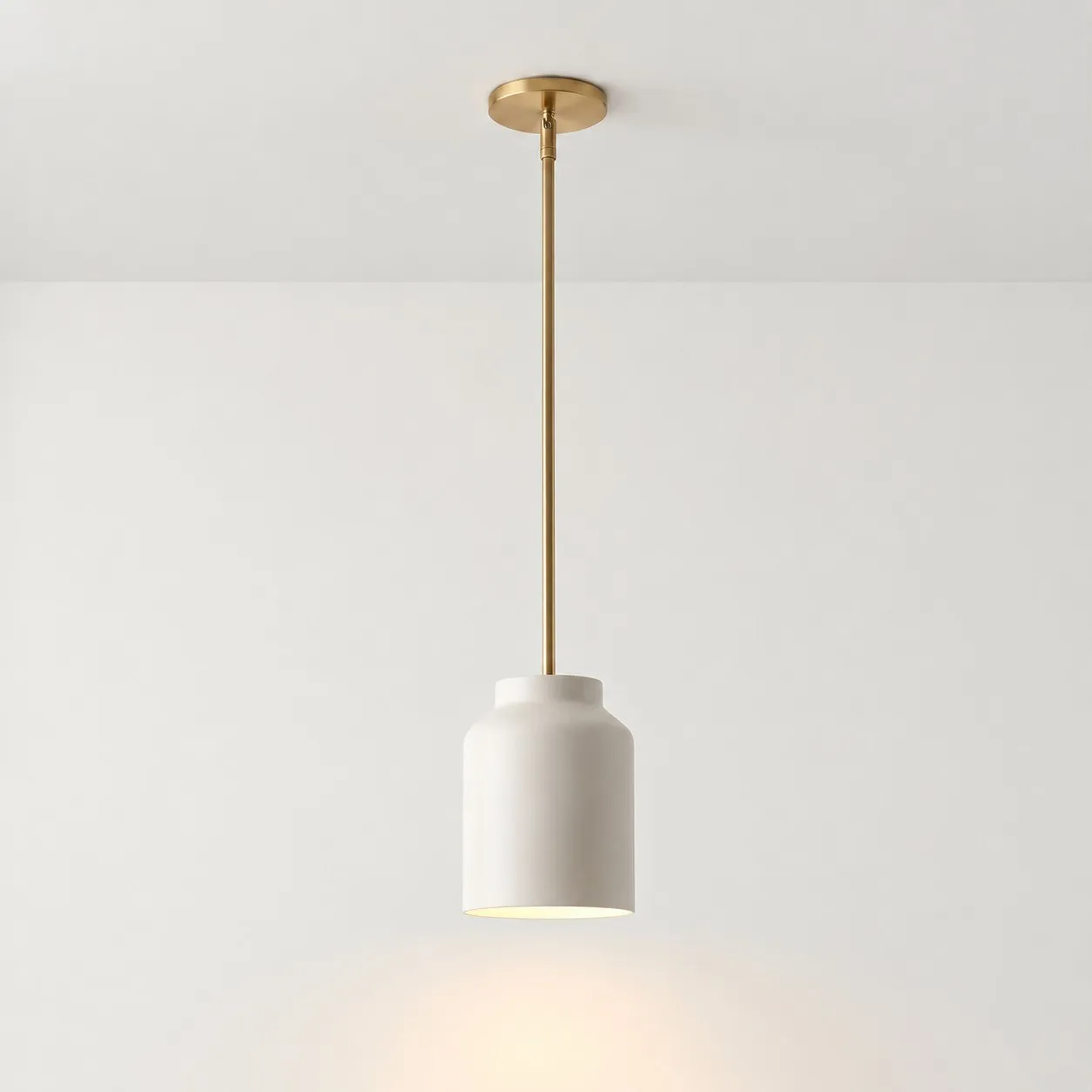
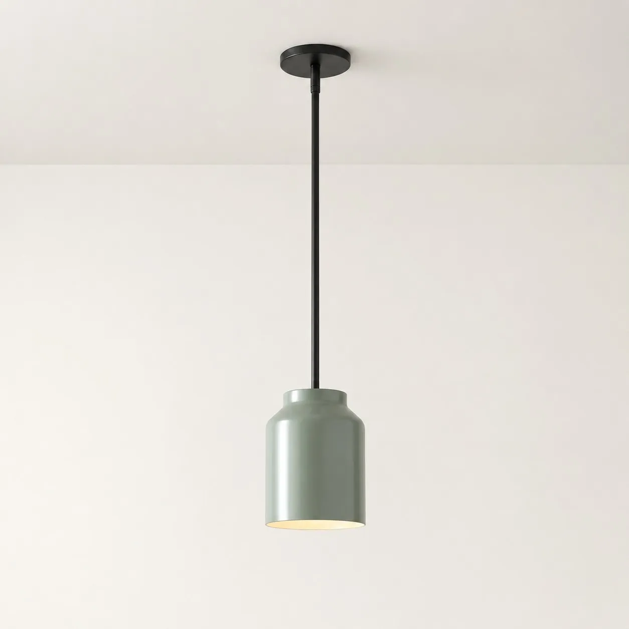
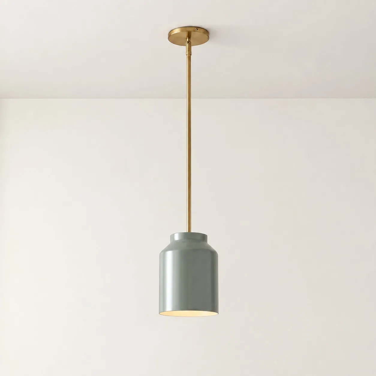
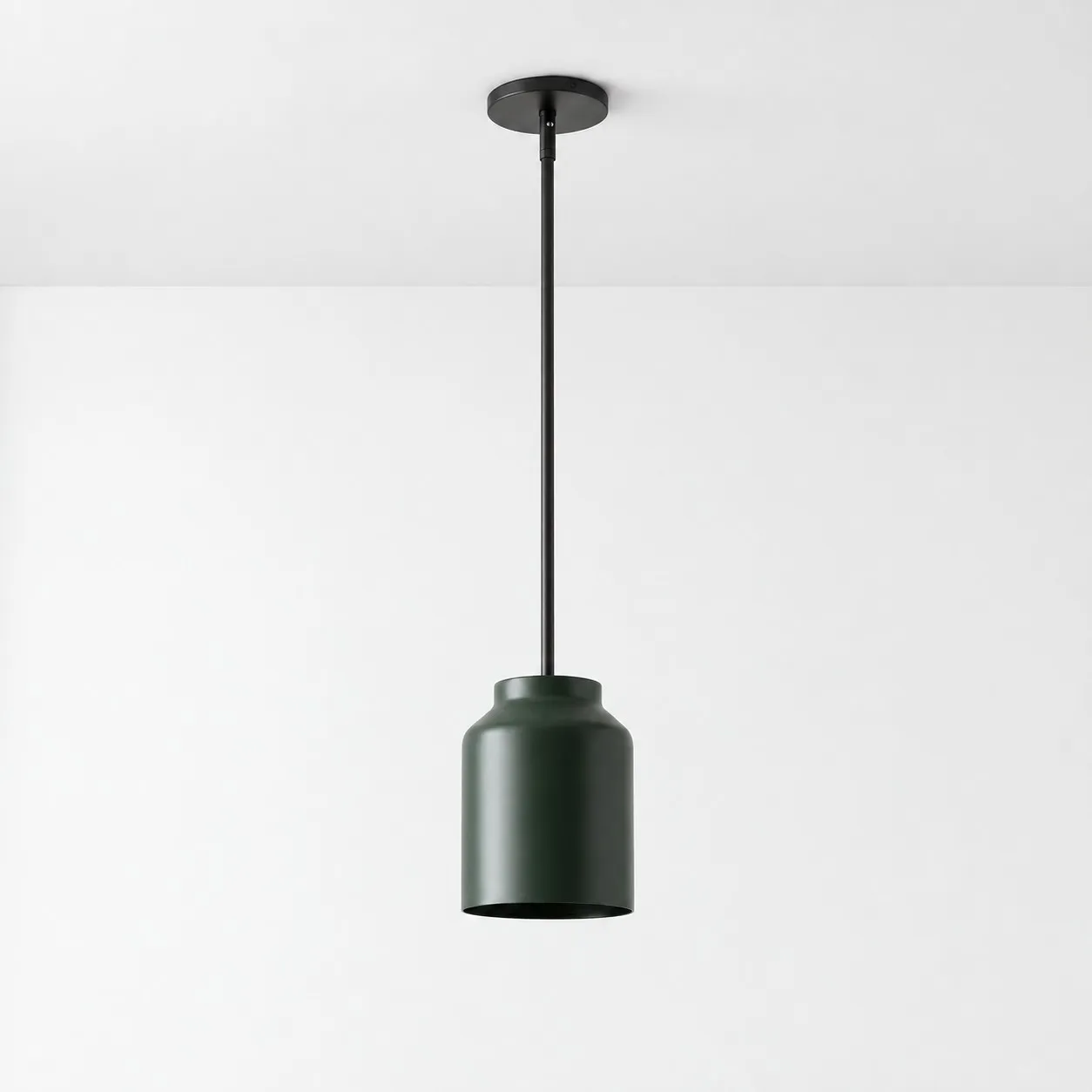
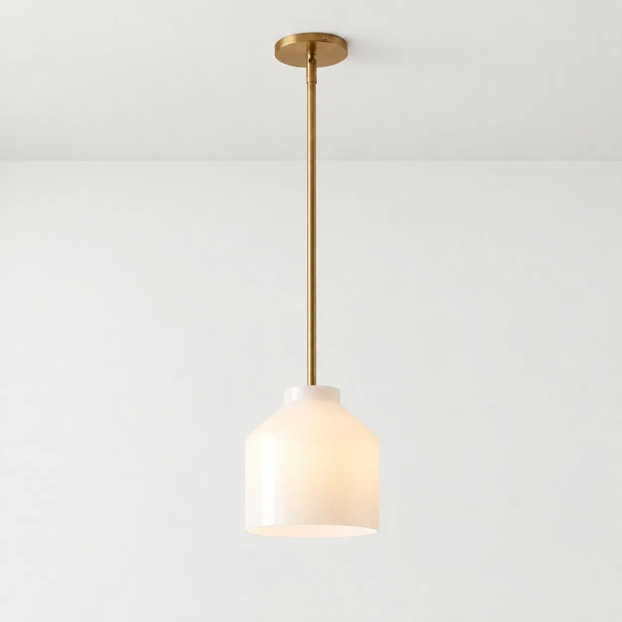
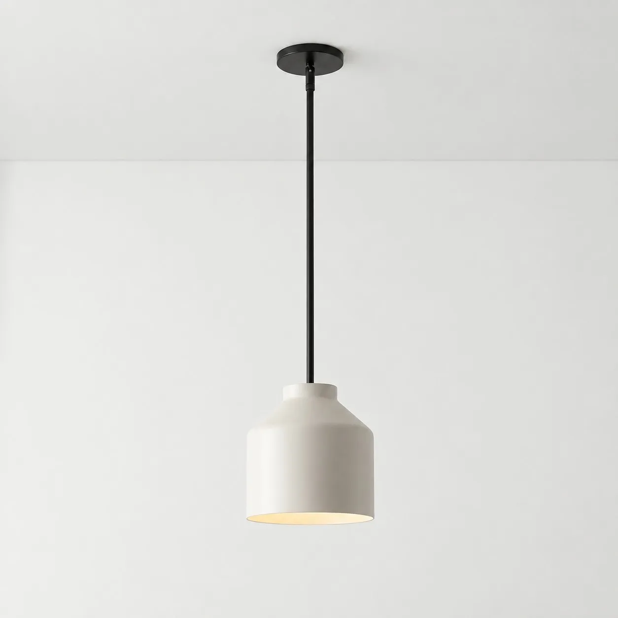
If there is no existing color to echo, ask whether you want the pendant to introduce the first one. A restrained color over the island can give a neutral kitchen character without repainting the cabinetry. For a real example, the Hanton pendant light offers shade color choices such as Powder Coated Ivory, Coated Celadon, and Powder Coated Dark Olive. Its Matte Black selection is listed separately as a finish, so check both selectors when choosing a configuration.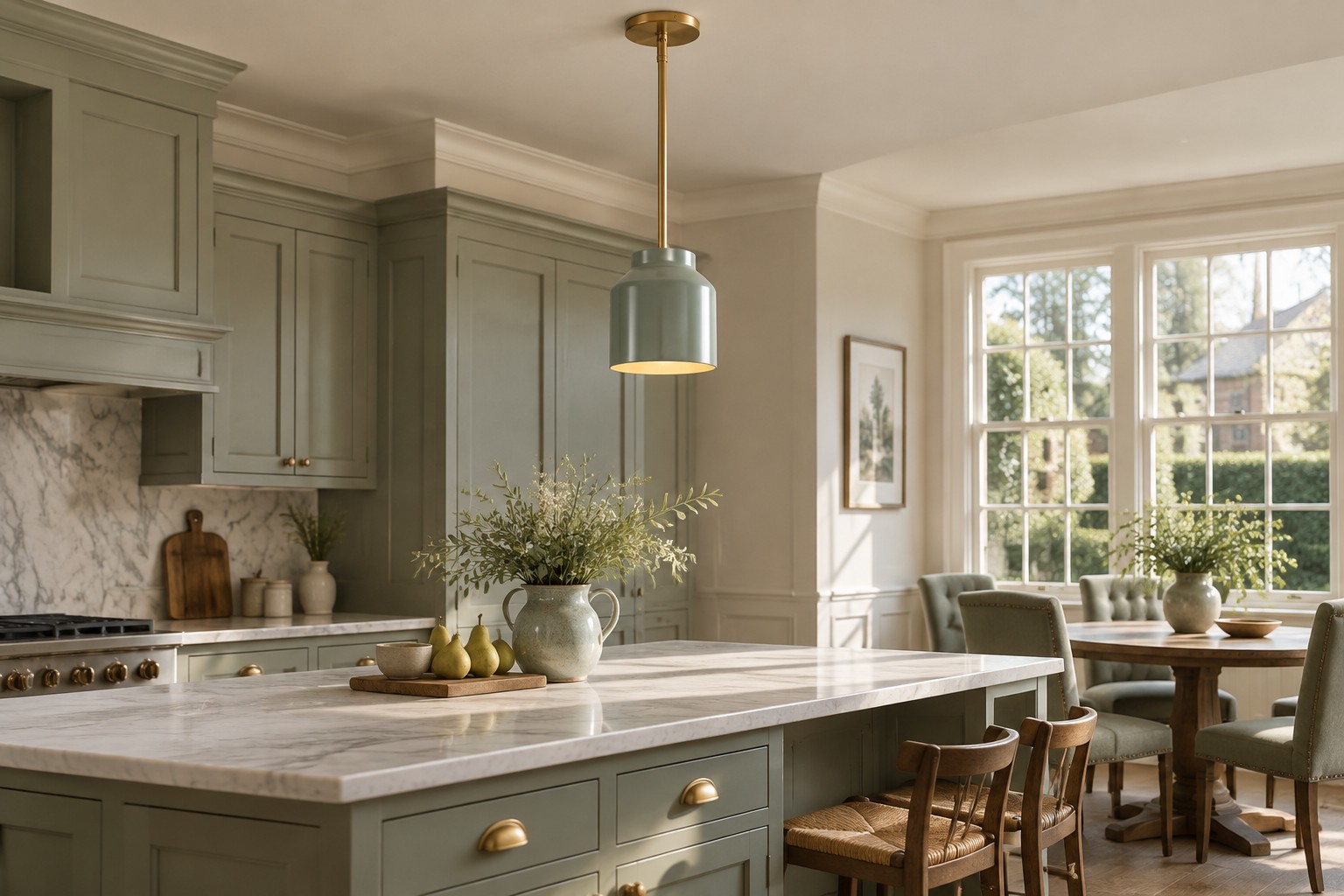
Use the room, not a color rule, to decide
| Your kitchen | Try first | Check before buying |
|---|---|---|
| Dark hardware or window frames | Black or a dark finish | Does the shade become too dominant? |
| Light cabinets and a quiet palette | White or ivory | Do the undertones agree in daylight? |
| A color already appears in the room | A related colored shade | Does it still feel right from the dining area? |
| A neutral room needs a focal point | One deliberate color | Does the fixture have the right scale for the island? |
Before ordering, look at the island from the entry, the work side, and the dining table if one is nearby. The best color is the one you can explain in a sentence: “It picks up the cabinet hardware,” or “It gives this quiet island its own identity.” That is a stronger test than asking whether black, white, or color is universally easiest.